
Carl Pei founded Nothing in 2021, and the brand has been consistently experimenting with design and user interface. While some of these experiments have been well-received by consumers, others have not. Today, I want to discuss Nothing OS, which is a feature that retains the core of Stock Android but adds a custom skin with essential customization features. Now, Nothing is introducing Nothing OS 3.0, which completely overhauls the software’s design and incorporates Nothing’s signature elements, including the dot matrix font that the company has used since its beginning. The first public beta of Nothing OS 3.0 is now available for the Nothing Phone (2a), and I’ll provide an overview of this new software version from Nothing, which is based on Android 15.
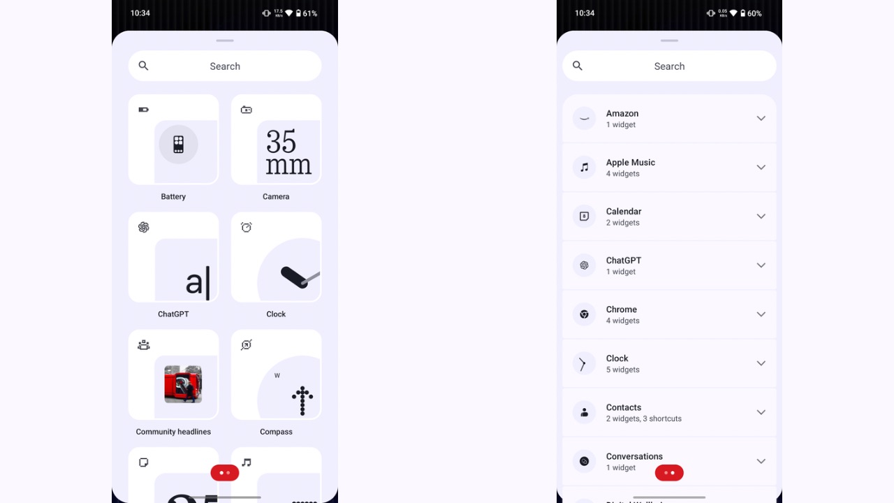
Starting off with the home screen, not a lot has changed in terms of the user interface, except for the Widgets tray, which has been completely redesigned. The new widgets tray is now separated in two pages, where the first page shows all the first-party widgets by Nothing while the second one shows the widgets from third-party apps. The design of Nothing’s own widget previews has also changed in Nothing OS 3.0, with an off-centre preview, along with the icon of the app the widget is from, placed at the top-left corner of the widget.
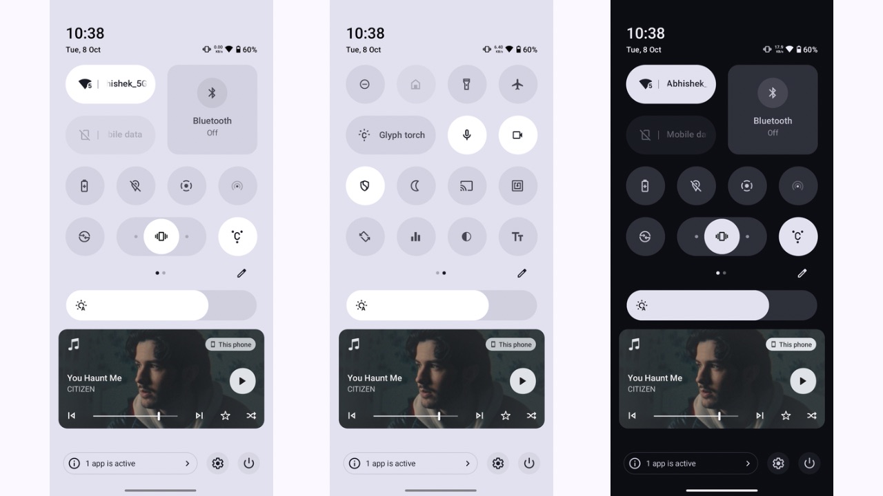
The next major change you’ll notice is the reworked quick settings panel which completely deviates from the Stock Android quick settings panel we see in Pixel devices and the previous versions of Nothing OS. The huge pill-shaped tiles have now been replaced with regular round icons of quick settings, where each can be resized as well. When expanded, the quick setting for ring mode acts as a slider to toggle between ring, vibrate, and silent modes, which is quite a unique implementation.
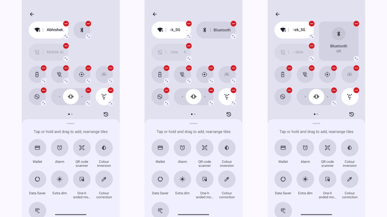
Instead of the six tiles earlier, you can now place up to eight tiles when non-expanded and see up to sixteen when the panel is expanded further. Further, the colour scheme of the quick settings panel has also been redesigned in Nothing OS 3.0, wherein in light mode, it is completely white and in dark mode, the dark grey and black colours take over. This is unlike the previous implementation, in which only the bottom half of the notifications panel changed its colour to dark and light modes.
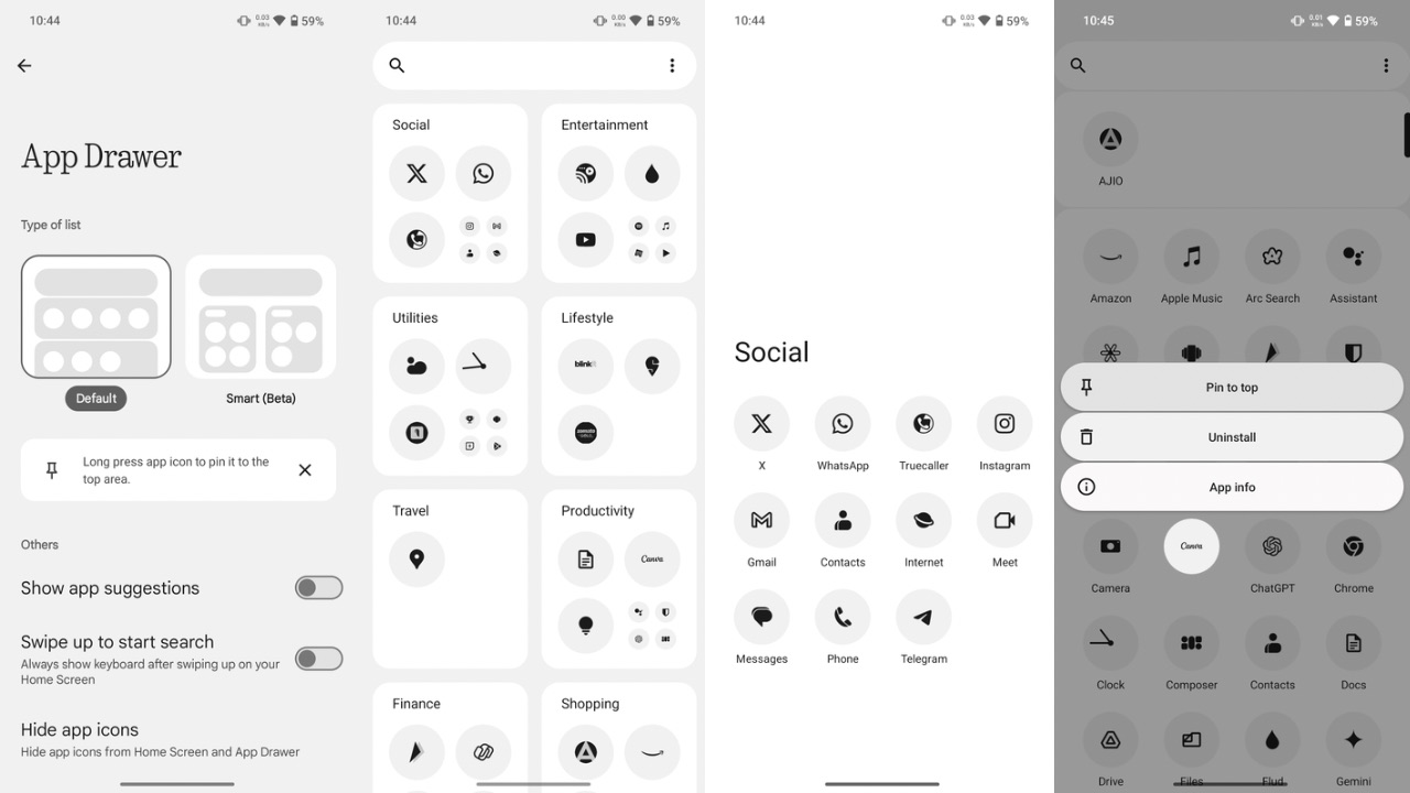
Next, the new smart app drawer in Nothing OS 3.0 is identical to that of iOS’ app drawer. It intelligently groups your apps into various categories. The smart app drawer is a neat addition, but we felt it still requires some improvement to categorize apps better. Apps like Samsung Internet were placed under the Social category, whereas they should have been under the utility category, similar to Chrome. Additionally, in the default app drawer, you can now pin apps in the top row for quick access to your choice of apps, such as the ones you use the most but don’t want on the home screen.
Read More: Nothing Phone (2a) Plus October 2024 Security Patch Update Rolling Out With Bug Fixes
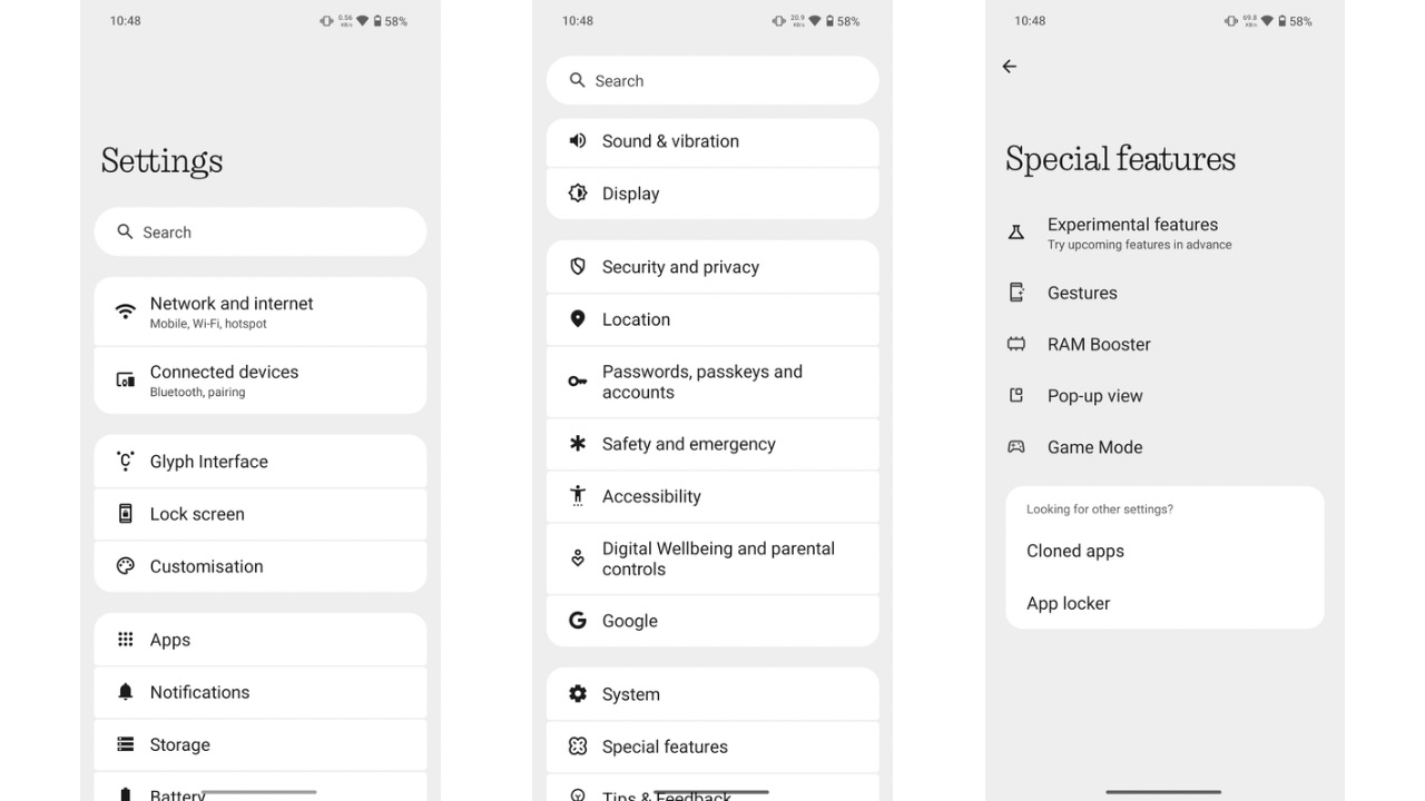
The Settings app is now well put together in Nothing OS 3.0 with better categorisation. Network settings have been grouped, followed by customisation, system settings, etc. The header fonts across the Settings, where the dot matrix font was used earlier, have also been replaced with a new Roboto font.
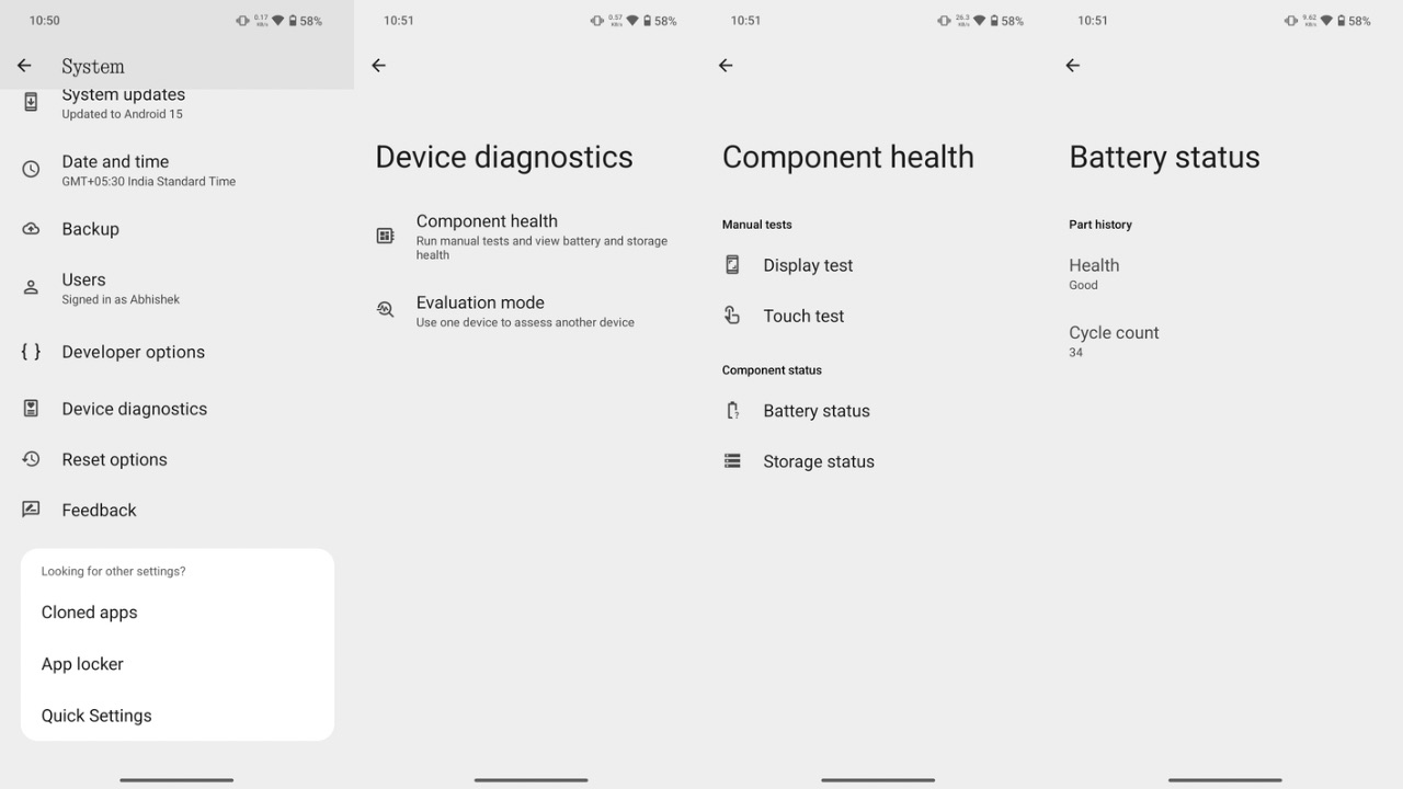
Then, in Settings, you can also find a new Device Diagnostics option where you can check the health of various device components, such as the battery, charging cycle count, display test, storage test, and touch test. Battery health isn’t specified in terms of percentage but only described in text, such as showing Battery health as “Good” in my case.
Some Android 15 features have also been implemented, such as the predictive back animation, where you can see where the back gesture will take you when you trigger it. While we couldn’t find the Private Space feature like in the Android 15 beta on Pixel devices, you can still hide apps from the app drawer by swiping towards the right in the app drawer. Other Android 15 features that are a part of the update include auto App archiving, and partial screen recording.
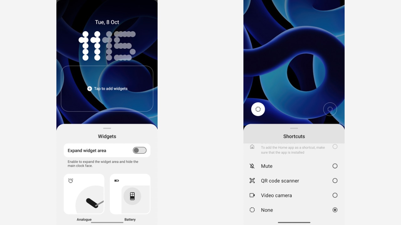
Lock screen customisation is another new aspect Nothing has worked on in Nothing OS 3.0. Once you tap and hold on the lock screen, a new “Customise Lock Screen” button appears at the bottom. Tapping on it takes you to the screen where you can choose and customise the lock screen shortcuts at the two bottom corners, and choose from five new clock styles. I would have also liked it if these same settings were accessible from the Lock screen section in the Settings app, but unfortunately, you can’t. Further, you can now “Expand Widget area” on the lock screen that hides the clock face and gives widgets the front seat.
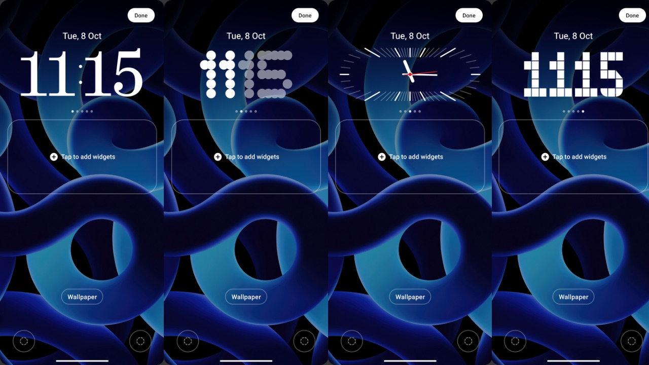
All these clock styles have been designed to appear at the top of the lock screen, and the previous design, where the dot matrix clock was positioned in the center, has been scrapped altogether. The new fonts for clocks, however, look better and more appealing than the previous one.
Moreover, the clock style you choose also carries over to the Always-on display so there’s some level of AOD customisation, too. There’s also a new dot matrix-inspired fingerprint animation, which replaces the ordinary-looking circle animation we were used to seeing in previous versions of Nothing OS.
Other user interface elements, such as the Glyph lighting features and their Settings UI, the home screen customisation UI and features, the camera app, etc., remain unchanged from previous versions.
Overall, the animations of closing and opening apps remain identical. System fluidity also looks similar, if not better. I could notice some bugs as well, such as the flickering of the lock screen when AOD triggers, the inconsistent unlocking animation when using the fingerprint to unlock, and some frame drops in the user interface. Because it’s a beta build, these bugs are expected and should be ironed out in future releases.
Future releases should also bring the new Gallery app Nothing has teased, as it isn’t a part of the first public beta. The new charging animation that was shown in the launch video is also not yet available.
What I’d also like to see in future releases is some more options I am used to in other Android skins, like double-tap on the lock screen to wake up the screen, which would add further value to the software.
Overall, I am quite impressed with Nothing’s effort in Nothing OS 3.0 as it clearly shows the brand’s aim to distinguish its software from the other players. As of now, it looks like a step in the right direction.
