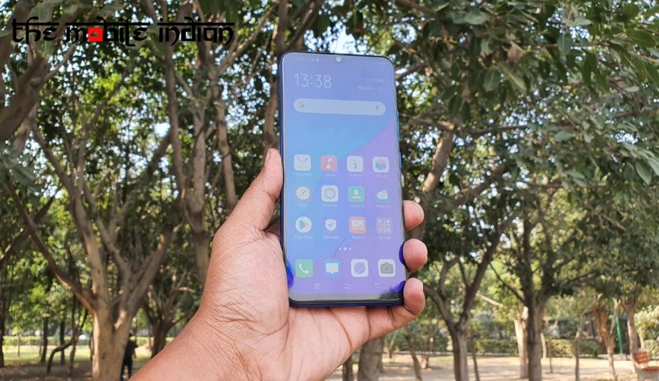
Vivo has today announced the launch of its latest budget-centric smartphone, the Vivo U20, in India. The smartphone comes with a price tag of Rs 10,990 for the 4GB RAM + 64GB internal storage variant and Rs 11,990 for 6GB RAM + 64GB internal storage option.
With this, Vivo is going quite aggressive with its U-series. The U10 from the company created a lot of buzz with pricing along with some exciting specs. The successor of the U10 is once again touted to follow the same route. However, this time it will have to face fierce competition from the likes of Realme 5s and Redmi Note 8. So, does it have enough arsenal to beat the competition? Let’s find out.
[[VIDEOID=1555]]
What we liked in Vivo U20!

To start with the first thing we liked about the smartphone was the design. The smartphone comes loaded with a gradient finish at the back panel, which surely looks attractive. It is available in two colour options, Racing Black and Blaze Blue. We got the latter for review and we liked the S-shaped finish, which divides the purple and blue hue.
Coming to the display, the Vivo U20 is loaded with a 6.53-inch Full HD+ display with a screen resolution of 2340 x 1080 pixels. The display offers some good viewing angles and colour reproduction it to the point. It also comes loaded with Widevine L1 support, meaning that users can enjoy HD streaming on Netflix and Amazon Prime Videos. The brightness of the display is good and you will not face any problem while reading the text in outdoor conditions.

Another area where the Vivo U20 does a good job is the camera department. The smartphone has a triple-camera setup, which comes with a combination of 16-megapixel primary lens, an 8-megapixel Wide-Angle sensor and a 2-megapixel macro lens. For the front, the company has added a 16-megapixel selfie shooter. The daylight performance of the Vivo U20 is good and it takes good photos. We quite liked the Macro lens as it took some sharp images.
The performance of the Vivo U20 is good. The smartphone is powered by a Qualcomm Snapdragon 675 Processor along with Adreno 540 GPU. The phone is backed by up to 6GB of RAM and up to 64GB of internal storage, which can be further expanded via microSD card slot. It is a good thing that Vivo is giving you Snapdragon 675 processor, whereas, others are offering Snapdragon 665 chipset. This results in better multitasking and gaming performance as compared to Realme 5s and Redmi Note 8.

We played PUBG Mobile on this smartphone and was satisfied with the performance. During our gameplay, we did not notice any lag or shutter and it ran the game at high graphics settings. Furthermore, there is an Ultra Game Mode, which helps in enhancing the gaming performance.
The battery of the Vivo U20 delivers some good output as well. A 4,000mAh battery backs the smartphone and it supports 18W dual-engine Fast charging support. The battery can last up to 2 days under normal usage and if you are a power usage, then it can last up to one full day. The phone gets fully charged in around 2 hours.
What we didn’t like in Vivo U20!
Although the design of the Vivo U20 is good, it is not perfect. The smartphone feels heavy when you hold it. This effect the usability factor if you are binge-watching a series or playing games for an extended period. Plus, the back and front panels are prone to smudges, so it is advisable to keep in cover or you will end up wiping the smartphone frequently.

Furthermore, during gaming experience, we noticed that the phone tends to overheat and the area near the camera modules heats up quickly when you are playing games like PUBG Mobile.
Another area where the whole user interface is spoiled is the software. The Vivo U20 runs on FunTouch OS 9.2, which is backed on Android 9.0 Pie. The user interface offers some good features like system-wide dark mode; customisation options from changing themes to fonts and font size; Motorbike mode; and Easy Touch, which acts as a shortcut to favourite apps and for navigation purpose.

However, the whole user interface still feels heavily customised and far from stock Android. The major problem of the user interface is a complex nature. It is quite challenging to find anything in the Settings menu. The control centre, which is again inspiration from Apple, feels not necessary. Furthermore, the design of the control centre is not that great as well. The brightness and volume bar mostly takes the space, the shortcut icons are placed in a small space, which means you have put in extra efforts to scroll to the bottom to find the desired option.
Furthermore, we felt the gesture-based navigation controls are half-baked as you don’t get as smooth experience as other smartphones are offering. Plus, the problem of bloatware persist and you get lots of third-party apps, which is a mood spoiler.
The wide-angle lens is not that great to be honest, as you will notice a drop in quality and detailing is not at its strongest. In low light conditions, the smartphone gave mixed-bag results as it sometimes took good images, though in some cases the detailing was lost. Photos taken in the low light conditions using a wide-angle lens delivered average results. The detailing was quite ordinary and grains and noises were prominently visible.


