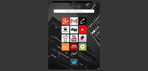
Opera Software recently announced a new web Browser – Coast – for iPad tablet. The new Coast web browser works on the iOS 6.0 or higher update running iPad tablets. Opera has carefully crafted the Coast web browser for the Apple iPad owners to enjoy and make use of the full screen real-estate. The Coast by Opera is available as free application from the Apple App Store.
Though there are several web browsers available for the smartphones and tablets but very few of them are able to offer the rich web experience. The Coast has been designed from ground up for the Apple iPad tablet. The web browser supports both the iPad and iPad Mini models. We got lucky to try out the Opera browser just after Apple released the iOS 7 software update.
Coast by Opera bears a design inspiration from its own Opera Mobile web browser and several other instances. The homescreen of the Coast web browser is almost like a tablet’s menu with icon grid on it. That icon grid is basically the easy to access Favorites panel. Swipe from right to left for checking out the stacks of Favorites panel. These bookmarks can be arranged in 3×3 or 3×4 grid format. Amazing part is one can choose any image from the web page or from existing photos to set as the background for the Coast.
The Coast web browser has been developed using the WebKit and has been designed to offer web experience with minimal possible text input. That is why there is no address bar throughout the app. Users can simply type out the website’s address such as “themobileindian” and the Coast browser will smartly show up a tile with relevant favicon on top of it. Select that tile and the desired website will open up. The suggested list of websites is very dynamic so it will change as you keep feeding the names.
When tapped on the website’s tile like icon, it opens up in the screen filling entire space and leaves only thin strip at the bottom. This way, a normal web page is displayed entirely to fit the screen size of the iPad tablet. Navigation and interaction with the web pages is enabled with gestures. Clicking on a link or image will take the user to the next page and swiping from left to right on the screen will perform typical – Back function for the browser.
Similarly the right to left swipe gesture performs the Forward function. The three dots on the right bottom corner give a quick access to the Tabbed browsing menu where the snapshots of the tabs opened are showed. One can simply scroll sideways between those open panes to jump between different sites on respective tabs.
While one browses the web, there are no menu buttons, no forward or back options. Clearly, Coast is meant to enjoy the rich web experience without having to worry about anything. Coincidently, the Coast does not incorporate Opera’s own data compression technology so ensure that use the browser over WiFi networks. Also, the images can be saved to be accessed later from the Photos app of the iPad.
At first, the button less interface might be little odd but soon one gets used to enjoying web content in the full screen mode. Text entry is very easy since one simply has to tap on the text box of a web page for data input. Small grid of nine squares at the bottom while browsing takes the usage to the homescreen.
Re-arranging the Favorites on the homescreens is not an issue – simply press, hold and release any tile and all of them will start to wiggle. Then you can either re-range those tiles by dragging the tiles around. To delete any of the tiles, just press and swipe it till the top. Similar press, hold and swipe upwards gesture can be used to delete the tabs from the Tab menu.
When it comes to security, the Coast has been integrated with Web of Trust feature that allows checking the credibility of the page and doesn’t open pages that have been flagged as malicious. To check the level of security on a webpage, users can click on the three squares at the bottom right corner to access the tabs. On each webpage’s tab, there is an “i” icon, and one can tap on that to show the level of security on the page. Right corner of the tab pane has an option that allows sharing that particular page with others via email, Social network and others. Opera has also added social sharing capability throughout the browser.
Coast by Opera is a very sincere attempt to bring a minimalistic web browser for rich web browsing experience and just enough security features. We wished for the Opera Link feature for two-way sync of the favourite websites between Coast and all other Opera browser versions.
Weighing about 16.5 MB, the Coast by Opera web browser is available for free from the Apple App Store.


