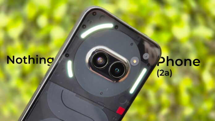
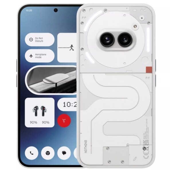
Nothing is now entering the fourth year since its inception and the brand is ready to sell a new smartphone called the Phone (2a). This smartphone sits above the Phone (1) and below the Phone (2) in the brand’s smartphone portfolio. At Rs 23,999 for the 8GB/128GB model, Rs 25,999 for the 8GB/256GB model and Rs 27,999 for the 12GB/256GB trim, should you consider buying the Nothing Phone (2a)? We’ll try to find that out for you in our review of the handset.
Design & Build
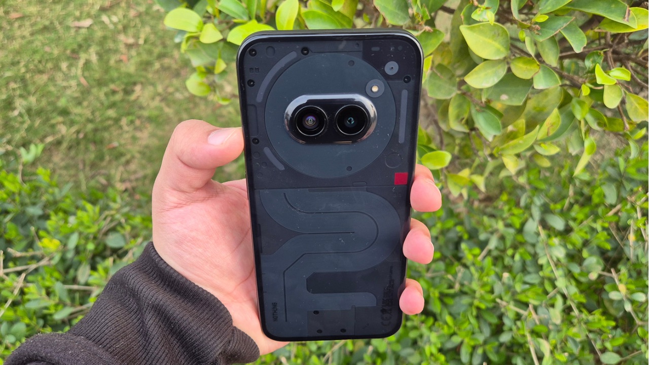
Nothing’s primary strategy has always been playing on design and with the Phone (2a), that’s not different by any means. It seems like an ambitious design, like the brand’s other two smartphones. Nothing says that the concept of this device was made back in 2020 and the cameras of the device denote two eyes through which the handset interacts with the outer world.
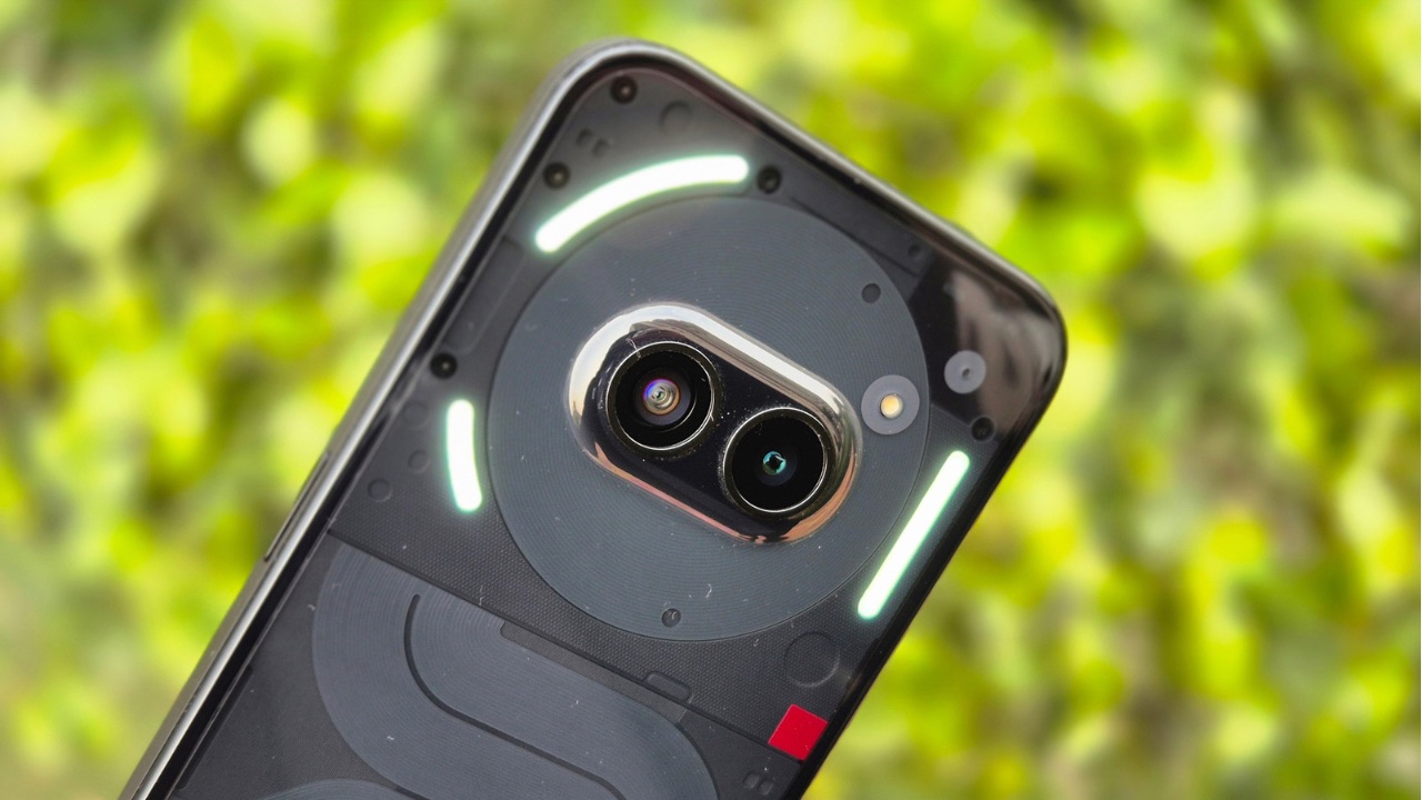
While all of that sounds great, the design in the real world matches the Nothing vibe, too. It may not be everyone’s cup of tea, but it is definitely unique and indeed looks like how a Nothing smartphone should look. It’s catchy, attractive, and nothing like you have ever seen before. The back panel is now slightly tinted where you can see the coils running down along with the cameras placed at the top-centre in the form of ‘eyes’.
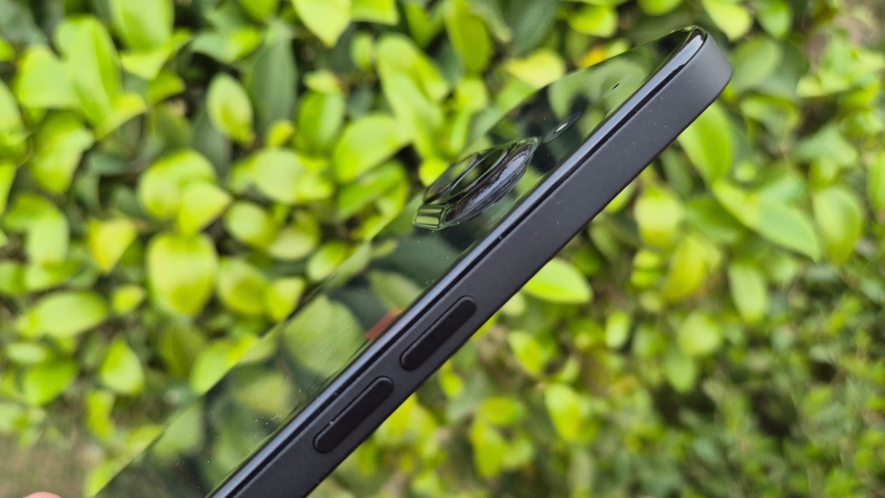
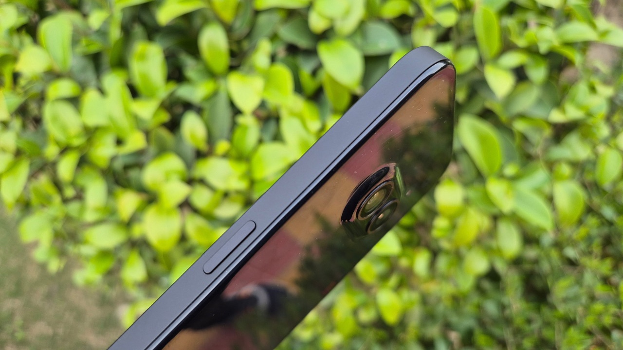
Nothing has used polycarbonate this time around for the back panel and the frame instead of glass and aluminium which it used in Phone (2). However, by no means does that make the smartphone look or feel cheap. The flat frame has a textured finish which adds to the grip while the back panel is all glossy. Thanks to the glossiness, it attracts a lot of fingerprints; specifically in the black variant, a lot of dust is visible too, so you’ll have to clean it often if you plan to keep it without a case.
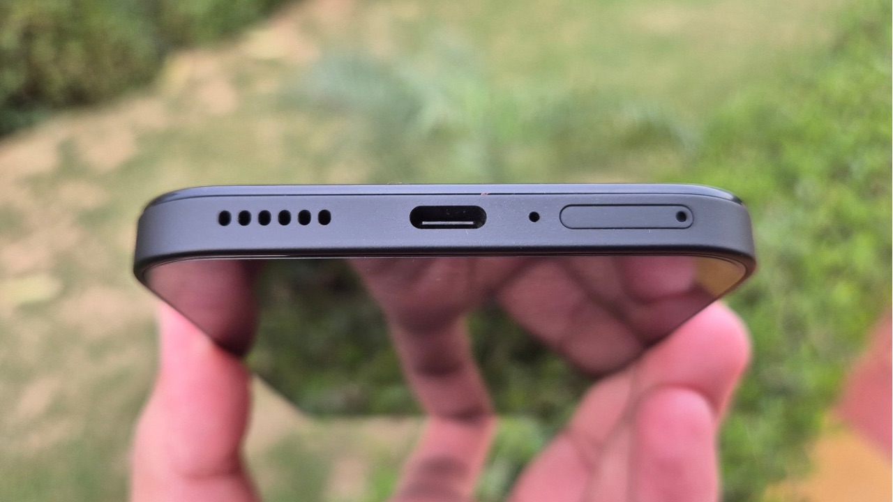
The internals are better visible in the white model with the translucent rear panel, but the black one gives the device a stealthy look. The white version also has black button which provides it with a contrasted look over the white frame. However, that’s not the case with the black one as Nothing decided to go with the black buttons instead of white. The handset is also IP54 rated, so a few splashes should be handled easily.
As for the haptics, they feel premium too. They aren’t as strong as the Phone (2) but handle the job just fine. The stereo speaker setup is loud enough and focuses more on vocals rather than bass. The stereo separation is well-handled.
Overall, the device feels light to hold in hand, and thanks to the curved corners, it also has a modern look. We think that the design of the Nothing Phone (2a) is quite impressive and despite cutting corners in the build quality, Nothing was able to keep up with its previous standards in terms of a premium feel.
Glyph Interface
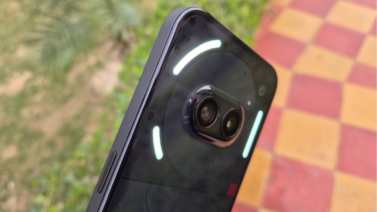
A major design element is the glyph interface, which includes three LED lights around the camera module. Nothing decided to keep the glyph interface more straightforward with Phone (2a). Instead of eleven elements such as those seen on the Phone (2), there are only three on the Phone (2a) and that’s not necessarily unimpressive. In fact, some people may not like too many flashing LEDs on the back and three would be the sweet spot for them.
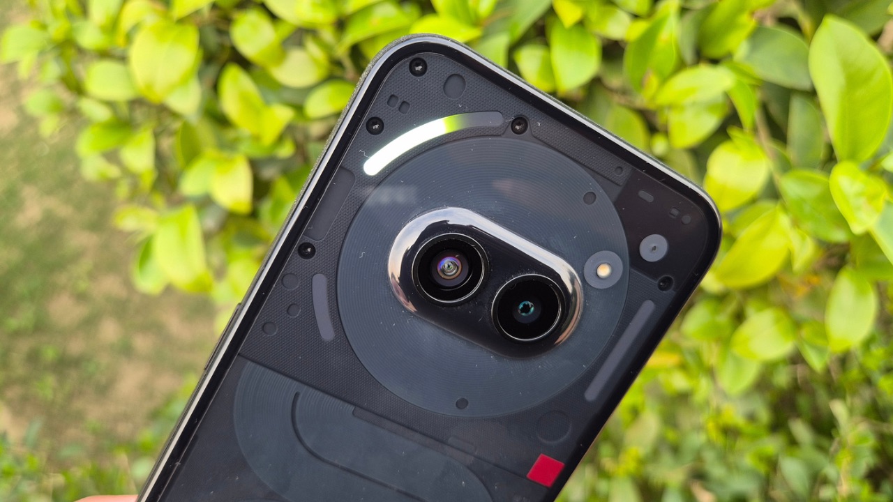
Despite packing only three LEDs, Nothing was able to give the Phone (2a) almost the same amount of Glyph LED features it gave to the Phone (2). One major Glyph feature omitted from Phone (2a) is the charging indicator, which used to light up at the bottom LED when the phone was slightly wiggled while plugged in and facing screen down, as observed in Phone (1) and Phone (2).
There are 26 individually addressable zones. The top left LED has the mappable zones so it can act as a volume bar when changing volumes or as a progress bar when you set Glyph timers. It can also be used as a Glyph progress indicator for third-party apps like Uber or Zomato, which will show you how far your cab driver or delivery rider is from your location in the form of a progress bar.
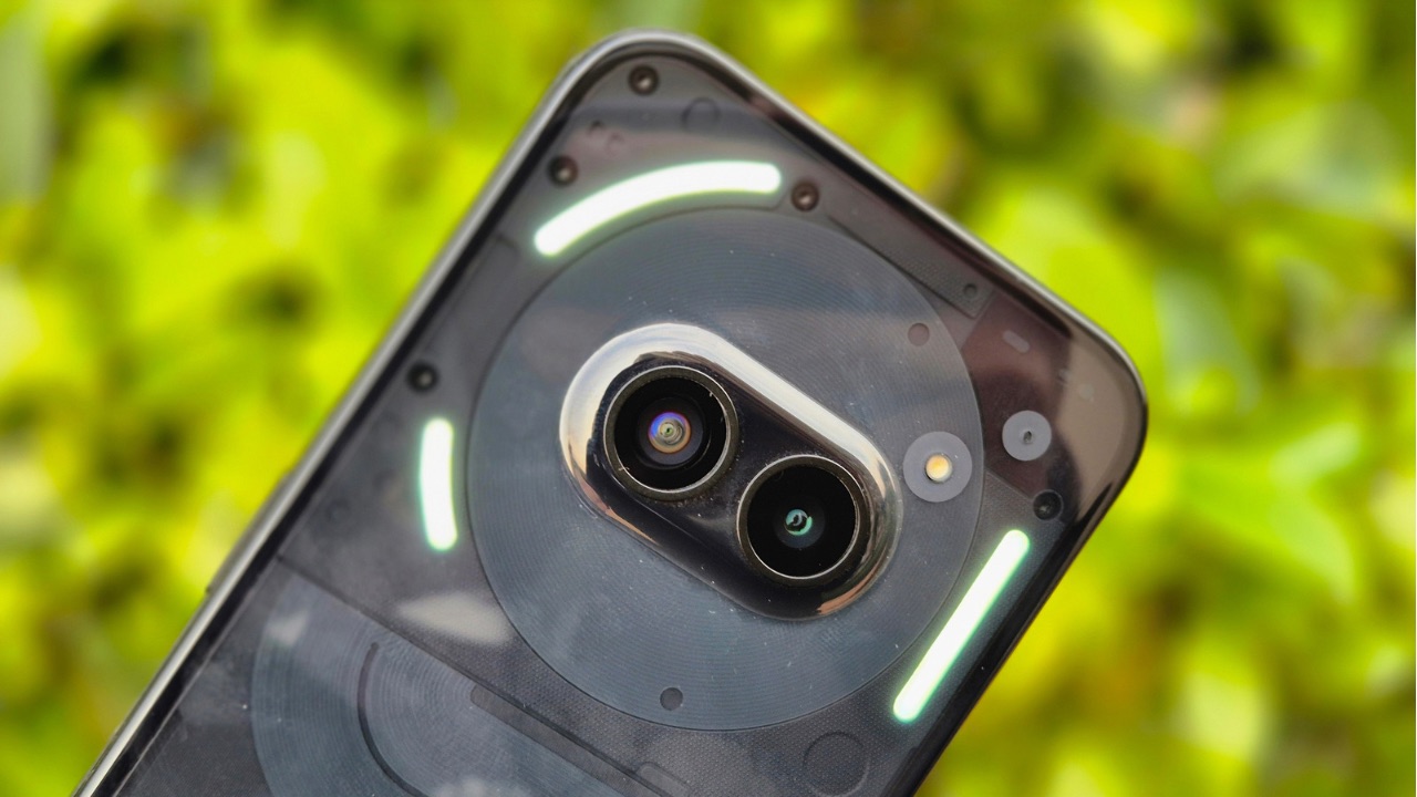
It still does need some work, as the glyph progress bar didn’t always work in the case of third-party apps, but maybe that’s why Nothing has categorized it under Beta features. The usual Flip to Glyph feature works without any issues so whenever you flip the phone and keep it on a flat surface, only the Glyph LEDs will be used to notify you of calls or notifications instead of the notification sound. Additionally, you can use the glyph LEDs as a fill light by tapping and holding on the Torch quick settings tile, which will turn on all three LEDs in the form of ‘Glyph Torch’.
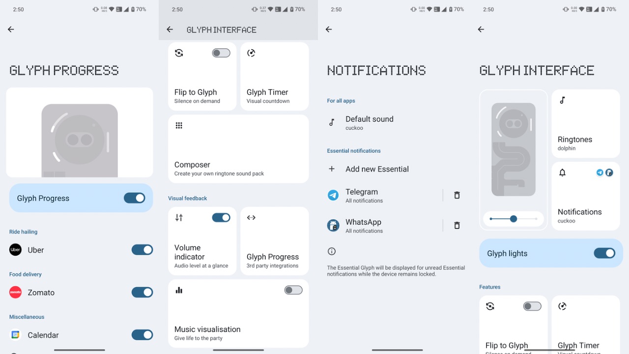
The message and ringtone sounds have been optimised to use these three LEDs instead of the eleven we saw with Phone (2). It can further be synced to your music so it can light up whenever you play a track. There’s also the glyph composer, so you can create ringtones of your choice that sync up with these three LEDs.
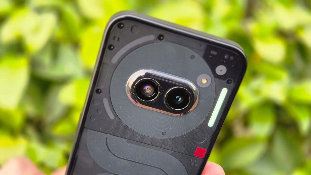
There’s also the Essential notification feature so you can set the choice of your apps to keep the right LED lit up constantly when a notification from one of those apps arrives. This instantly helps you know about a notification from one of the apps that’s important to you.
One thing to note here is that Nothing omitted the red blinking recording indicator which was a part of both the Phone (1) and the Phone (2). Also, you can always turn off the glyph LEDs if you don’t want flashing lights on the back of your device.
Nothing kept the glyph interface minimal and retained most of the features from its other devices which is actually a good sign of what we can expect from the brand in future as well.
Display
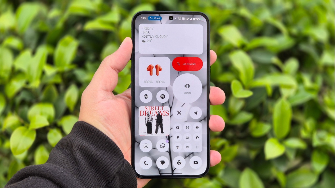
The Phone (2a) incorporates a 6.7-inch AMOLED Display which has a 1300 nits peak brightness level, 1084 x 2412 pixels resolution, 30 to 120Hz adaptive refresh rate, Gorilla Glass 5 protection, 240Hz touch sampling rate, 10-bit colour depth and 2160Hz PWM frequency.
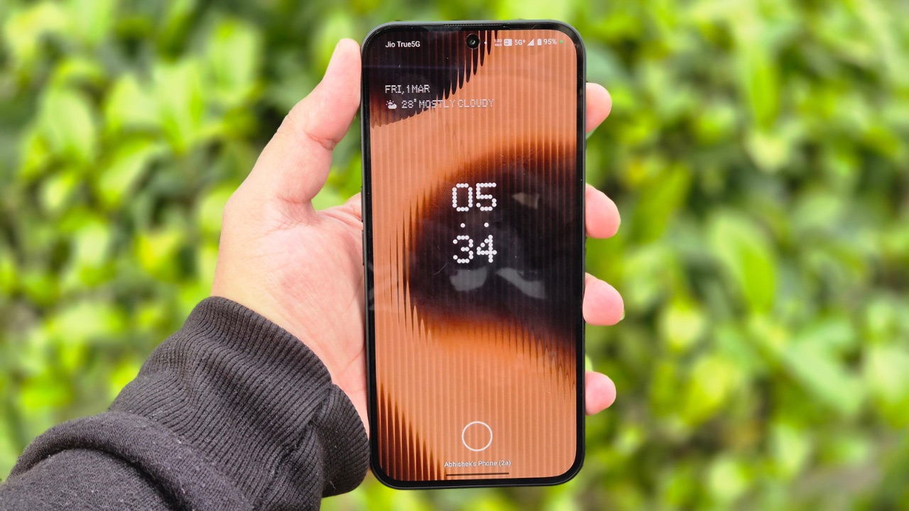
From the looks of the specs, the display looks like a decent one and we can claim that by the looks of it in real world use, it matches the reputation it creates with its specs. This panel reproduces vivid colours with deep blacks, and is also far superior than the Phone (1). The brightness is adequately high under direct sunlight so there were no issues with readability. Viewing angles are impressive too, while the display doesn’t often drop the Refresh Rate below 120Hz even when set to adaptive.
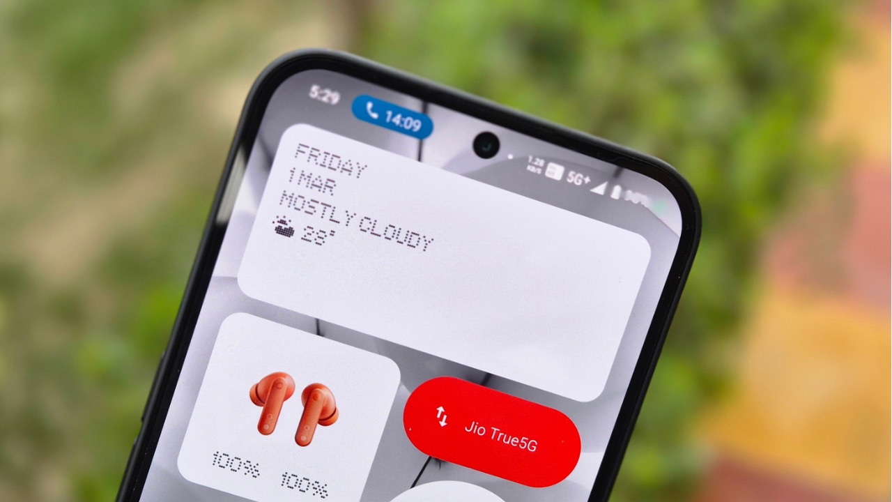
Moreover, Nothing decided to keep the bezels even on all sides which actually makes a major difference in terms of looks as well as usability. They are almost as thin as we saw them on the Phone (2) which is something we appreciate.
Performance & Software
The Nothing Phone (2a) is using the MediaTek Dimensity 7200 Pro Chipset under the hood and that’s a first for Nothing as it has used Snapdragon chips in its smartphones till now. The Dimensity 7200 is a decent chipset for daily usage and handles most tasks without any issues of any sort. Performance overall is on the nicer side except in heavier games where it may struggle and that’s not unexpected from a smartphone that costs this much. Thermals are also well managed, also thanks to the 3,200mm² vapor chamber which helps keep the device cool.
Efficient RAM management is a piece of cake for the Nothing Phone (2a), at least on the 12GB RAM model we got for review. It also packs a new RAM booster technology which is nothing but Virtual RAM which is supported up to 8GB.
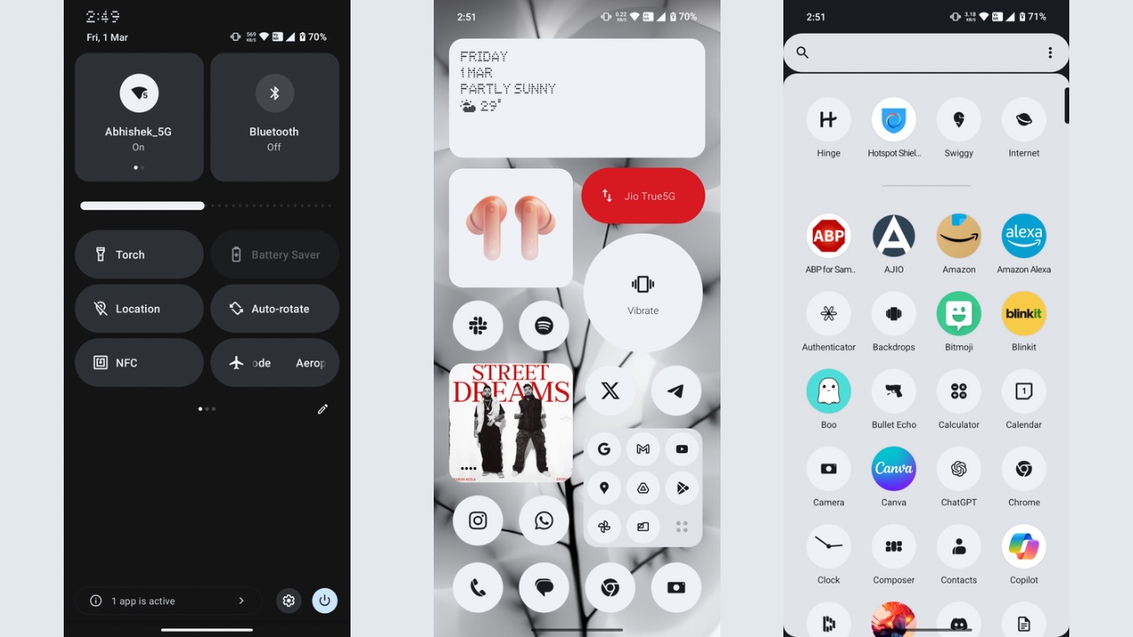
Nothing OS has always been closer to stock Android with basic customisation options and some over-the-top ones we see on phones from OnePlus, Samsung and more. While those have their own advantages, Nothing OS maintains its core principle of being as minimal as possible by providing only the essential customisation options and not too much tweaking with the user interface.
Nothing OS 2.5 on Phone (2a) is based on Android 14 and some of the customisation options of Nothing OS 2.5 include the basic system theming based on wallpaper colours, the atmosphere and mirror effect for any wallpaper you set, and setting custom icon packs as well. There’s a new feature in Nothing OS 2.5 called Wallpaper Studio where you can create AI-based wallpapers after you combine two of the given elements. The output from combining the two types of elements was nicer than I expected. It’s not as detailed as Google’s and Samsung’s Generative AI wallpaper feature but something is better than Nothing right? (No puns intended). In addition, you can also set solid colours as wallpapers.
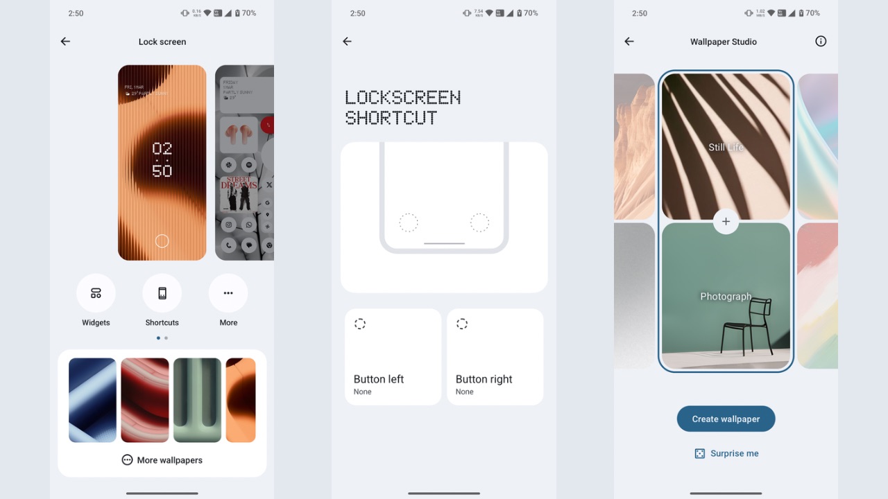
Then, you can change the lock screen shortcuts as well as customise what the ‘Quick Look’ widget shows you. Talking of widgets, this is where a major portion of customisation lies, as you can put various types of widgets on the lock screen in different shapes.
That’s the specialty of the Nothing launcher, as it allows you to create unique setups that also help in creating an identity for Nothing devices so as soon as you look at the home screen, you know it’s a Nothing smartphone.
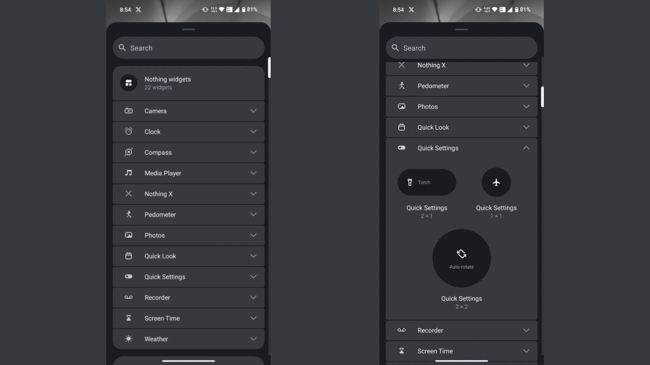
Various types of widgets include those from the Nothing X App (where you can change the settings of your earbuds right from the home screen), camera widget, music player, quick look, quick settings and a lot more.
Overall style of Nothing OS remains closer to how the UI looks on Pixels with some tweaks that have been tailored to suit the identity of the Nothing brand. Connectivity performance of the handset remained optimum in terms of 5G, Bluetooth as well as Wi-Fi.
The Nothing Phone (2a) is running on the February 2024 security patch as of writing this review. It is set to receive 3 years of major Android OS updates and 4 years of security patches which is again a great move.
Issues with Nothing OS in Phone (2a)
As for the performance of Nothing OS, the animations remain smooth for the most part, except for times when you quickly want to open other apps and you notice a glitch. At times when you open and close the camera app, you may notice a stutter in the animation. At other times, the device may take a second to respond to your touch and open the app in a delayed manner.
Aside from a couple of glitches, there were some bugs too within the OS. For instance, the Instagram app often froze on me while scrolling through Reels. Then, the Always-on display won’t show me notifications until I press the power button and up the screen post which they’ll begin to appear. When scrolling, the X (formerly Twitter) home feed could lag.
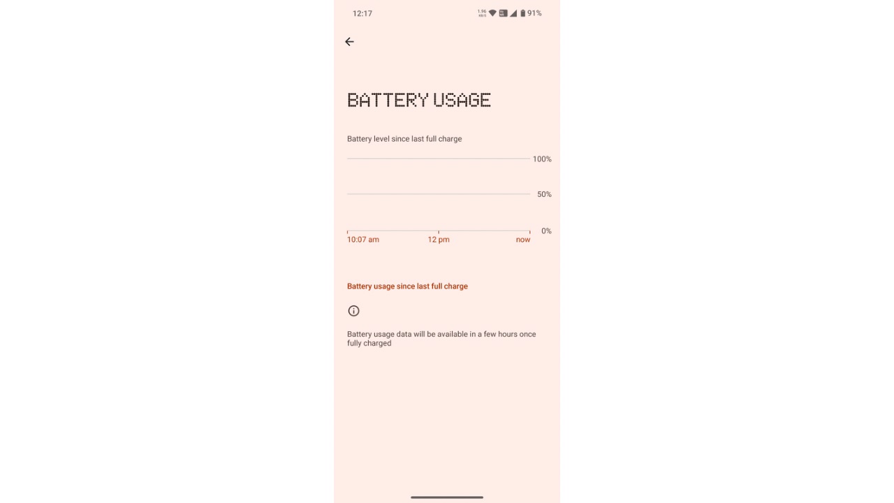
Finally, the battery stats took a lot of time to update when you go to the battery page, where it can take up to about 30 seconds or more to update the screen-on time since last charge.
As for the fingerprint sensor performance, I feel it could have been better as compared to Phone (2) which was quick in unlocking the device. On Phone (2a), the device takes half a second to recognise and unlock the device.
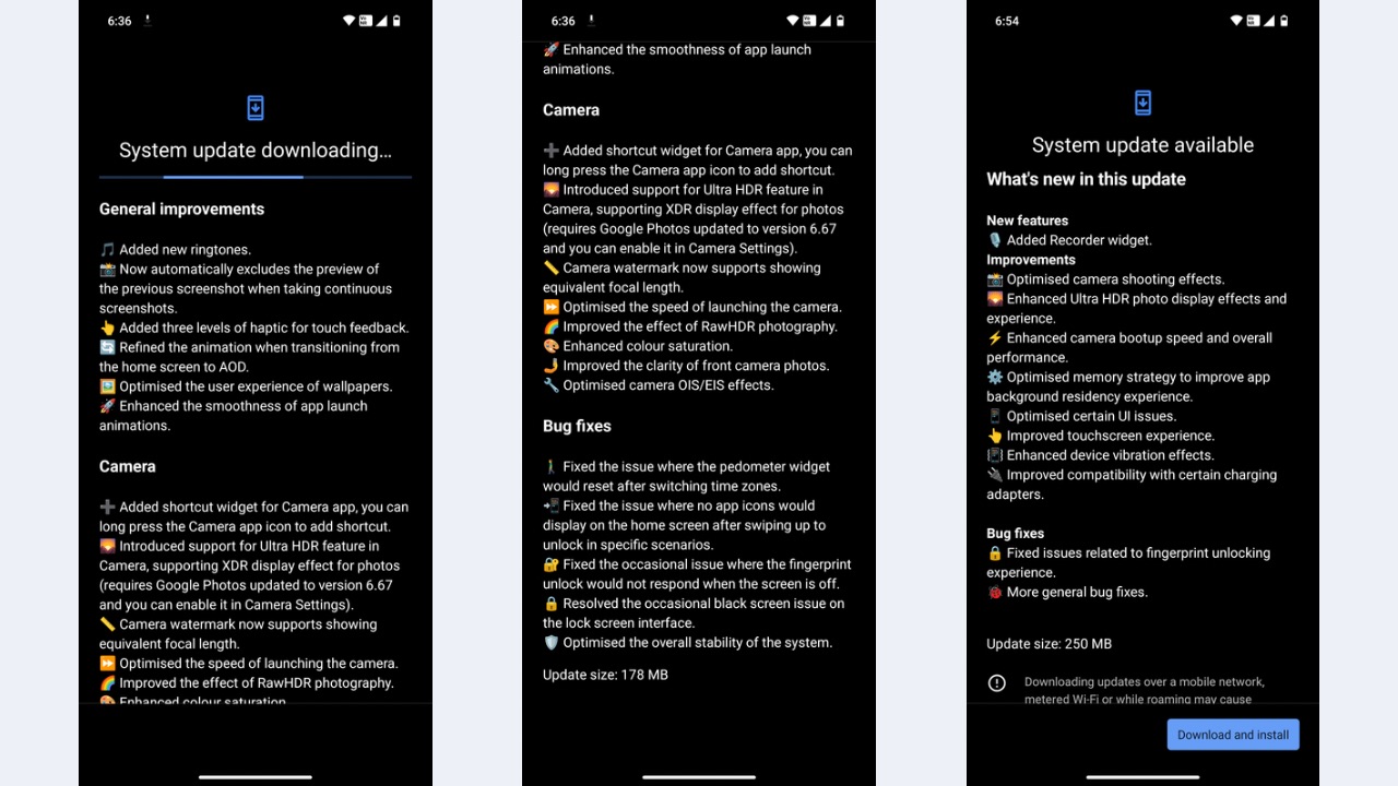
We already received two updates after unboxing the device, where it went from Nothing OS 2.5.1A to version 2.5.3 but that didn’t seem to have solved the issues we mentioned.
Lastly, an option I usually see in most smartphones is “double tap to wake up screen”, but the same wasn’t present in the Phone (2a). Instead, it had only a single tap to wake, which resulted in multiple accidental wakeups while I had the phone in my hand. It does support double tap to lock the phone but not for waking up the screen, which I feel is a bummer.
Battery backup
A 5000mAh battery with 45W Fast charging powers the Nothing Phone (2a). This cell doesn’t disappoint in any case and is bigger than any of the battery units used in Nothing’s previous devices. Nothing claims that it increased battery longevity by over 25%, so Phone (2a) can maintain over 90% of its maximum capacity after 1,000 charging cycles, corresponding to over 3 years of daily charging. Contributing to its longevity is the reduced temperature of the battery while charging and discharging – a 13% reduction compared to the Phone (1).
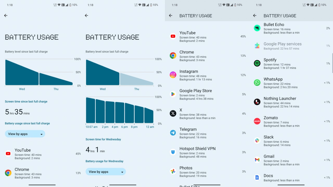
In real world use, the device can easily last you 1 to 1.5 days with moderate use such as chatting, some light gaming, a few minutes of calling, browsing social media apps and the internet also. I was able to get 6 hours of screen-on time with around 29 hours of use where the AOD was also ON. It could easily also cross the 6-hour screen-on time mark on a few days, reaching up to 7 hours as well, which is exceptional.
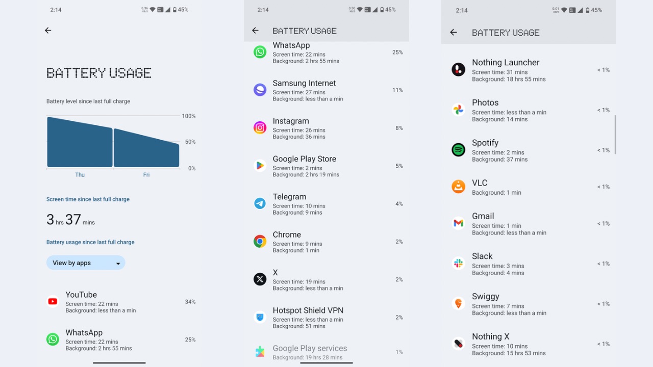
The device takes about 1 hour 10 minutes to charge from zero to 100% with a 45W PD charger, which in our case was the CMF 65W GaN charger. Overall, the Phone’s battery stats (2a) didn’t disappoint. Charging speeds could have been slightly faster though but it’s not a major issue by any means.
Cameras
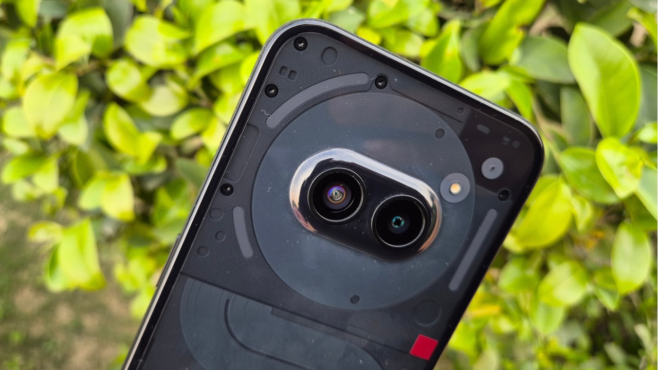
The Phone (2a) packs a 50 MP main sensor with a f/1.88 Aperture lens and 1/1.56” sensor size. It also supports OIS. Alongside the main sensor is a 50 MP ultra-wide sensor with a 114° field-of-view and a f/2.2 aperture. The device also supports the Ultra XDR technology co-developed with Google, which brands like Google itself and Samsung introduced in their latest respective flagships running on Android 14. A 32 MP sensor resides on the front with an f/2.2 aperture.
Now, the Camera app is the same you see on previous Nothing phones along with the Ultra HDR feature. The app user interface is easy to understand and also has Google Lens integration. Aside from that, what I didn’t like about the app is the shutter lag which is evident and needs a lot of improvement. Furthermore, this is the only app that lagged for me across the whole software, such as while zooming in or toggling through modes like photo to video, video to slo-mo, and so on.
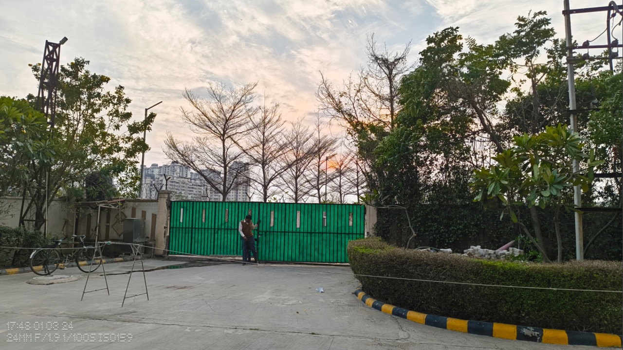
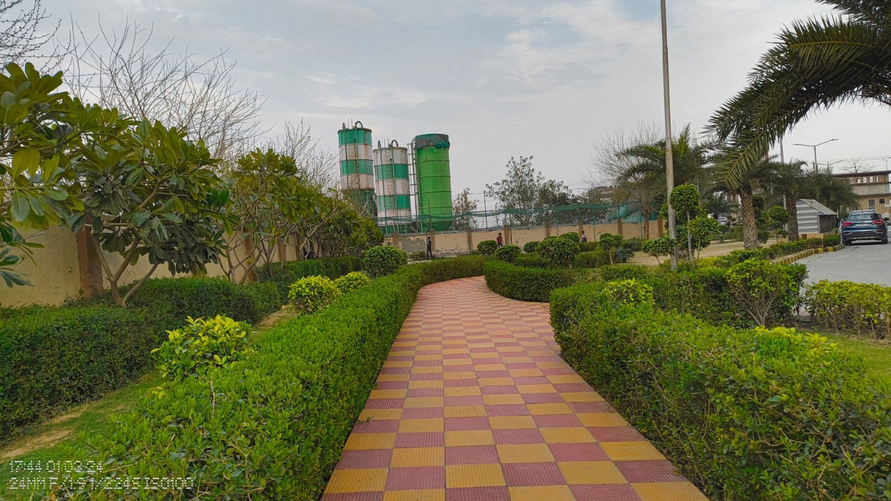
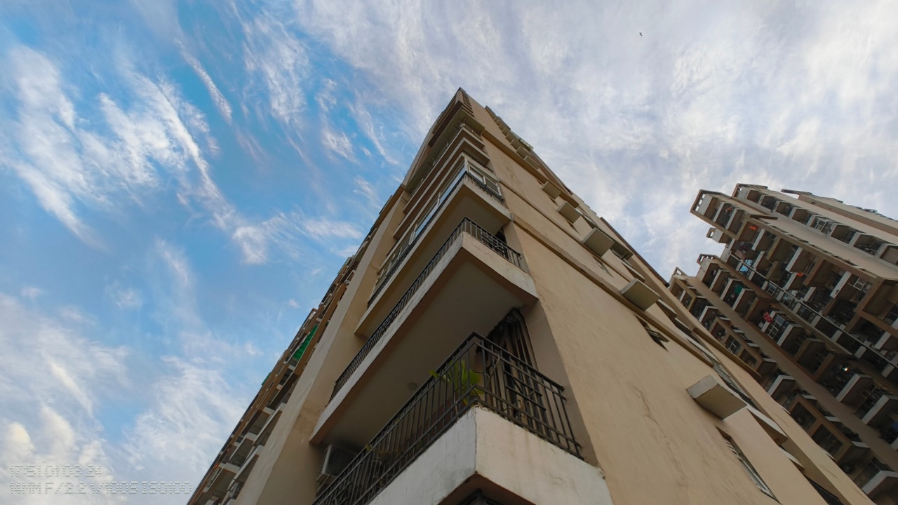
Shots from the primary sensor are pretty impressive in general. They capture a good amount of details while sharpness and exposure levels are also decent. The colours are on the natural end of the spectrum with a slightly warm tone, and even when you zoom in, you can notice most of the details in a shot with clarity, such as text written far away. The impressive dynamic range adds to the appeal of the shot.
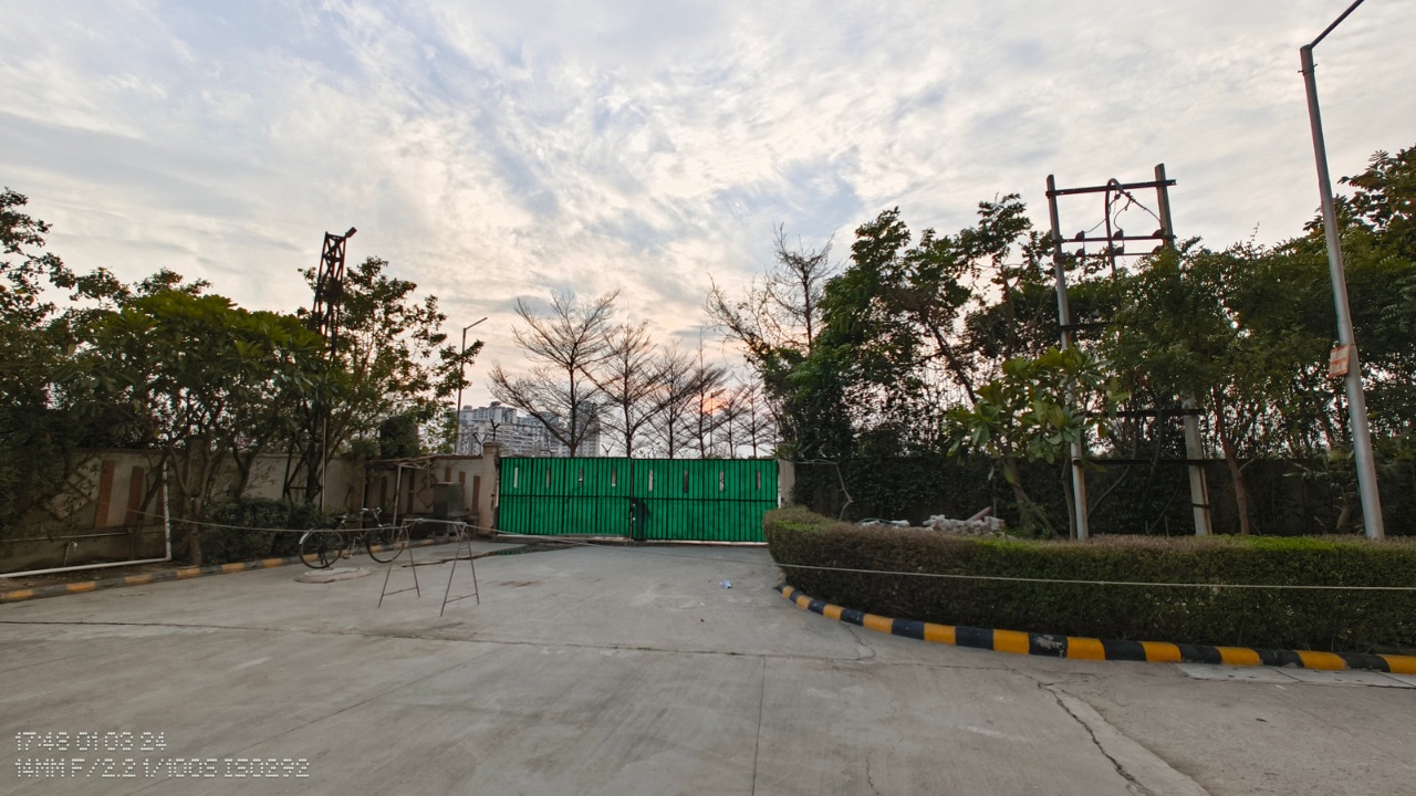
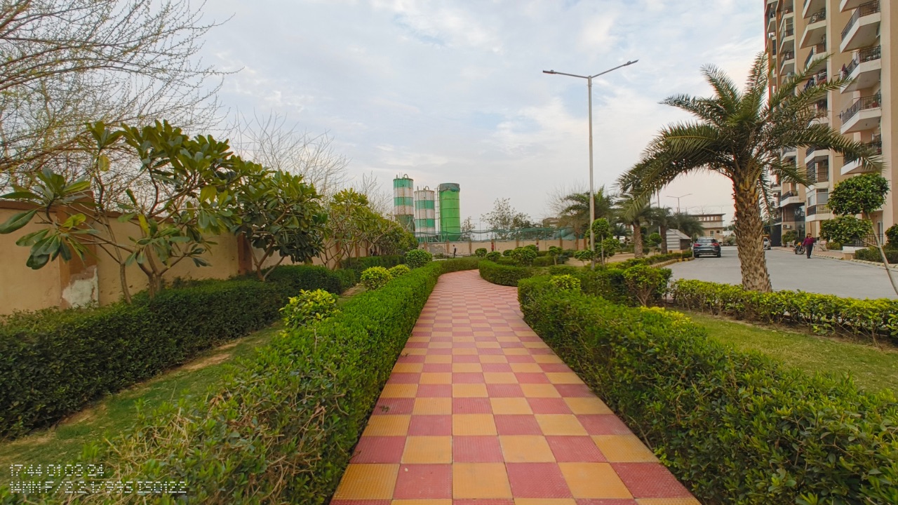
With ultra-wide angle photos, the dynamic range is once again on point with not too much of a colour shift over the shot from the primary sensor and that’s appreciable. However, if you zoom in and look closely, you can notice the photos aren’t as sharp as you’d expect them to be and detailing takes a hit. The distortion at the edges is under control, though.
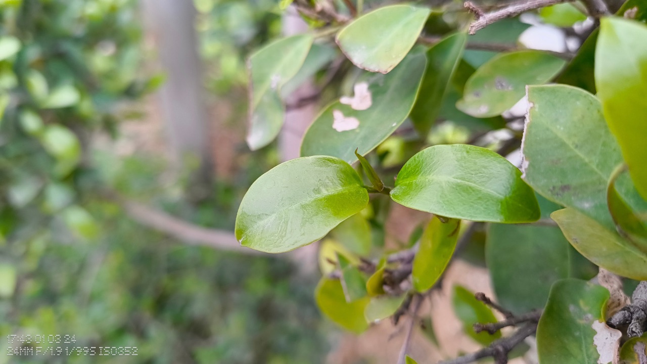
When shooting portraits, the main sensor performs up to its full potential and gives out shots that are excellent. While the EDGE detection can be improved a lot, the colours are accurately captured, and the minute details are visible in the shot as well. Even the bokeh effect looks natural.

Selfies from the front-facing camera are attractive as well. The skin tones are handled fine and the overall detailing in the shot remains high too. With front facing portraits, the edge detection, once again, can be better but the bokeh effect is nice.
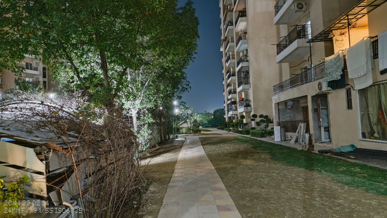
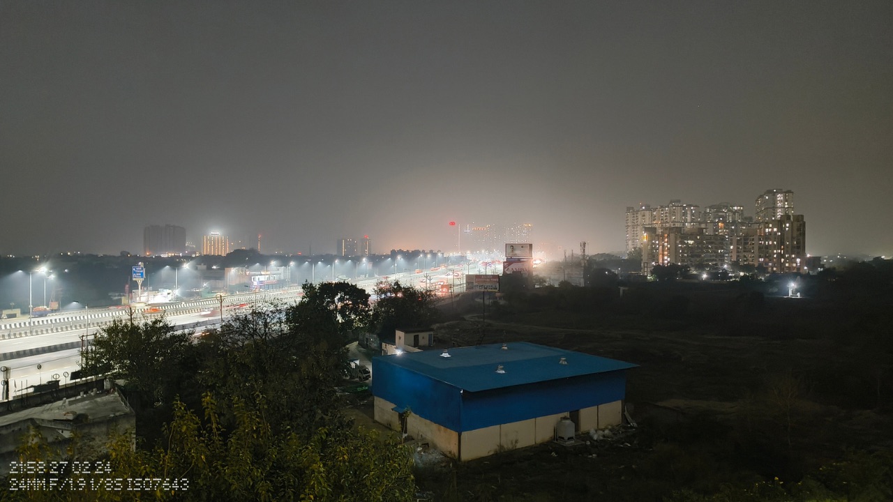
Under low-lighting conditions, the device doesn’t seem to struggle under low-lighting conditions as it shoots highly sharp images with natural colours with no noticeable noise. However, in pitch dark environments, you can notice some amount of noise while the details also go for a toss. Turning on Night mode didn’t seem to make a drastic difference as such.


