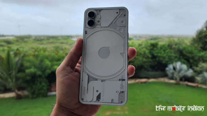
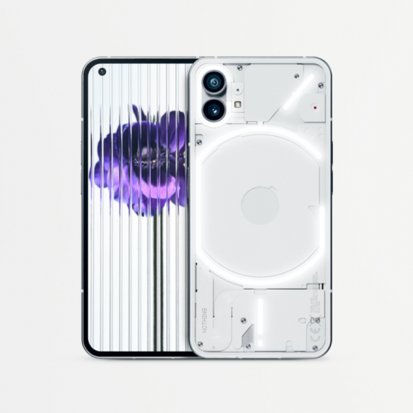
It wouldn’t be wrong to say that the Nothing Phone 1 is one of the most hyped smartphone releases of the year so far. The reason is the continuation, of course with modification, of the viral marketing strategy we saw during the launch of the Ear 1 earbuds. Today, finally, Nothing Phone 1 has been launched in full glory. Is it different? Does it have an X-Factor? We try to answer a couple of these questions in our first impression of Nothing Phone (1).
Let’s start with the complete specs and price, as in the last few weeks, most of the device’s specs have been leaked or shared by Nothing.
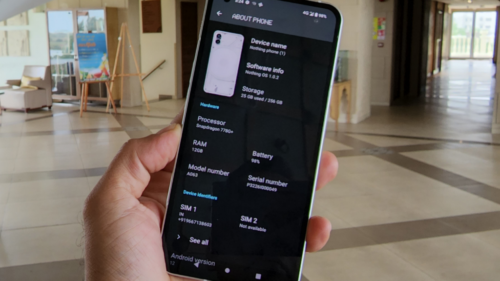
Variants: 8GB RAM + 128GB (Rs 32,999), 8GB RAM + 256GB (Rs 35,999), 12GB RAM + 256GB (Rs 38,999)
Dimensions – Height: 159.2 mm, Width: 75.8 mm, Depth: 8.3 mm, Weight: 193.5 g
Display – 6.55″ flexible OLED display, HDR10+, 60Hz – 120Hz adaptive refresh rate
Camera – Main 50 MP, Sony IMX766 sensor, OIS and EIS image stabilisation
Second Ultra wide Camera, 50 MP, Samsung JN1 sensor, EIS image stabilisation, 114° field of view
Front camera- 16 MP, Sony IMX471 sensor
Video – 4K recording at 30 fps, 1080p recording at 30 or 60 fps, OIS and EIS image stabilisation
Battery – 4500 mAh battery size, 33W PD3.0 wired charging, 15W Qi wireless charging with dual charging support, 5W reverse charging
Chipset – Qualcomm Snapdragon 778G+
Audio -3 mics, Dual stereo speakers
SIM card – Dual SIM
Nothing Phone (1): What is new?
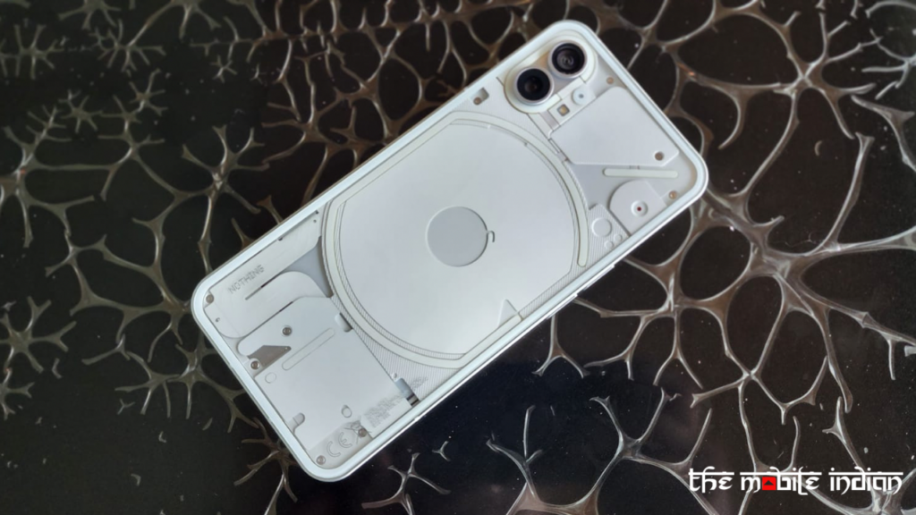
Nothing had been teasing about transparent back design for a long time, which is the first unique element in Nothing Phone 1. Apart from being unique, is it an XFactor? Well, that is subjective. Some users might feel it is an attempt to break the monotony in smartphone design, while others may find it a strategy just to gain attention. In my opinion, it is different and a continuation of the brand’s design strategy, which we first saw on Nothing ear 1.
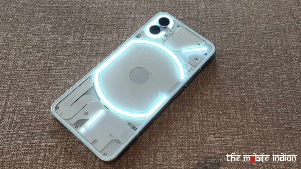
In it, complete hardware is not shown rather, metal plates held by screws shielding the individual parts of the handset are shown using a transparent back cover. It will definitely generate curiosity and may prompt users to explore the phone.
In terms of look, Nothing phone 1 has a flat screen with equal-sized bezels on all sides and a left-aligned hole-punch selfie camera. The phone has flat sides and is made of recycled aluminium. Some might feel the design is quite similar to iPhone 13.
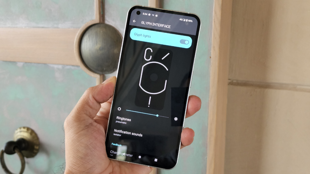
Now let’s talk about one more add-on on Nothing Phone (1). Its glass transparent covers a collection of 900 individual LEDs( glyph interface) embedded in the back panel that offers unique light shows based on which notification sounds you have assigned for calls and messages from differnt senders. It can indicate incoming notifications, Battery Charging status, and when the phone is wireless charging or reverse wireless charging. They can even act as a fill light when taking low-light photos or Video recording.
Do keep in mind that if one can remember the light combination they have assigned for a particular user, they can find out the caller’s identity even if the phone is kept with the display facing down.
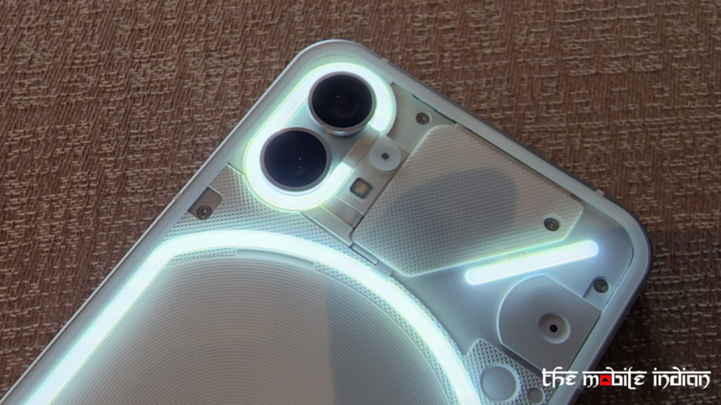
The LED combination and its implementation on smartphones is a first of its kind and many young would-be smartphone buyers may find the feature influencing this buy decision. But, is it a useful feature, and does it solve any particular problem or is it just a fancy new addition in the armoury of Phone (1)? We will discuss it in detail in our review, which will be up soon.
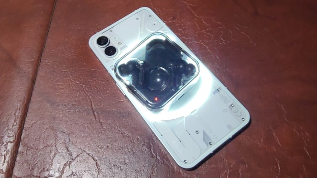
When it comes to battery, Nothing Phone has a 4500 mAh battery size. So wondering why are we talking about the battery in “what is new in Nothing Phone (1) Segment? Because of Multiple charging options. It supports 33W PD3.0 wired charging, 15W Qi wireless charging with dual charging support and 5W reverse charging.
What about interface and display?
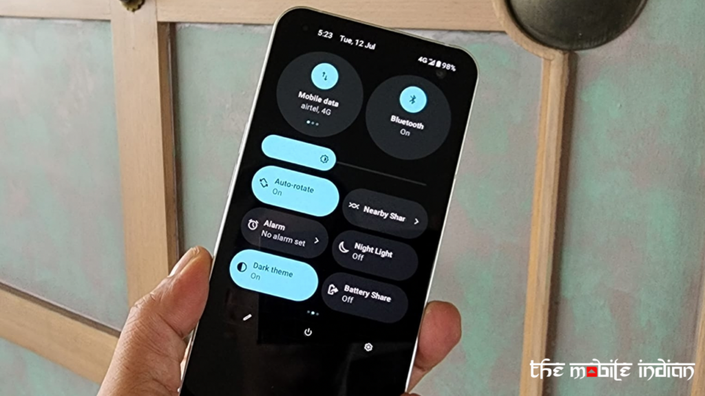
Apart from Design and Glyph, Nothing Phone (1)’s user interface is different from what we see in other Android-based smartphones. The Phone (1) runs Android 12 and has a skin close to stock Android but at the same time has a distinct look. It supports custom icons, different sizes for App icons and folders, and multiple layout options. The quick settings panel sports both large and small toggles. Overall the UI looks neat and clear. Also, during the brief time I used Phone (1), the experience was lag-free.
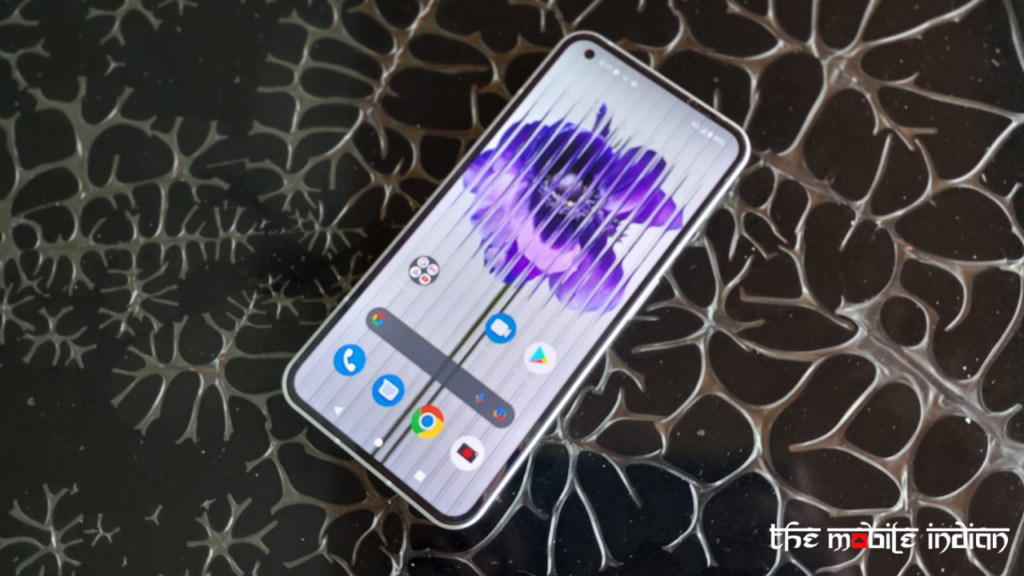
Now, if I talk about the 6.55-inch OLED on Phone (1), it supports a 120Hz Refresh Rate and has always-on display. The display looks quite vibrant, and viewability is good.
Power of Two
Nothing Phone (1) comes with dual camera setup at the rear. The main camera is a 50MP Sony IMX766 sensor. It supports OIS and EIS and captures both photos and videos in 10-bit colour. It also supports 4K video recording. Scene detection and automatic Night mode are also available. The second camera is also a 50 MP sensor. It is a Samsung JN1 sensor and supports EIS image stabilisation, 114° field of view and can also take macro shots.


On the front, we have a 16 MP Sony IMX471 sensor. We will share our experience with the camera in our detailed Review of Nothing Phone (1) but what we can say right now is that giving two meaningful cameras instead of the gimmicky camera is a welcome move, and our initial experience with the camera has been good.
Why has Nothing Phone (1) gone with Snapdragon 778G+?
Nothing Phone 1 is powered by a Snapdragon 778G+, and a lot of people might ask why has Nothing not gone ahead with a more advanced Processor like the flagship Snapdragon 8 Gen 1? The answer could be to add wireless charging and reverse wireless charging – something you won’t get on any other phone with a 778G+ CPU. Also, battery management of 778+ is quite good, which might come in handy.
Initial Impression of Phone (1)
Phone 1 seems to have generated a lot of curiosity and has come up with some unique features that can be head turners. But everything will now boil down to its performance, and we will share our detailed review quite soon.


