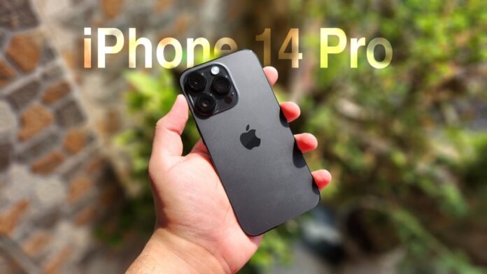
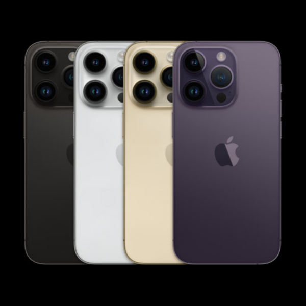
The Apple iPhone 14 Pro was released to much fanfare earlier a few weeks back. It touted several new features that were designed to appeal to users. But is the iPhone Pro really worth its starting price tag of Rs 1,29,990? Does the latest iteration live up to this legacy? And where do the improvements over last year’s model come from? Let’s dive in and find out in our review of iPhone 14 Pro!
The design is the same yet different.
Apple has kept the design of the iPhone 14 Pro similar to that of the iPhone 12, 13 series, with completely flat sides along with the front and back panels. The in-hand feel of the smartphone feels top-notch and very grippy because of the flatter sides.
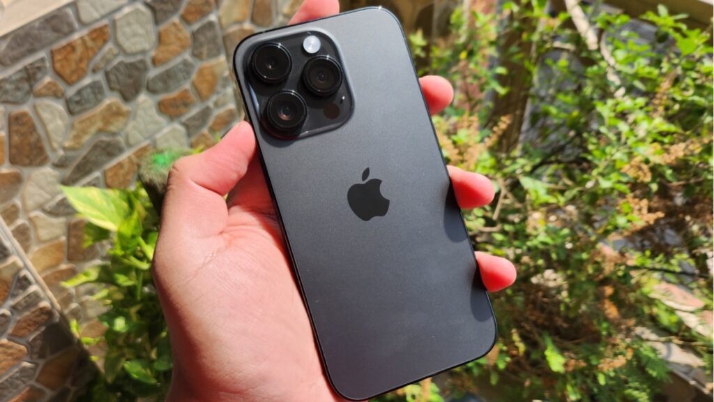
However, because these are glossy, they are an absolute fingerprint magnet and you will often have to clean them if you are someone who prefers to keep the phone without a case. As it’s smaller than many flagships out there, the compactness feels good, and because of a more round design than what we see with Android flagships, each corner is easier to reach with one hand. In my opinion, this is the perfect size for a smartphone.
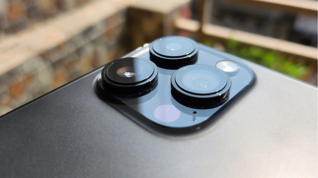
The camera bulges quite a bit from the back, even more so than the iPhone 13 Pro. Because of that, the phone wobbles a lot on a flat table if you ever try to type or use it while it’s laying flat.
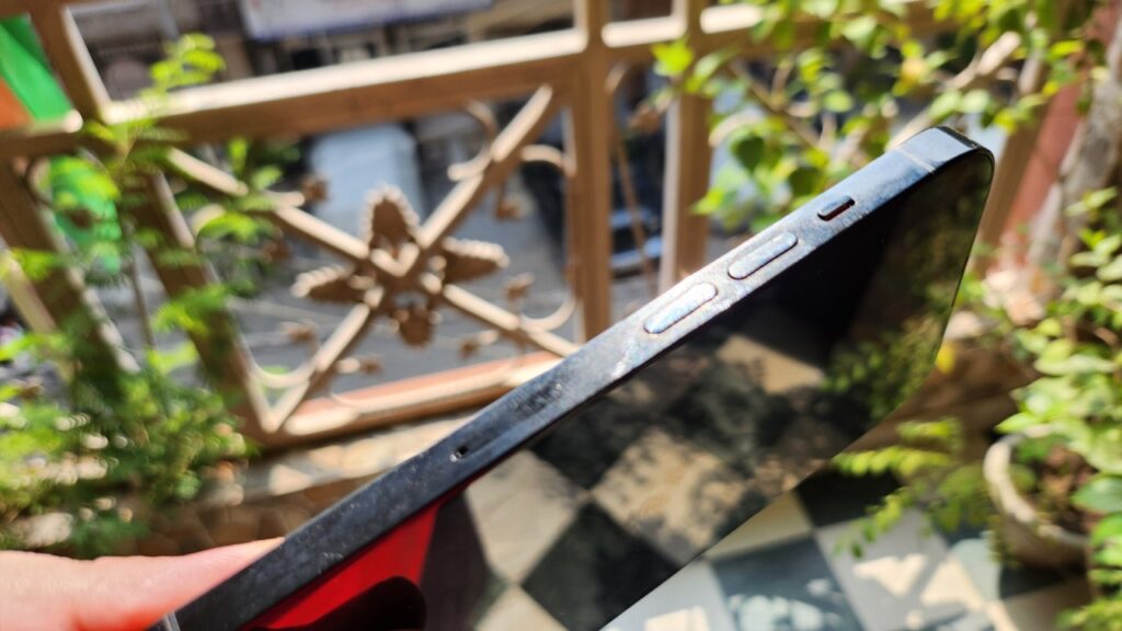
The buttons on iPhone 14 Pro have good tactile feedback, and the mute switch works pretty well. There are two speaker grilles at the bottom, out of which only the bigger one works because the actual speaker resides behind it.
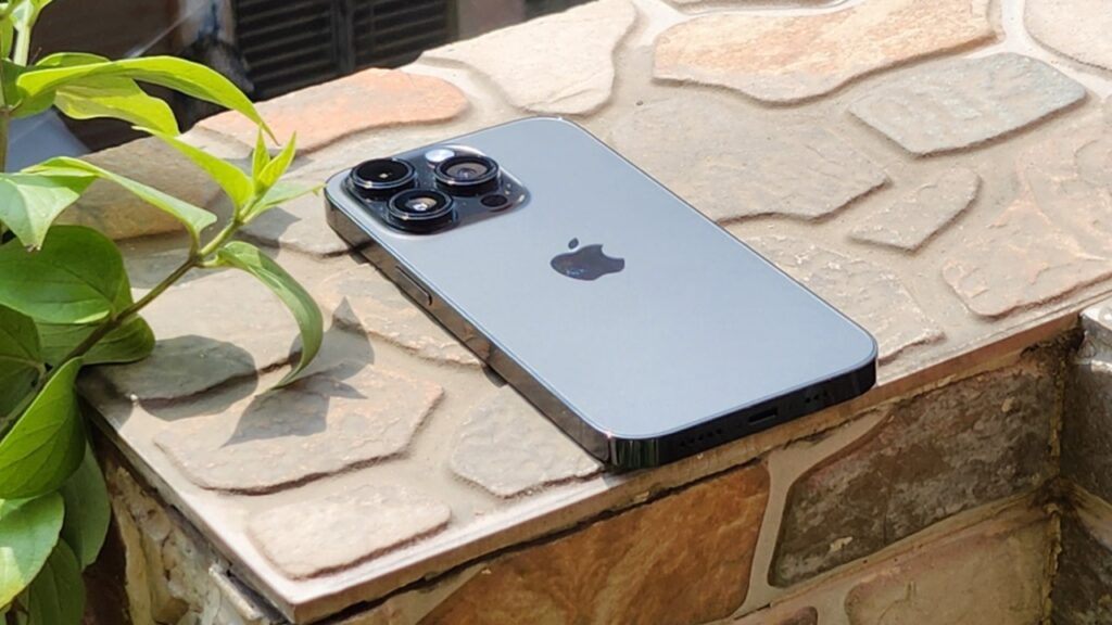
The top earpiece also acts as a speaker, and the sound coming out from these two is loud, full and very clear. There’s also some amount of bass that can be felt via the frame of the device. The haptic engine works as it does in other iPhones with a very tight feeling in vibrations that can be felt even while the phone is in your pocket.
The Dynamic Island is actually very ‘Dynamic’.
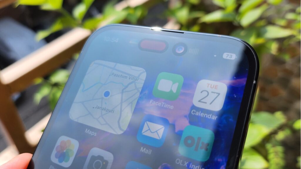
As we had said earlier Design of the iPhone 14 Pro is similar to its predecessor but is a differentiating factor – a new pill cutout at the front, which Apple likes to call “Dynamic Island”. The design of the island isn’t completely pill-shaped, as there is a small pill housing the Face ID tech accompanied by the circular camera sensor cutout. However, Apple decided to fill the empty space with black pixels, so it looks like a whole pill.
One can see the real design under direct sunlight or when it’s too bright. If I talk about the experience of reaching Dynamic Island, Even with the Pro model, which is smaller compared to Pro Max, I could barely reach it with one hand, so you can imagine the situation with the even bigger 6.7-inch display on the 14 Pro Max.
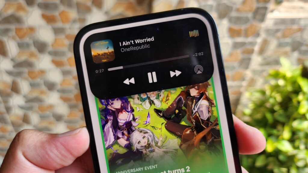
Apple kept the name of the pill as smartly as it implemented it. The Island dynamically adapts to most activities you are putting into action and can accordingly change its shape while also animating the change. For instance, when you play music, album art and a waveform animation appear on either side of the island.
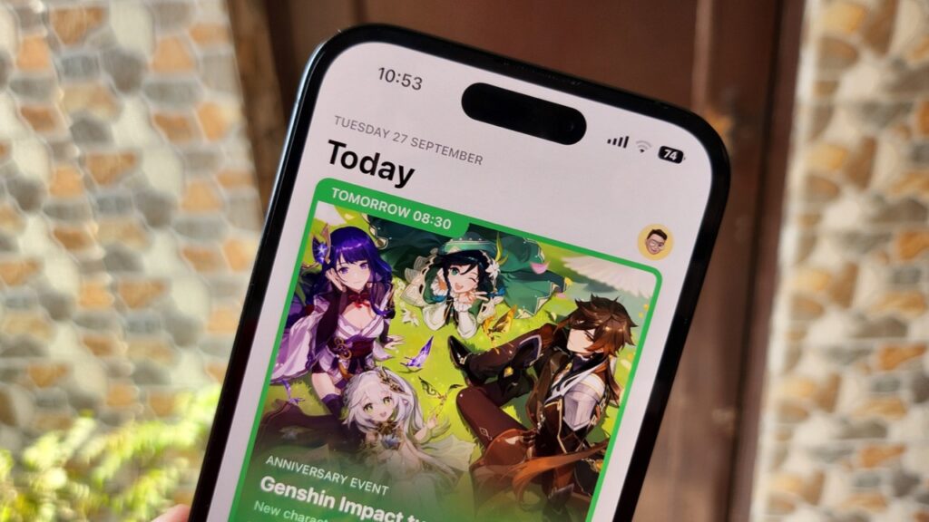
The Island expands from both sides with a smooth animation. Further attention to detail is the fact that the waveform animation is synced with the music in real-time, just like how it is when you are on a FaceTime call. The FaceTime call brings the image of the person on the left and a waveform on the right which shows changes as you speak.
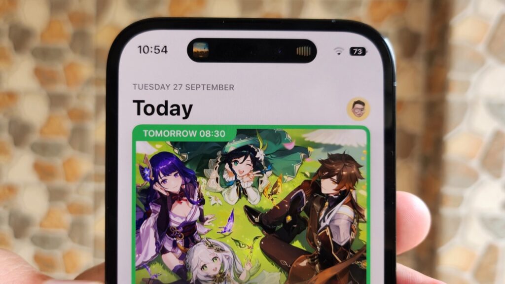
Next, Dynamic Island can take advantage of multiple other activities such as playing music via third-party apps like YouTube, Spotify, YouTube Music, Wynk and more. However, the dynamic island shuts off if you switch to the landscape position while you are using it.
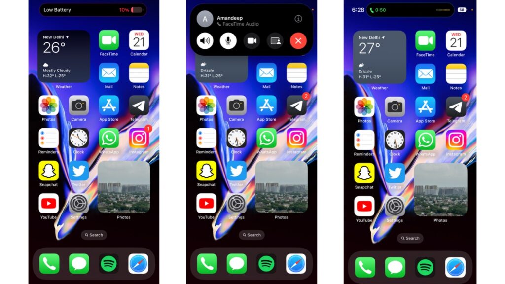
Furthermore, Apple Maps, when in use, show you the direction you have to head in via the dynamic island. An incoming call expands the Island downwards with the name of the person and accepts/decline buttons which were earlier shown in a normal notification format.
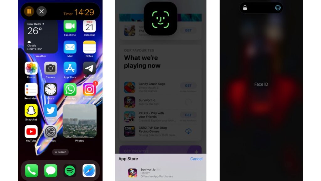
The dynamic island can also change its shape to a square for Face ID recognition animation when you are purchasing apps or using them elsewhere. On the lock screen, though, the animation shows differently, with the iPhone 14 pro-Dynamic Island stretching from both sides, like in the case of the music player.
A bunch of other system notifications and services support Dynamic island, including Screen recorder, Apple Pay, Charging notification, Switching between Ring & Silent mode using the switch, NFC, Airplane Mode alert, Watch Unlock, AirDrop, AirPlay, Focus Mode changes, Shortcuts, AirPods connection and some more.
Between the pill and the camera, Apple has placed the microphone and camera usage indicator in the form of orange and green dots. Live activities supported by Dynamic Island include Map directions, Music, screen and voice recording, personal hotspot and more.
WhatsApp, Instagram, and Skype also support the calling activity on the dynamic island. Further, Dynamic Island can also help you multitask. This happens when there are multiple ongoing Dynamic Island-supported activities. For instance, if you are playing music and then also start a timer, the timer separates itself from the music player in the form of a liquid-like animation and goes to the right in the shape of a small circle.
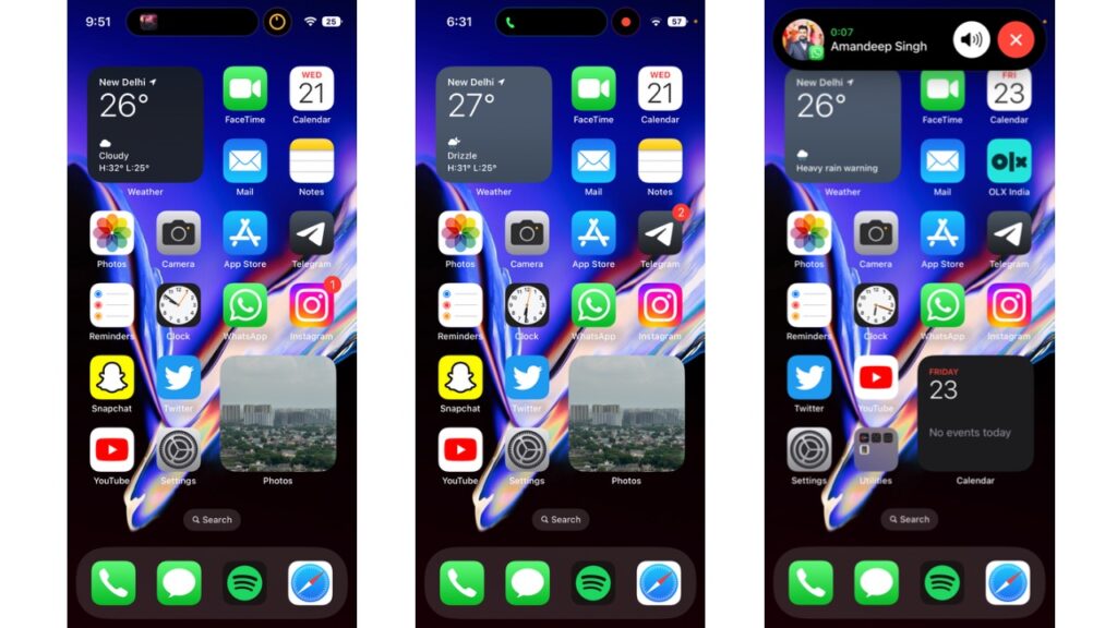
For additional controls, you can tap and hold on to any of the activities to bring up controls such as play/pause, forward/backwards, seek bar in case of the music player and stop and pause controls in case of the timer. For those of you wondering, the dynamic island and the pill-shaped cutout also show in the screenshots and don’t disappear, such as in the case of Android devices.
You can interact with each and every activity being displayed on Dynamic Island by tapping or holding on it. During my review accuracy of eliciting a response from the dynamic island was 100 percent. Also, one doesn’t have to worry about tapping exactly at the spot where the pixels are, as tapping anywhere on the pill will work. Moreover, even if it is sitting idle, tapping on the island will give it a ripple effect, while tapping and holding on to it will give you haptic feedback along with a more intense ripple effect.
The dynamic island is a very clever combo of hardware & software and is definitely a great element to use. With all the bouncy animations and physics for which Apple has a new dedicated Display Engine in the A16 Bionic chip, the Dynamic Island is definitely a unique way of looking at the camera cutout. It’s so unique that some Android manufacturers are already in the race to copy and implement it in their devices. However, is it really better than having the traditional notch when watching content? We’ll talk about that later in the review.
Read More:
How to find forgotten Apple ID? Simple & Easy to use Guide
The iPhone 14 Pro FAQ: All your questions answered
Top 5 countries selling cheapest iPhone 14 series compared to India
The Display has a ‘Bright’ future.
The 6.1-inch OLED panel on the iPhone 14 Pro has symmetrical bezels on all the sides, and because the notch has been omitted or let’s say redefined, the overall look is much better. It is protected with a Ceramic Shield front cover to prevent cracks and scratches.
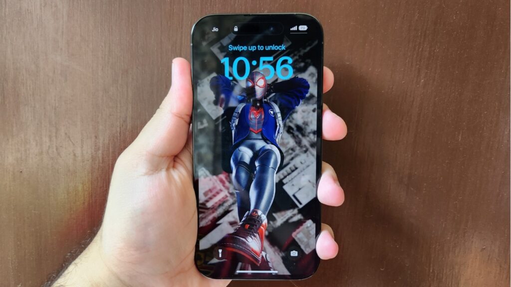
Apple iPhone 14 Pro has a full-HD Resolution of 2556×1179 pixels with 460 ppi. It also has a variable Refresh Rate that can go as low as 1Hz and as high as 120Hz. Moreover, the display supports peak outdoor brightness of 2000 nits and the numbers speak for themselves in direct sunlight, where I had no issues concerning visibility. It gets bright to the extent that is more than enough.
The colours are really punchy, and the viewing angles are great. It is very responsive to the touch, and the 120Hz screen refresh rate really elevates the experience when matched with the fluid animations. Using the new display engine technology and better hardware has enabled Apple to finally bring a feature that Android has had for a while now: Always-on display.
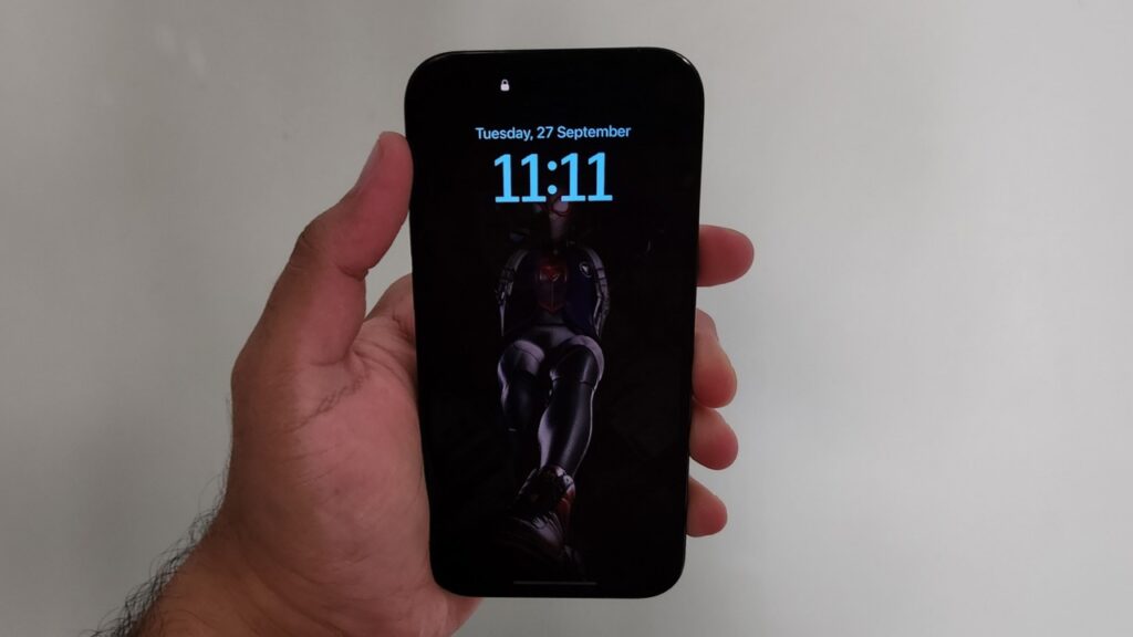
As always, Apple has tried to implement it in a different way than Android, where the Always-on display looks exactly the same as your Lock Screen but is really dim. This includes the wallpaper as well, which isn’t removed but is dimmed, unlike how Android does it, where only the Clock, battery percentage and notifications are shown.
Now, as cool as it might look, it can be disturbing at times because it is too bright for an Always-on display. Yes, it solves the purpose of showing you notifications, clock and other Important stuff, but then it confused me quite a few times if my phone’s display was On or Off. Further, it may be a little more disturbing for you if you are used to keeping your phone by your while side while sleeping because of its brightness.
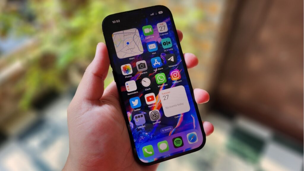
Also, the feature lacks any sort of customisation. There’s only a single toggle in settings to turn the always-on display ON or OFF, and that’s it. Fortunately, it does turn off automatically when it’s completely dark such as when the phone is in your pocket, to save battery life. If you have an Apple watch connected, it will turn off automatically if you walk away from your phone at a certain distance.
We cannot say that we don’t like it because it’s finally present for those who need it and solves the basic purpose. However, its implementation can be improved with future versions of iOS.
iOS 16 evolves further with Keyboard haptics, Battery percentage and more
Apple’s iOS 16 has evolved and brought many new features such as Keyboard Haptics, Lock Screen customisation, battery percentage in the status bar, live activities on the lock screen, and much more. During my review period of the iPhone, I didn’t face much hiccups in terms of performance, except for some bugs, which I’ll address in a while. The animations are all smooth and fluid, and the RAM management has been great. Reports state that all iPhone 14 models have 6GB of RAM, and that should be more than enough for efficient performance.
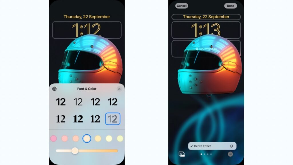
The new Lock screen customisation is one of the best features of iOS 16 on Apple iPhone 14 Pro wherein you can change the style and font of the clock. There’s also a depth effect where some portion of the lock screen clock can hide behind the subject in the photo.
Next, you can add various widgets to the lock screen which are basically Apple Watch complications. Note that the depth effect doesn’t work when you add widgets to the lock screen. Some basic features such as Keyboard Haptics and battery percentage in the status bar introduced in iOS 16 work fine as expected.
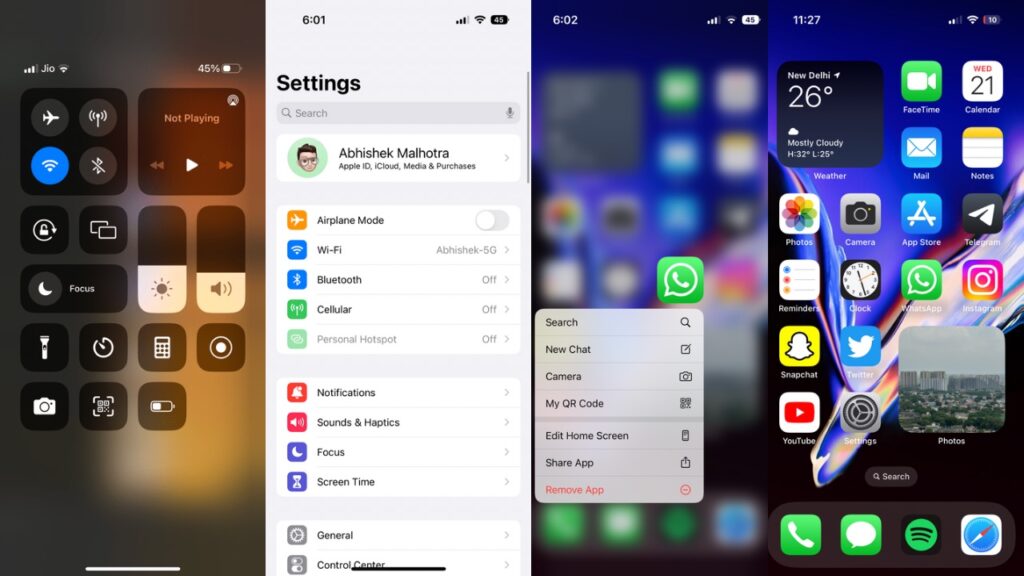
As far as iMessage users are concerned, they can now edit a message they just sent or unsend a recent one altogether. And you can mark a message as unread if you can’t respond at the moment. There are minor UI changes as well, where notifications can be stacked at the bottom of the lock screen, which is much better than we saw before. However, notifications on iOS still need some work in terms of grouping.
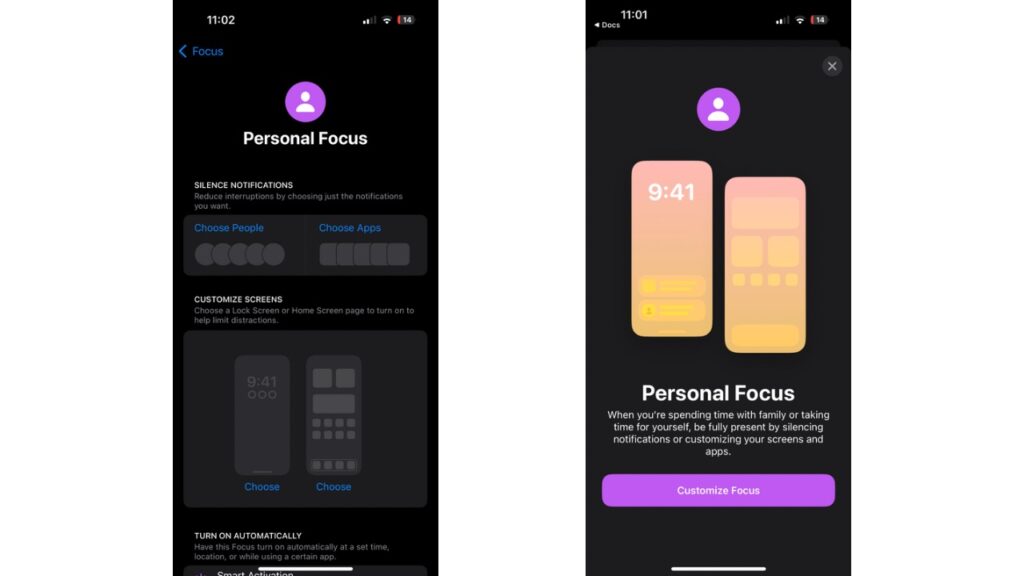
There are also various focus modes you can go through for better notification handling during various times and circumstances throughout the day. Moreover, you can also connect your Lock Screen to your Focus mode, so the look and feel of your iPhone match how you want to use it. With a swipe, you can go from your Personal Focus to your Work Focus with widgets showing upcoming meetings and to-do lists.
You can also check our article where we have compared iOS 16 with Android 13 and what all new features the software comes with.
iPhone 14 Pro, 14 Pro Max, iPhone 14 and iPhone 14 Plus come with Crash Detection and Emergency SOS via satellite. Both of these features are limited to the new models because they are dependent on dedicated hardware such as the new dual-core Accelerometer capable of detecting G-force measurements of up to 256Gs and a new high dynamic range gyroscope.
The Satellite connectivity feature combines custom components deeply integrated with software to allow antennas to connect directly to a satellite, enabling Messaging with emergency services when outside of cellular or Wi-Fi coverage.
Both of these features can be really useful, yet, we couldn’t test them for obvious reasons. Even if we could, we wouldn’t be able to test the satellite feature because it is available only in the US and Canada. As for other connectivity options, Wi-Fi and Mobile Data performance remained optimum.
iOS 16 also brings the ability to unlock your iPhone with Face ID even if the phone is in landscape position, and this worked without any issues for me. Moreover, Face ID generally works well and is quick to identify my face 9 out of 10 times, be it with or without a mask. However, I don’t find it any faster than a fingerprint because, at times, I would have to adjust the angle of the phone or take it away from my face so the device could unlock.
As Apple’s A16 Bionic chip is so capable and powerful, it can easily handle the heaviest of games. Call of Duty Mobile, Apex Legends Mobile, PUBG: New State can work on the highest graphics without any lags. The phone does warm up a bit, though, during longer gaming sessions.
More Stories:
Does it make sense to buy iPhone 14 series from the US?
Top 5 wireless chargers for Apple iPhone 14 series
Battery Life is as good as it can get.
The iPhone 14 Pro reportedly packs a 3,200mAh battery which, according to Apple, can give you 23 hours of video playback. In real-world usage, I was easily able to get 6.5 to 7 hours of SOT with 23 hours of mixed WiFi and Mobile data usage along with Always-on Display and Keyboard haptics ON, which is amazing for a smartphone with such a battery size. My usage included some light gaming, lots of social media, music streaming and video streaming as well.
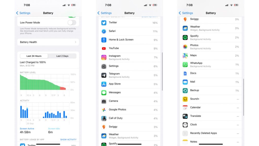
Things get even better when you turn off Always-on Display, as the Screen-on time can easily get close to a whopping 8.5 hours with more than 24 hours of usage. This time, apart from my usage mentioned above, it also included an hour of FaceTime audio calling. This usage time will decline when you use mobile data more, but even then, this is very impressive.
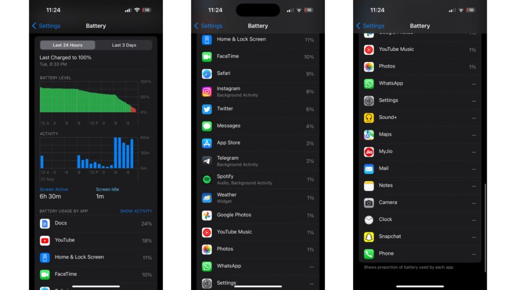
Well, this also shows that the Always-on display does eat up a big chunk of the battery life and can easily save you 1 to 2 more hours of SOT when turned off. I would blame it on the AOD being too bright and showing a lot of unnecessary content, such as the wallpaper, which means that almost all of the pixels on display are always lit up, even if at low brightness.
On Android, those pixels that aren’t needed are turned off intelligently to preserve the battery. We also don’t know how Apple’s way of doing AOD could affect the display panel in the long run because Android smartphones have often suffered screen burn-in issues even with most pixels off.
The Pro level cameras.
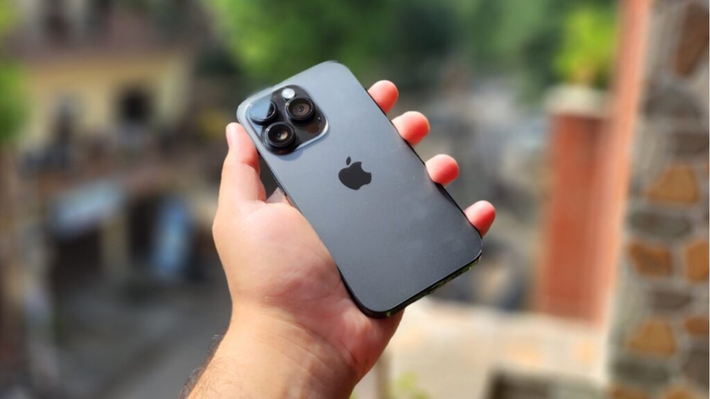
The primary camera sensor on the iPhone 14 Pro has been upgraded from a 12MP sensor to a 48MP sensor with f/1.78 aperture, second-generation sensor-shift optical image stabilization, seven‑element lens, and 100% Focus Pixels. Then there’s a 12MP ultra-wide sensor with f/2.2 Aperture and a 120-degree FoV alongside a 12MP 3x telephoto f/2.8 aperture sensor. At the front, there’s a 12MP f/1.9 TrueDepth camera at the front for selfies and video calls.
Because of the bigger sensor, Apple has been able to enable the 2x Optical Zoom as well, which crops up to 12MP into the 48MP sensor. Apple hasn’t updated its Smart HDR from last year, which remains HDR 4. Then for videography, there’s a new Action mode that can shoot up to 2.8K at 60fps.
In Action mode, the video becomes incredibly stabilised, and in our testing, it worked well. However, it kept giving me a ‘More light required’ popup at the top. While that didn’t stop it from recording, the video does appear to be a little dull if you try to shoot indoors.
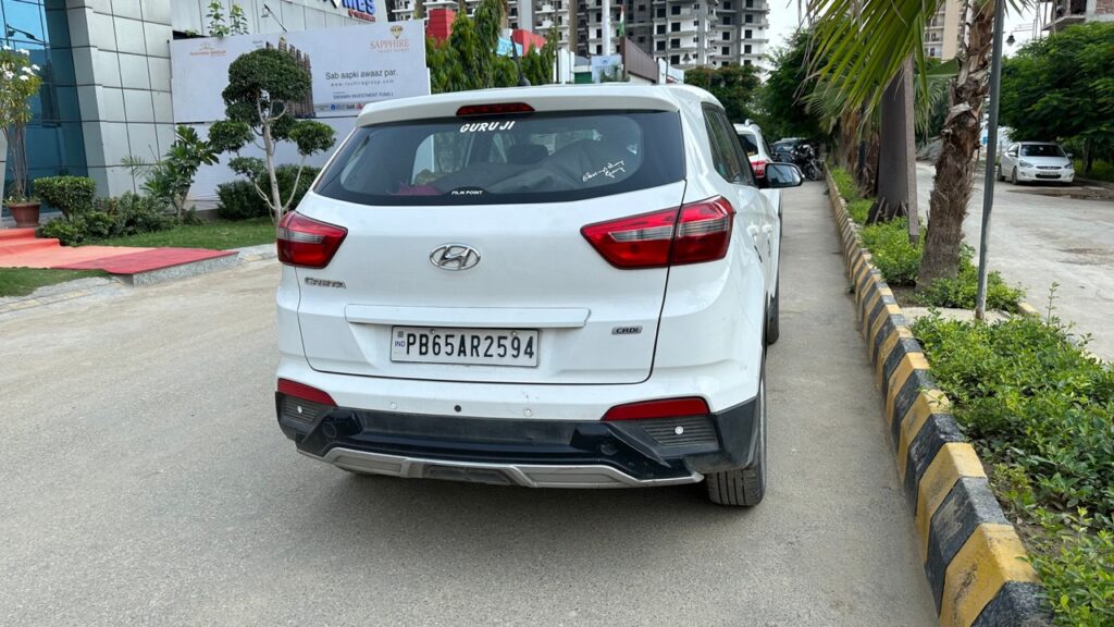
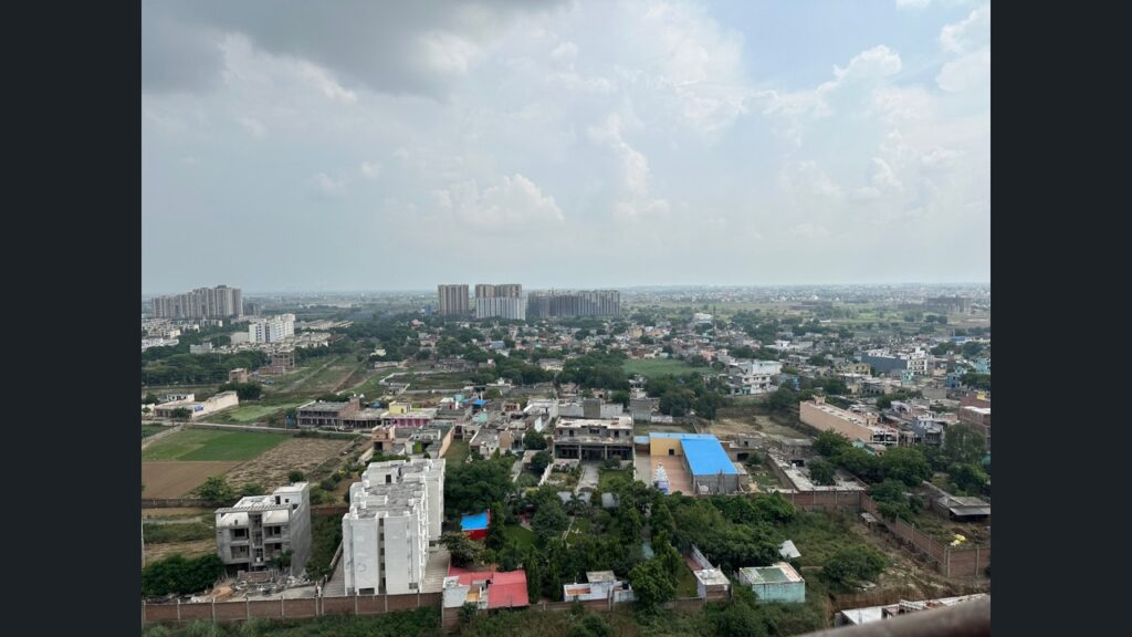
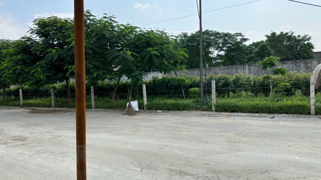
Now, as you’d expect, talking about shots from the main sensor are incredibly sharp and have really natural colours. You can choose from 5 colour tones of the photo, including standard, rich cool, which has a rich contrast, alongside vibrant, cool and warm tones. While I prefer the second one for all photos, the standard mode had quite a warm hue for my liking. Also, the shadows can often get completely crushed and the contrast is overdone, which needs to be corrected.

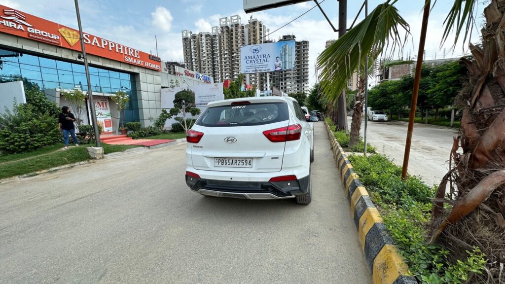
The dynamic range can be a bit messy at times, but the actual shot turns out to be great when it works. As for ultra-wide angle photos, the colour shift from photos clicked by the primary sensor was actually close to none, and that’s impressive. Sharpness is on point and the distortion at the edges is well contained.
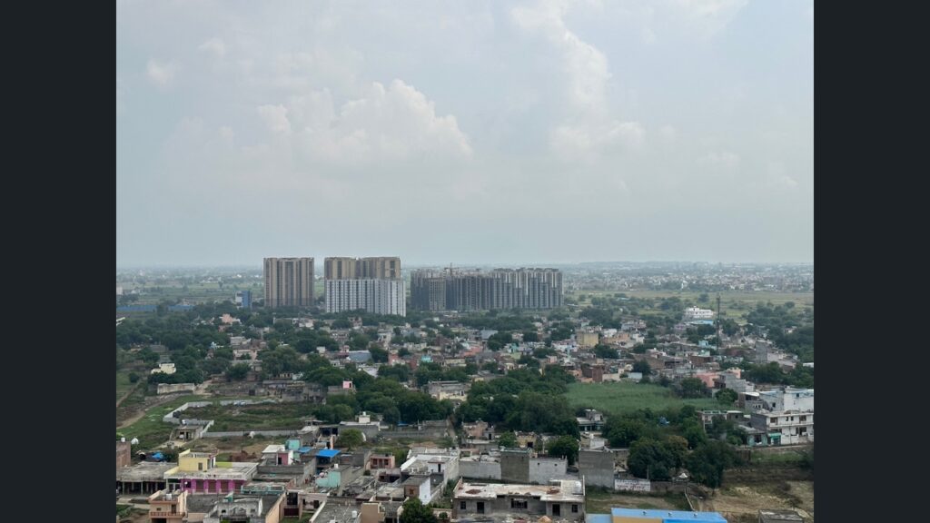


The telephoto lens also captures good photos. As you zoom in, the details slightly take a hit, but the colours are kept intact. The 3x zoomed shots look better in comparison to the 2x shots with more details while the colours remain the same. When you completely zoom in at 15x, you cannot expect a lot of details, and I wouldn’t suggest zooming that much unless you absolutely require it.


Coming to portrait shots, the iPhone 14 Pro clicks absolutely detailed photos with a good amount of sharpness and great colours. There’s a good amount of bokeh effect, but then I was surprised to see that the EDGE detection missed some parts of the photo while blurring them out.
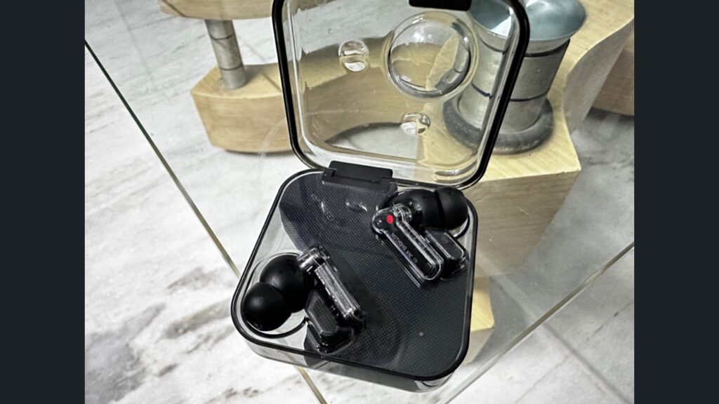
Under artificial lighting, the iPhone 14 Pro shines again with great detail in the photo. I have noticed that the software tries to keep the photos as natural as possible and works for photos in artificial lighting. The hue can sometimes become too warm depending on the lighting conditions.

Low-light shots are a bit tricky for the iPhone 14 Pro to handle. When I tap on the brighter part of the area, the photo instantly becomes black, but when I tap on the darker area, it brightens up but often loses focus from the subject. The colours are also quite inconsistent, but whenever it takes a perfect shot, it doesn’t miss on anything, including details that a lot of smartphones do miss out on.

For all types of shots, Apple’s ProRAW format introduces a major improvement in terms of colours and details. But it is not always possible to shoot photos because the size of the photos is unrealistically high. Where a normal photo had a size of 2.9MB, the same shot with ProRAW turned ON came out to be at 85MB.

As for selfies, the iPhone 14 Pro plays a lot with the skin tones in post-processing, and the photo ends up looking entirely different than what it looks in the viewfinder. Where the viewfinder shows me a skin tone close to mine, the final shot turns up the contrast, and the photo loses the actual colours.
Yes, the selfies are very detailed, but I don’t like what it does with those selfies in terms of colours in post-processing which also makes things inconsistent with overkill in HDR.
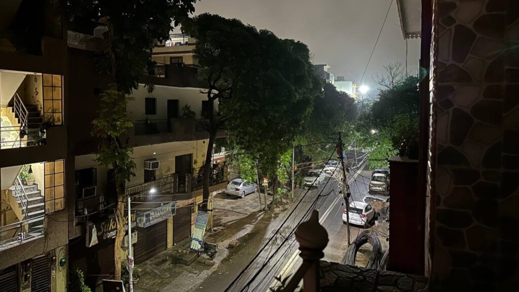
Night shots from the iPhone 14 Pro are okay-ish with exposure and brightness, but the details are super accurate. There’s no dedicated night mode, but then the photos look good.
What we think can be improved
Now, let’s talk about what I mentioned earlier in the review, whether Dynamic Island is better than the notch in terms of watching content. While the notch seemed like a part of the display, it wasn’t as intrusive as the Dynamic Island feels like because of its thickness and placement.
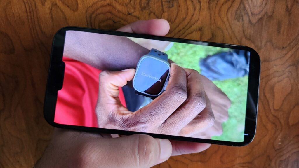
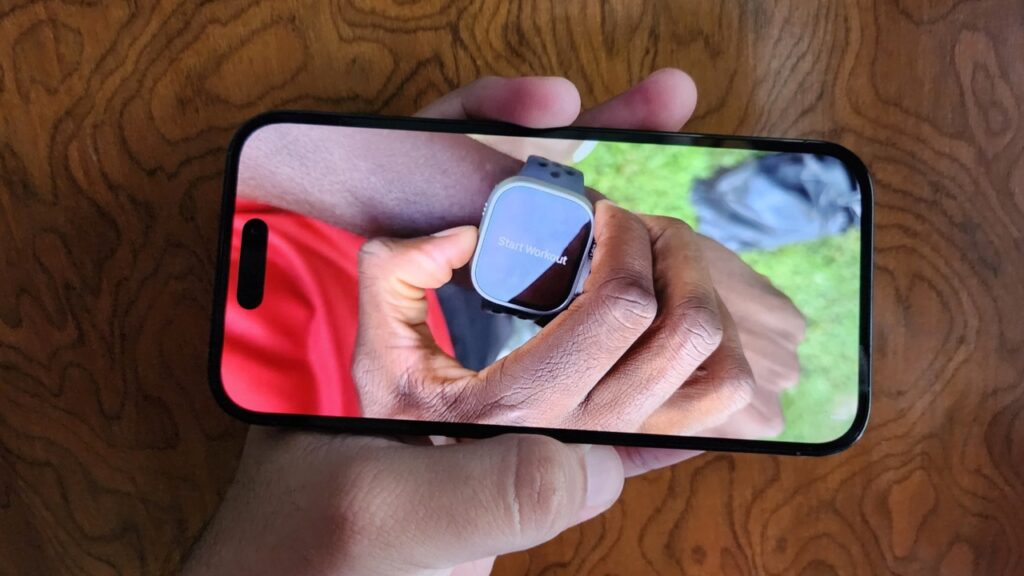
While watching videos, it cuts into some of those depending on the aspect ratio they are shot in. Once it gets noticed, it really becomes unnoticeable and can obstruct your viewing experience. This may be better on the Pro Max model because of its bigger display, but it certainly isn’t as good-looking in real life as it looks in photos on the regular Pro model.
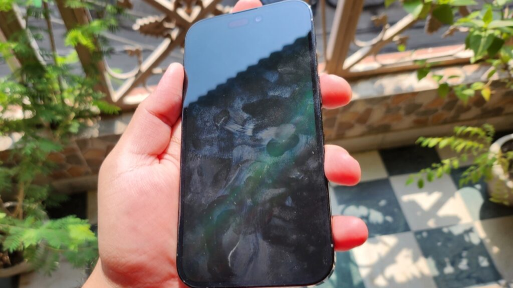
Continuing with another issue I faced with the display, I have been noticing a lot of fingerprint smudges, and I don’t know whether it is because of poor oleophobic coating or something else because the display isn’t good at resisting fingerprints. Moreover, as the dynamic island is placed alongside the selfie camera, it shows fingerprints on the camera itself when tapping on the island. I would have to clean the selfie camera often to take a clean selfie.
Bugs on iPhone 14 Pro
Next, iOS 16 is still plagued with some bugs as of now. We received the 16.0.2 version software update on 23rd September, which fixed some bugs, including iMessage crashes I was facing, the display refusing to wake up even after multiple button presses, and the Photos app crashing while editing a picture.
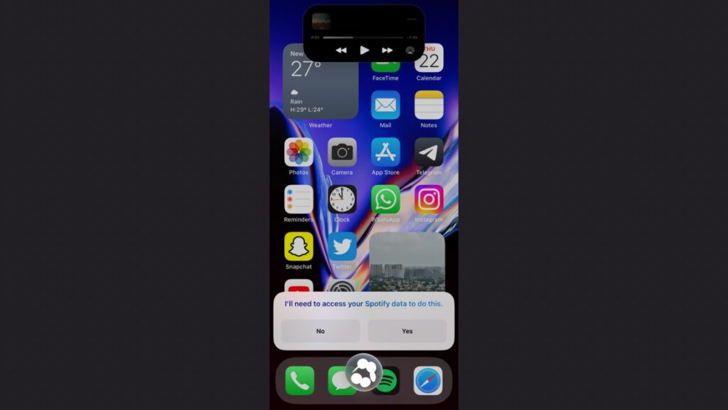
However, some bugs still need to be ironed out, including one where using the “Hey Siri” command to Play some music, the phone froze for a while with Siri stuck at the bottom, and the music player animation also behaves a bit weirdly on the dynamic island. Further, the Wallpaper settings crashed once when I was trying to enable the depth effect. Also, the dynamic island cuts off some text in the status bar in some scenarios so the alignment has to be fixed. Another bug I found is that the dynamic island sometimes appears in screenshots and sometimes doesn’t. You can notice this issue with the battery screenshots posted above.
iOS 16 also needs some more polish because, with the addition of the dynamic island, the system now has new elements that need to be implemented properly. For instance, when playing music, the player appears in three locations showing you the same information to interact with, such as in the notification area, in the control centre and now the dynamic island as well.
Lastly, the only aspect in which Apple needs to improve is the charging speed which took close to 1.5 hours to go from 0 to 100%. Flagships nowadays have much faster-charging speeds.
Why you should buy the iPhone 14 Pro:
- If you want one of the best camera systems in a smartphone
- If you want a battery life that lasts longer than a day
- If you are already into the Apple ecosystem
- If you are upgrading from an iPhone 12 series device or below
- If you just want the latest iPhone
Why you may skip iPhone 14 Pro:
- You are not comfortable with the high price tag
- If you are coming from an iPhone 13 Pro/Pro Max
- If you are buying it only for the Dynamic Island, do not. You actually won’t pay much heed to it after a couple of weeks.


