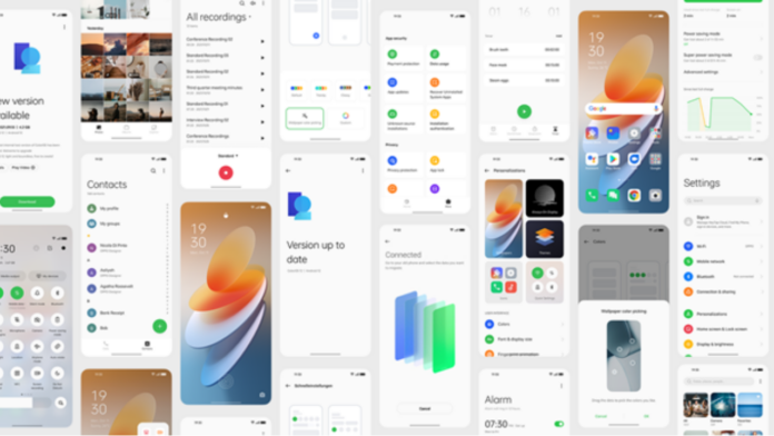
Oppo’s ColorOS 12 has now been unveiled globally, and the first device to get the update is the Oppo Find X3 Pro. We got our hands-on on the smartphone along with ColorOS 12 based on Android 12. Oppo has picked up a bunch of features from Stock Android 12, including Privacy Dashboard, Wallpaper based theming system and more. So here’s our review of ColorOS 12 and what we liked and disliked about the newest operating system.
ColorOS 12: What we liked
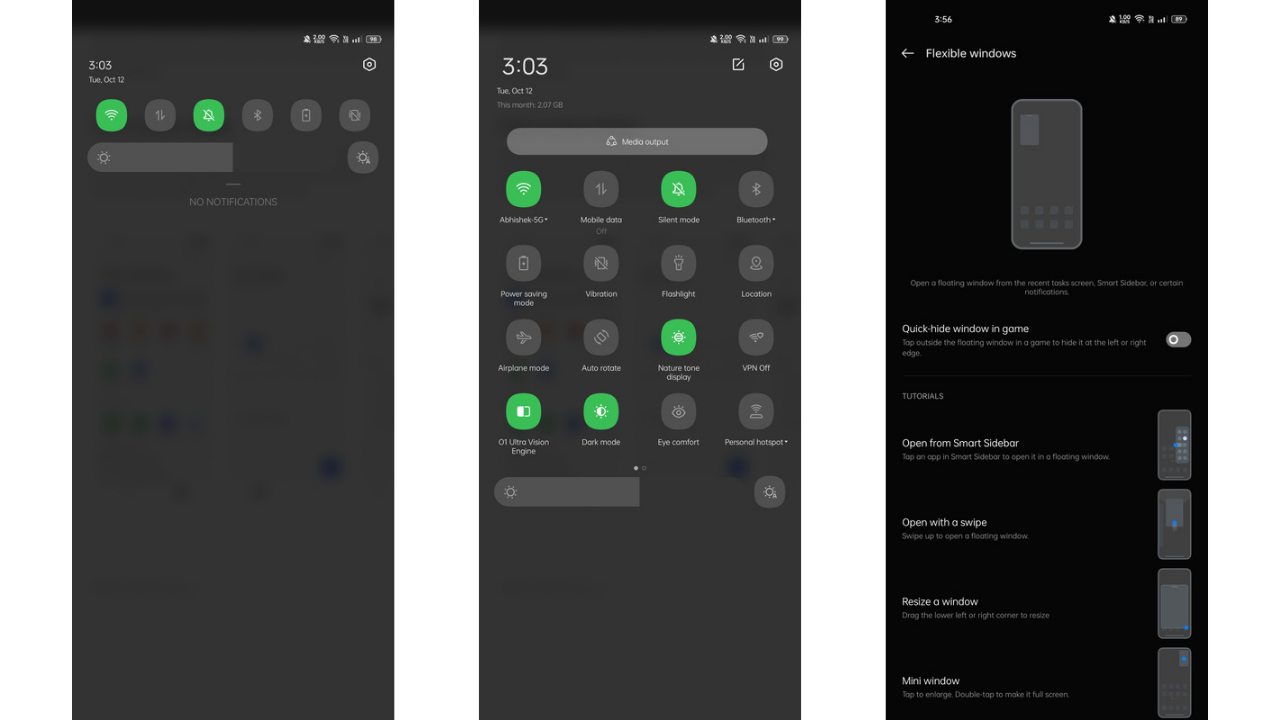
ColorOS 12 has been super smooth during our usage. Much of it is contributed by the hardware as well, including the Snapdragon 888. But we feel that even on devices with lower-level specifications, this software should run smoothly without any issues.
The performance has been quick with fluid animations. Oppo claims that its Quantum Animation Engine adopts more than 300 improved animations. We also had a Nord 2 at the moment of testing, so we compared the so-called Oxygen OS with ColorOS 12, and the animations have been improved and made smoother.
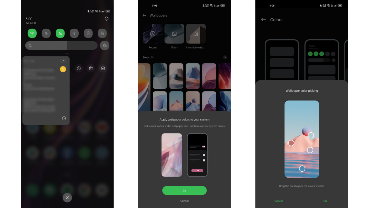
ColorOS 12 is filled with features up to the brim. With a wallpaper based theming system, the OS gives you options on what colour you want to pick from the wallpaper. Once selected all the icons in the settings and QS panel change to that colour. This works quite nicely and accurately in my opinion.
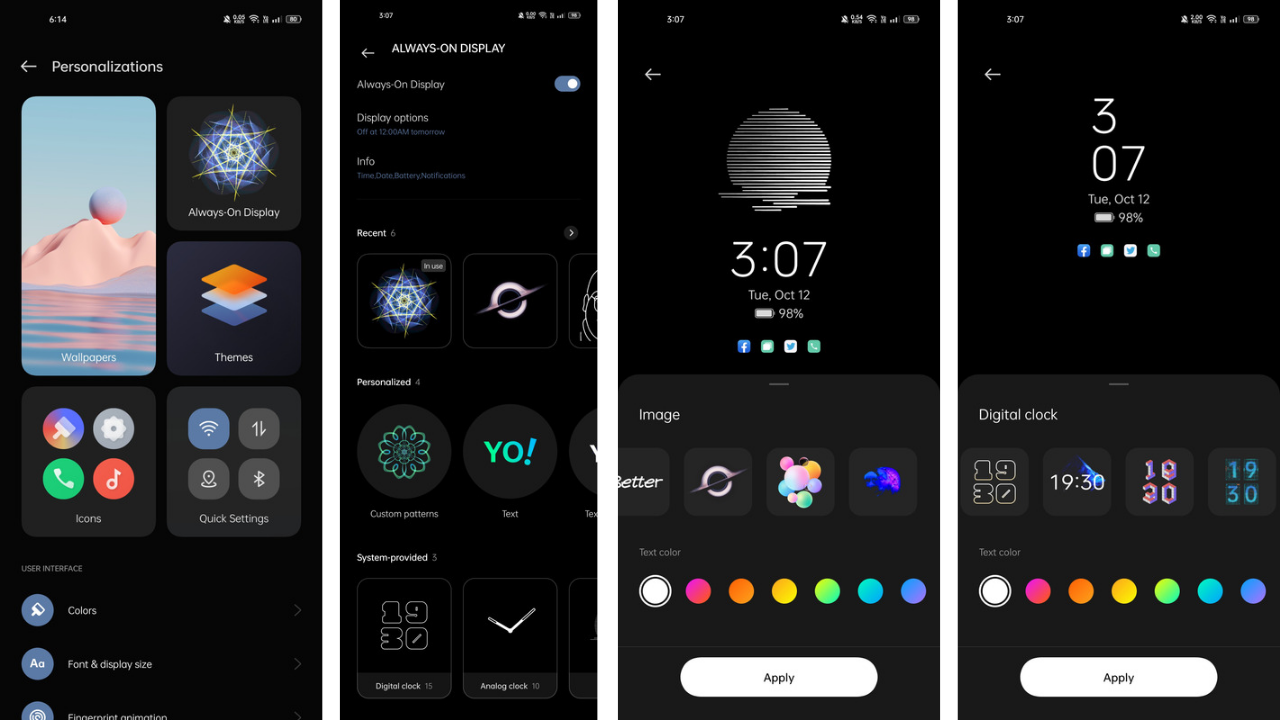
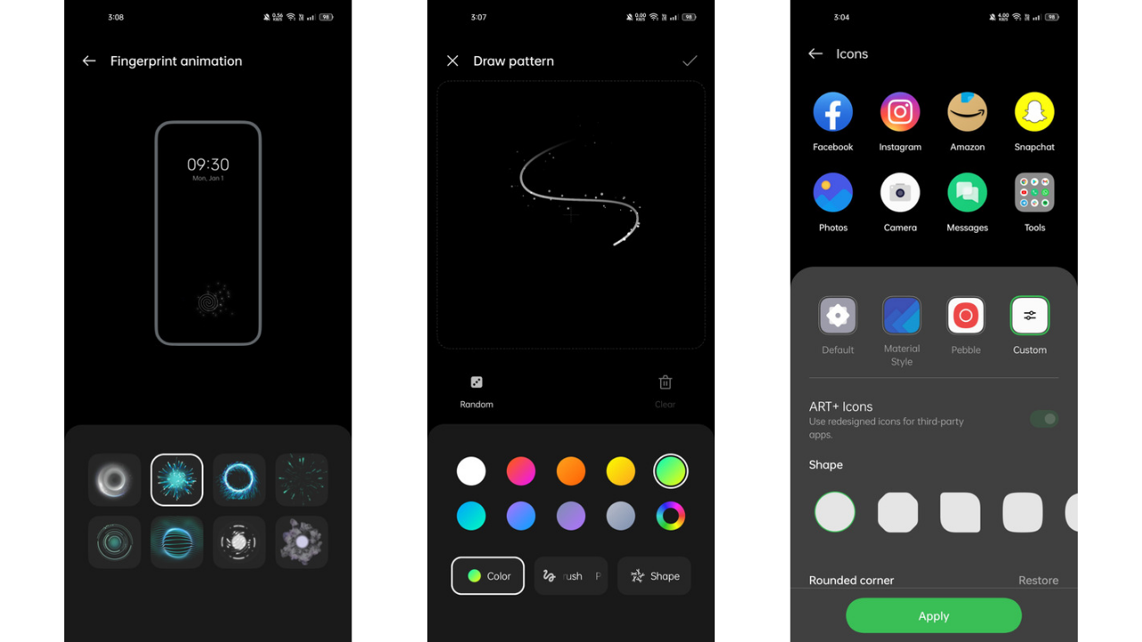
Next in line under personalization settings is the Always-On display. For this, there are so many options to choose from that you may get confused as to which one you should pick. GIFs, custom photos, patterns, text, etc can be used to apply to the Always-On display. One can also choose from 8 different styles of fingerprint animations and different colours for EDGE lighting. There’s a dedicated theme store with both free and paid themes and fonts to choose from.
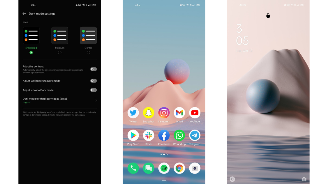
Introduced with ColorOS 11, the next generation of ColorOS still retains three levels of dark modes. The notifications do have some issues in the beta we are using about which I’ll discuss in a bit. Talking about Privacy & Security, Oppo has included the new Privacy Dashboard that shows what all apps used my camera, microphone and other Sensors in the past 24 hours.
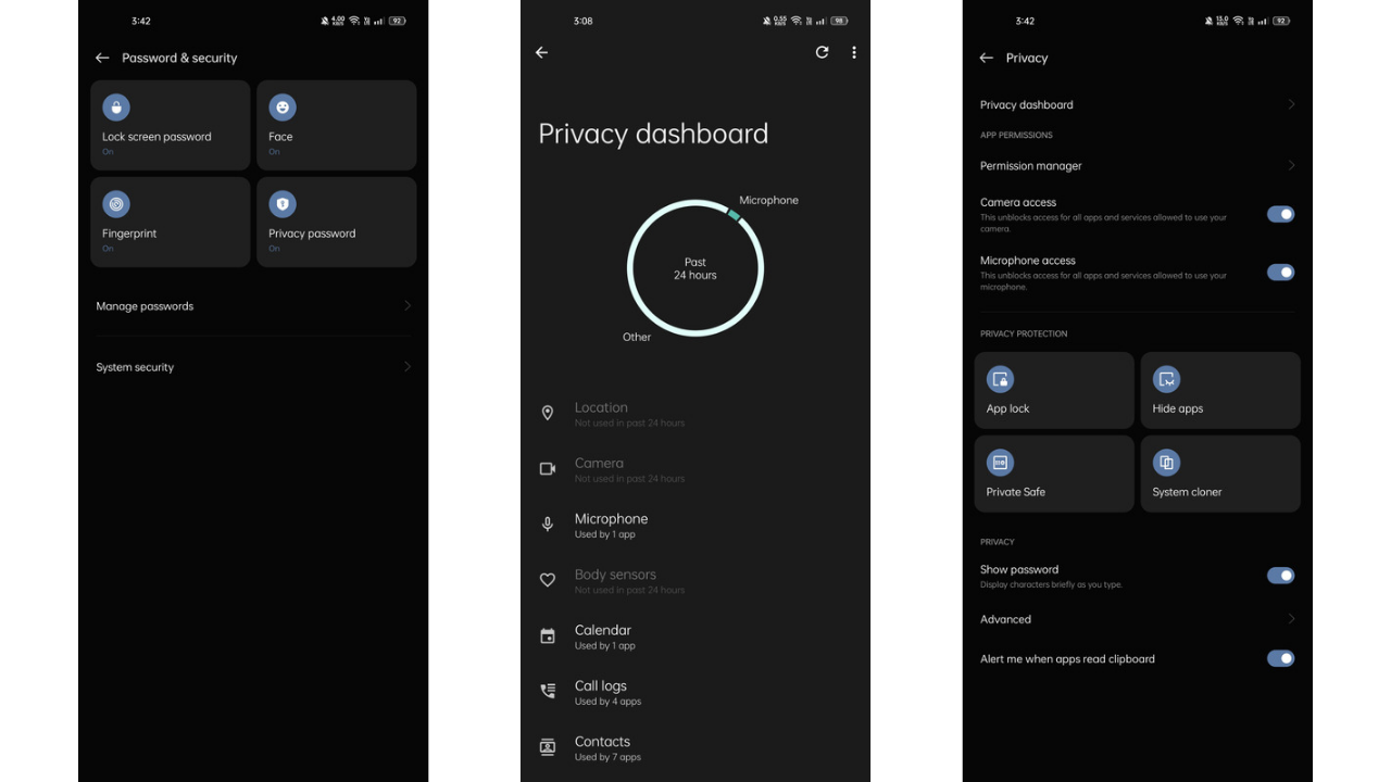
One can now also turn off access for mic or camera from the notification panel for all the apps. This helps in keeping your private moments secure. The camera & mic in use indicators is also present up top once they are in use. Apart from that, there’s a new way to hide apps from the App launcher where you can type in your code in the dialer to access the hidden apps. App lock and Private Safe are both present in the software. There’s also a System Cloner, so you can set two different systems with two different passwords in a single phone. There’s also an alert that will be shown to you if an app fetches and pastes the text from the clipboard.
Read More: ColorOS 12 Global Version launched: Features, Eligible Devices, Beta Timeline
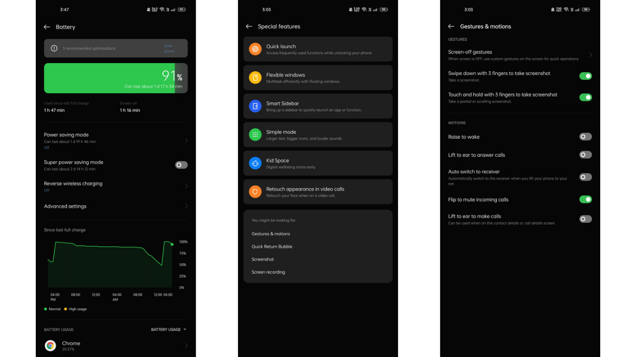
The battery stats page has been redesigned from scratch. Oppo had been missing out on a graph showing the battery usage that portrayed the usage in a simple manner. Now, Oppo heard the feedback and brought a graph that shows the stats. In addition, there’s a Super Power Saving Mode in addition to a Power Saving Mode that limits the system functions to as minimum as possible to save battery.
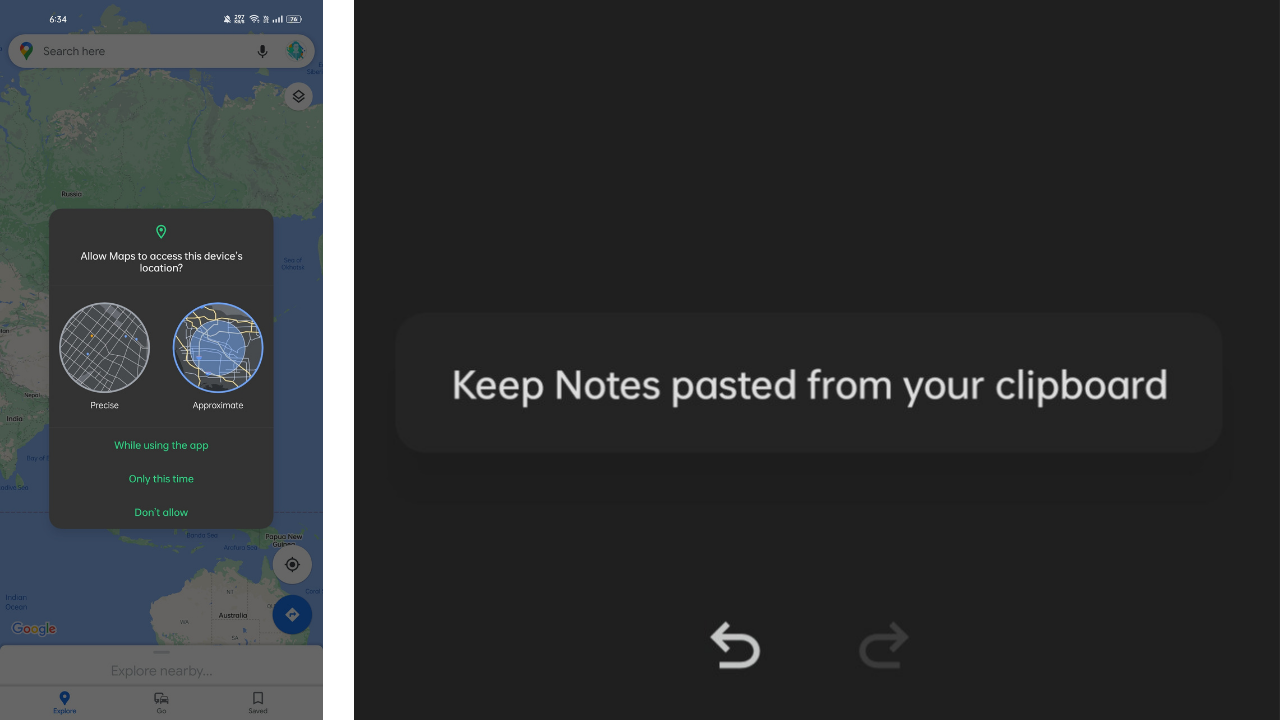
For location access, ColorOS now also gives you the option to provide access to an approximate location to the app instead of the exact location. This feature has also been picked from stock Android 12. In addition, a bunch of special features are present, including retouching your face in a video call, flexible windows for multi-tasking, an intelligent sidebar to access apps quickly, kid space, quick launch, and more.
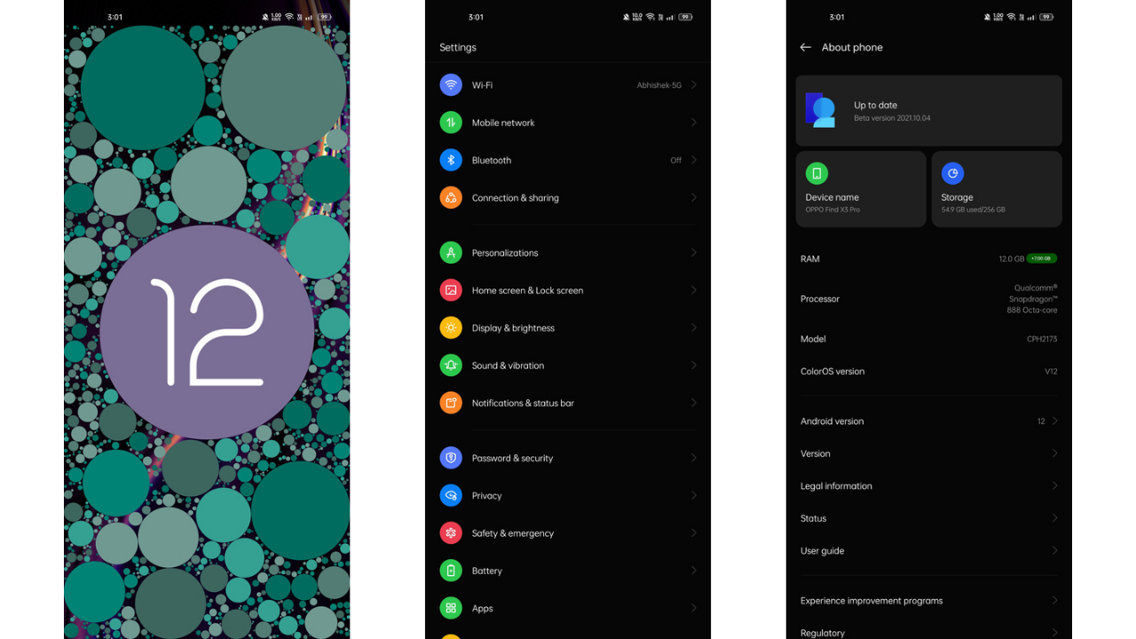
A bunch of convenience tools and gestures, and motions enhance the overall user experience. Overall, Oppo has tried giving its OS a sleek and aesthetic makeover that so far looks interesting and seems to be hitting the right spots. Multi-tasking has also been made easier to access. You can now drag a file from My Files or a photo from the Photos app to a floating window.
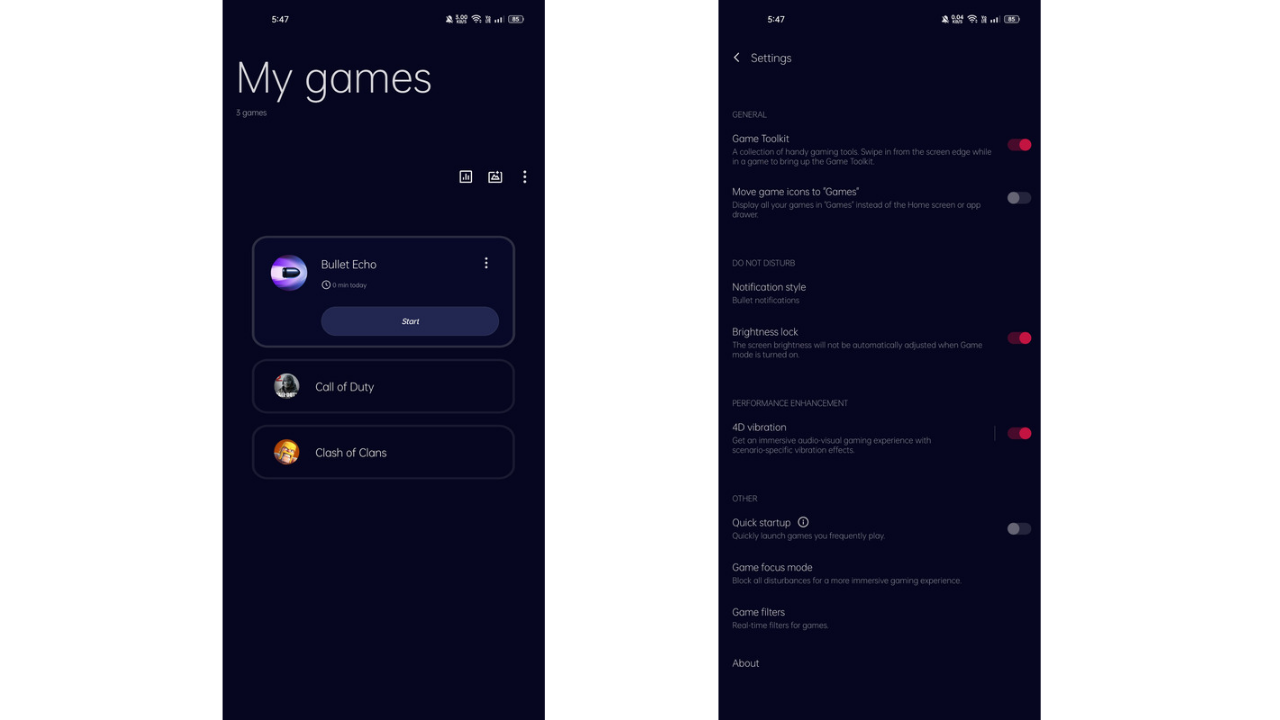
Also, the games app was one of the places where Oppo borrowed from OnePlus instead of the other way round (for the most part). Oppo seems to have retired its own Game Space app and has swapped it with the OnePlus’ Games app. For those wondering, the RAM expansion feature is still there with expansion available up to 7GB. A lot of new Gallery editing tools have also been added as well.
ColorOS 12: What we didn’t like
Yes this is a beta version and not the stable build, but there still several bugs that need to be squashed out. First was the media player notification that just didn’t appear in the Notification Panel no matter what app I would use. For Spotify, instead of the notification, there was a big blank space that wouldn’t go unless I force stopped Spotify.
The second is battery life, which needs to be improved as well. With ColorOS 11, I used to get higher Screen-on time with the same usage as on ColorOS 12. The difference isn’t drastic but is considerable for sure.
As for UI changes, the notification panel still needs some work as some notifications have a lot of wasted space and padding issues. Slight lags are also present across the UI. And the final major problem I had was with haptics. We don’t know whether it is present only with the Find X3 Pro or other devices as well, but the Haptics aren’t accurate.
Often I could hear sounds where the haptic feedback would end abruptly. The vibration sometimes ends longer while typing, whereas sometimes it’s fine. This creates inconsistency while using the phone and does hamper the experience to some extent.
Lastly, there’s still a considerable amount of bloatware I could find in the Find X3 Pro even though it was the international variant. We haven’t seen what all would be included with an Indian variant of any of the Oppo devices shipping with ColorOS 12. Fortunately, most of it was uninstallable. But bloatware such as Game Center, Oppo’s own Browser weren’t uninstallable.


