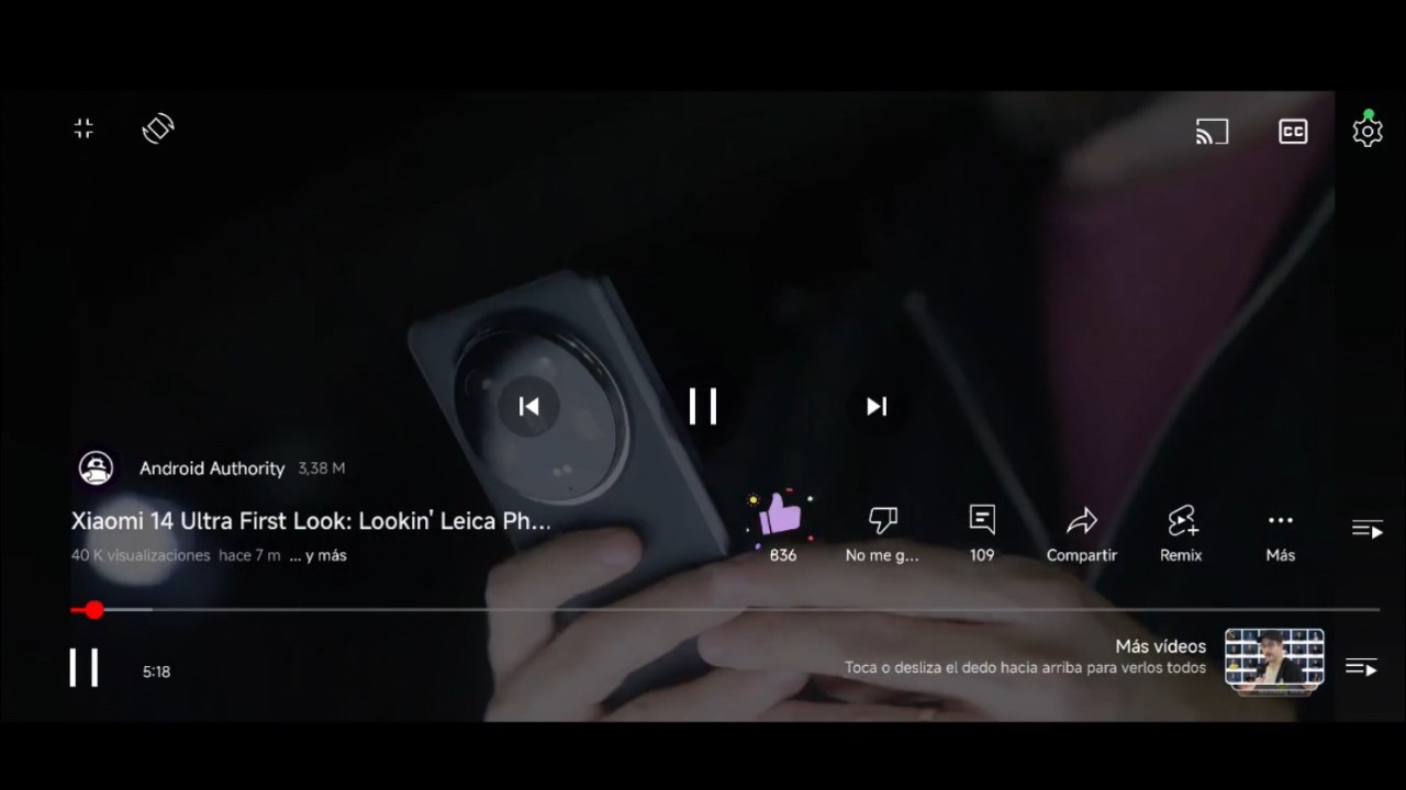
YouTube Video Player user interface has been updated with new elements and existing ones being repositioned. Report suggests that those users who have received the update haven’t appreciated the new user interface. Here’s everything you can expect from the new YouTube Video player UI.
As reported by Android Authority first, Google is now A/B testing a new video player UI in the YouTube for Android app. The tip publication received from a reddit user suggests that Google is making some big changes to the video player’s interface. In the new UI, the video title has been relocated above the progress bar, and the channel icon and subscriber count are now displayed alongside the channel name. The view count and published date are positioned below the title.

The expand button has been moved to the top left, with a rotate button placed next to it. Additionally, a second playlist button now occupies the spot where the expand button used to be, just above the progress bar. It appears that the forward and backward buttons are missing in fullscreen mode, though they do show up if the video is paused while in portrait mode.
Read More: YouTube Implements Pause Ads: Pausing Videos Will Now Show You Advertisements
In the updated UI, the like, dislike, comment, share, and more buttons have been relocated to the right side, just above the progress bar. Additionally, the number of likes and comments is now displayed below these buttons. The bookmark button has been moved under the menu, while the Remix button is now shown by default. A new button to view video chapters has also been added to the bottom-left, positioned next to the second pause button.
If you are watching videos in a playlist, you can now swipe up and down to move between videos in a playlist. You can swipe down to minimize a video only if it’s the first video in a playlist or if it’s not part of a playlist at all.


