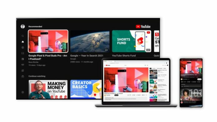
YouTube has gone through a number of changes since its launch and a bunch of new features alongside a cleaner look are now making their way to YouTube. The company says that it gathered input from thousands of viewers around the world and heard there was a desire for a cleaner, more lively design. It is now following the design language along these lines.
YouTube has already started rolling out the new cleaner look and several other features that offer a more modern and immersive viewing experience while also improving how users watch videos on the streaming platform. Here’s whats new:
Ambient Mode

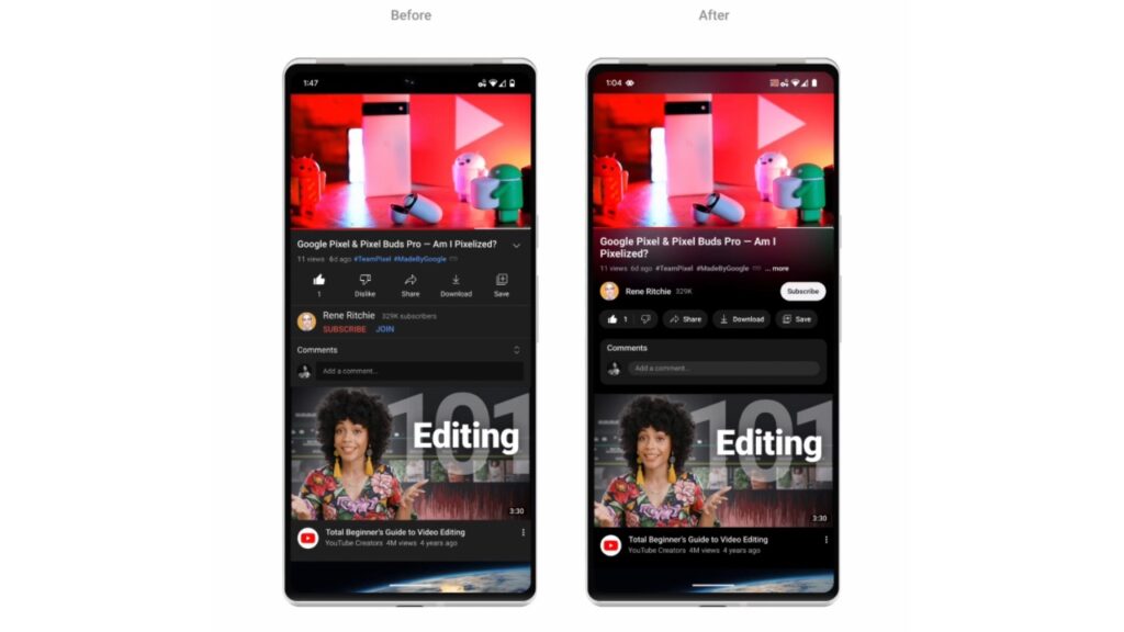
YouTube says that it has introduced ambient mode after it got a positive response from users during the testing of the feature. Using dynamic colour sampling, ambient mode introduces a subtle effect so the app’s background colour adapts to match the video.
“We were inspired by the light that screens cast out in a darkened room and wanted to recreate the effect so viewers were drawn right into the content and the video takes an even greater focus on our watch page”, said the company. This feature will be available on web and mobile in dark theme.
Darker Dark Mode

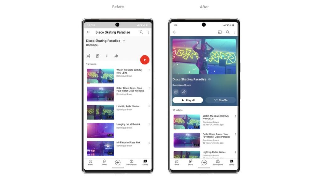
Next, YouTube has made the dark mode in the App even darker, based on user feedback. This visual change will roll out on web, mobile and Smart TVs. Moreover, Video playlists are also getting a slight change. They will adopt the same colour treatment as the video thumbnail and now show more details about each playlist.
Read More: YouTube to monetize Shorts: Check out the details
Video Player Updates
The video player is the heart of the YouTube app and it needs to be the most attractive visual element. So, YouTube links in video descriptions will now change to buttons, and frequent actions such as like, share and download, are now formatted to minimise distraction.
The subscribe button is getting a more curvy shape and now has richer contrast so it pops out in the UI. However, it is no longer red in colour. But the change has been implemented to make it stand out, easier to find and way more accessible to everyone.
Then, the brand has announced pinch to zoom feature which it has been testing with users since earlier this year. You can now easily zoom in and out of a video while on your iOS or Android phone up to 8x. And when you let go, the video stays zoomed.

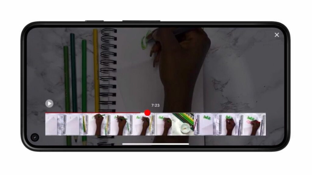
Lastly, there’s a new Precise Seeking feature. Whether you’re on desktop or your mobile device, you can simply drag or swipe up while seeking to display a row of thumbnails in the video player. This way, you’ll be able to make fine-tuned adjustments to get to the exact point in each video.


