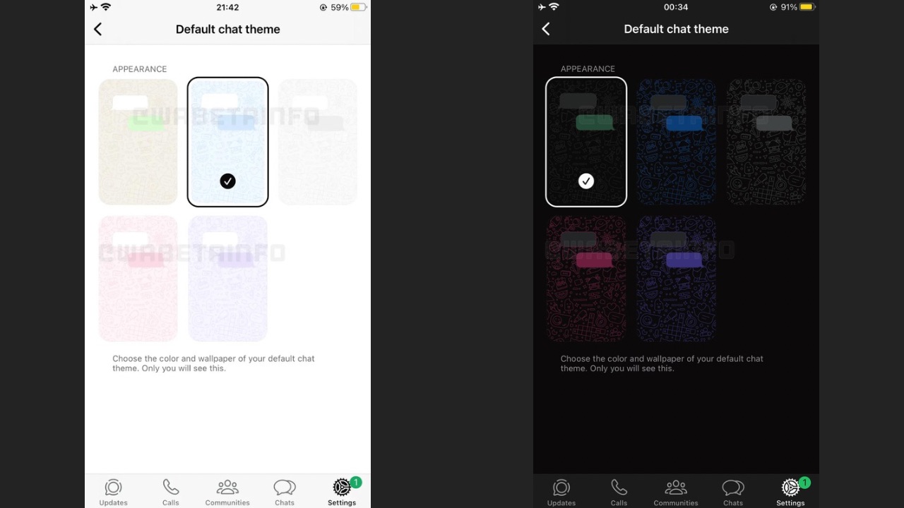
WhatsApp has always tried to be the more functional and practical Messaging app rather than being customisable, unlike Telegram which excels in both areas. However, that will soon change as a leak suggests that WhatsApp is working on multi-coloured chat themes for its iOS app, thereby ditching its own default green theme which the app has had for years at this point.
As per WABetaInfo’s findings, WhatsApp is working on a chat themes feature for its iOS app where it will be adding new colours for users to explore. The feature was discovered in the latest WhatsApp beta for iOS 24.11.10.70 update from the TestFlight app. The chat app will get a section where users will be able to choose the default chat theme of the app.
WhatsApp will not only allow to change the overall theme, but also specific options such as the ability to change the colour of the branding or the colours of the chat bubbles. Once available, it will be possible for users to select a new colour and wallpaper of the default chat theme from a range of five different colours, including purple, pink, blue, black and the app’ default green, as seen in the screenshot shared by the feature tracker. Upon selecting a colour, it will automatically become the default chat theme, adjusting both the wallpaper and bubble colour accordingly.

WABetaInfo notes that that selecting a default chat theme will only affect your own interface and won’t alter the appearance of the chats for the user on the other end, like how it does in Instagram chats. There’s no word on when this feature would be made available and whether it will also be available for Android. Considering it is in its final stages, it should soon appear for WhatsApp beta users on iOS.
WhatsApp recently also revamped its user interface on both iOS and Android versions of its app. The redesign moves the tabs from the top to the bottom navigation bar, that now consists of the Chats, Updates, Communities and Calls sections. The green header has gone white while the WhatsApp branding at the top is now green in colour. The search bar has changed into a proper box instead of the magnifying glass icon. Moreover, one can also trigger the new Meta AI via the search box, as it was seen in a recent beta update.


