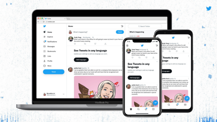
Twitter is rolling out a new design with a refreshed look across platforms for a more simpler and less cluttered usage access. Twitter aims to make the platform “more accessible, unique, and focussed” with the new design changes, including a new font called ‘Chirp’.
The changes were announced by the Twitter Design account on the platform. First of all, the Chirp font is ready to use today. All Western-language text now aligns left, making it easier to read as you scroll. Non-Western languages remain unchanged.
Twitter has also updated its colors to be high contrast and a lot less blue. The change has been made to draw attention to the photos and videos one creates and shares. It is also rolling out new colors soon, giving users a fresh palette. The buttons are now high-contrast as well.
This includes the ‘Follow’ button which is now black in colour. As per Twitter, it helps you see what actions you’ve taken at a glance. And finally, Twitter has cleaned up a lot of visual clutter. “There are fewer gray backgrounds and unnecessary divider lines”. It also increased space to make text easier to read. “This is only the start of more visual updates as Twitter becomes more centered on you and what you have to say”.
The Chirp font is Twitter’s first-ever Proprietary typeface. It was developed in collaboration with Grilli Type Foundry from Switzerland. The font aims to be distinctive and easy to read.
Twitter has been considering three new features, the early design concepts for which have been shared by the company previously. One of them is trusted friends feature that works similarly to how Instagram’s close friends feature works. The other two include ‘Facets’ and the ability to let users block certain phrases they’d rather not want to see.


