Smartphones have grown up quite drastically in terms of size, over these past few years. The original Galaxy Note which was then considered a behemoth phablet packed a 5.3-inch screen. Interestingly, this is even smaller than today’s average smartphone screen-size (5.5-inches). Although smartphones being so big is an issue to some, the number of people who actually prefer a smartphone with larger display has been increasing swiftly, hence, a lot of activities we perform on our smartphone has actually become two-handed. Well, one of them is accessing notifications and quick controls. Yes, swiping down from the top on a 5.5-inch screen is tedious for most of us because not everyone has big hands. An easy solution to this is ‘Control Center’ which is actually an iOS rip-off but comes in really handy even if you are an Android fanboy.

Usability
Control Center is cake-walk when it comes to usability. It is available for free on Android and as soon as you open the App for the first time you will be prompted for a bunch of permissions so make sure you allow them for the app to run optimally.
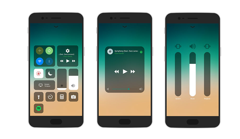
If you are familiar with the Control Center on iOS 11, you will not find any surprises here. In fact, it is the exact replica of the one found on iOS. The controls now sit on top of each other in various sizes. You have the usual four toggles for Airplane Mode, Auto-Sync, Wi-Fi and Bluetooth sitting on the top left. We have the music control right next to it below which we have the brightness and volume control. Apart from this, we also have a bunch of other shortcuts like Calculator, Camera, Flashlight torch and Clock. You can also control Auto-Rotate, Screen time-out. There is also a toggle for Blue Light Filter (or Night Mode) which didn’t seem to work on my device.

Customizations
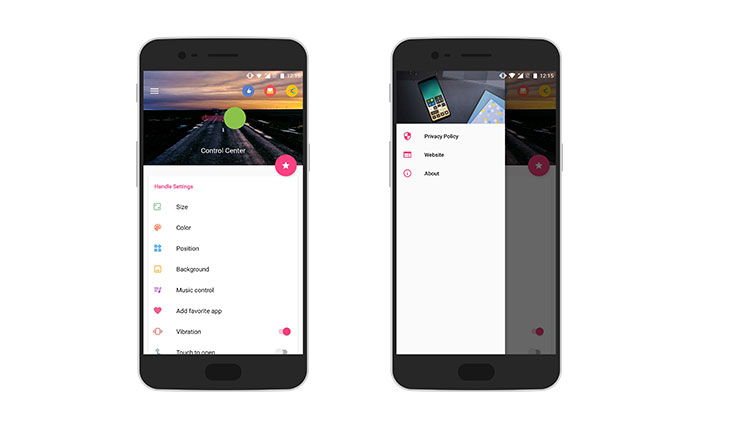
The first customization option you get is the size of the handle which you can position at the bottom just like it is on iOS or on right or left EDGE of your screen. You can further toggle the size and colour of the handle to merge it with your wallpaper. Note, you swipe up (right or left) from this handle to bring the control center. You can also allow this handle to show everywhere, for example, on your lockscreen. If you are using the latest Pixel launcher or a launcher which asks you to swipe from bottom to bring the app drawer, I would recommend positioning the Control Center handle on the right or left side of your display. Further, you can also enable ‘Touch to Open’ which also solves this issue. To be more comfortable, the app also allows a haptic feedback every time you open the Control Center.
Note: The menu for Size, Colour and Position is same.
Next, you can customize the background with the current wallpaper, blurring the screen behind or just leave it on default background or transparent, whichever works best for you. Apart from this, you can choose your default music player for ‘Control Centre’ which will essentially show up in your control center. Further, you can enable extended control for where holding the Music Control section will expand the music layout to toggle the media volume. Apart from this, you can add up to four of your favourite apps to the Control Center
Why do we recommend Control Center?
Because it is simple, free to download and does the job. Yes, there is no gimmicky animations or crazy fonts flying around here. Control Center is simply for those who want easy access to their quick settings toggle and are comfortable with the one found on iOS. I wish there were a bunch of themes for those who don’t really like the default iOS style, but it doesn’t look bad at all.


