Sygic GPS navigation App has been updated with a new UI along with a set of new features. According to the company, the changes in colour schemes and information layout are purposeful and aimed at providing a more user-friendly experience. These changes allow drivers to optimise their navigation experience while reducing the need for frequent screen interactions.
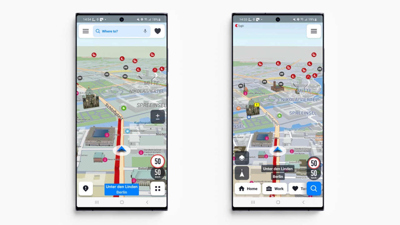
One of the most noticeable changes in the Sygic GPS Navigation app is the relocation of the search bar. It has been repositioned at the bottom of the screen, which now incorporates addresses for easy access. Additionally, the map layers button, including a satellite view option for comprehensive searches, is now conveniently accessible.

Upon opening the app, users enter the explore mode, seamlessly transitioning to the free drive mode. After the destination has been set, a single tap on the navigation screen will show a suite of buttons: volume control, map zoom, route overview, and a yellow notification bubble for reporting road incidents.
Read More: Google Bard updated with Extensions support: Unlocks new possibilities with YouTube, Maps and more
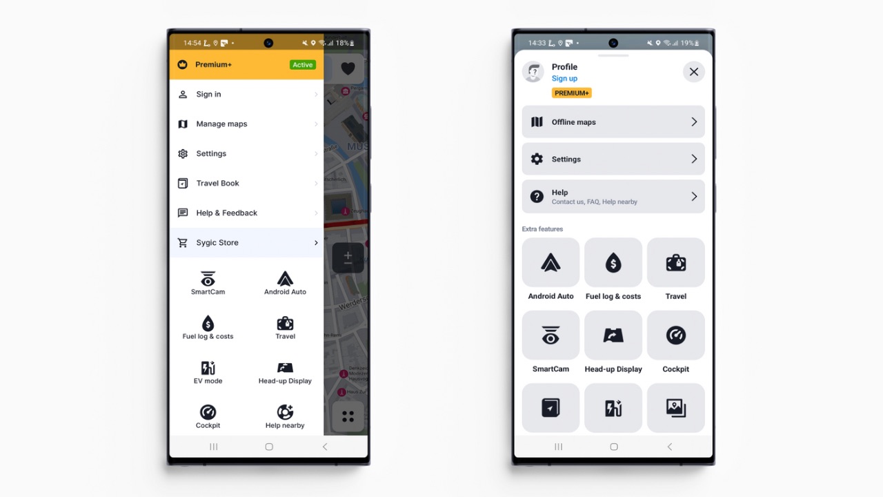
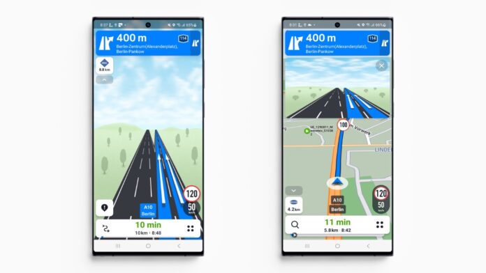
Then, there’s a redesigned menu that occupies the screen width, packing all items into one easily accessible location and eliminating duplications. In addition, several elements have received a refreshed appearance in navigation mode, such as the new speed limit information bubble with a redesigned shape and improved contrast.

While driving, four dots on the right side of the info bar conceal a quick menu, simplifying route management by enabling the addition or skipping of waypoints. This feature also provides insights into the estimated arrival times at each waypoint and the final destination. Charging points for EVs provide necessary details on connector types, payment methods, and availability. Users can also now access current fuel prices and contact information at fuel stations.
Lastly, a font redesign across the entire app has been implemented for enhanced readability. Both night and day modes sport fresh skins, and state borders have been highlighted in a distinct signal violet hue for improved visibility.


