Since OnePlus’ inception, the company has been clear about its goals, and like any other smartphone maker, it has also received a good amount of criticism. However, one of the spaces where the company used to shine was with its software which started with CyanogenMod and pretty quickly switched over to OxygenOS. But now, its second major change after switching from CyanogenMod to OxygenOS is the merger with Oppo’s ColorOS that has resulted in OxygenOS 12, which in our opinion, isn’t looking good for OnePlus’ software.
For those unaware, OnePlus earlier this year announced its software’s (OxygenOS) codebase merger with Oppo’s ColorOS. While this move attracted a lot of attention from all over the community, it got mixed reactions. Some people liked where this was going while some were afraid that the much loved OxygenOS will now lose its identity. Unfortunately, we belong to the second group of people.
I do like ColorOS a lot and in fact, I think it’s one of the most appealing, feature-filled, and smooth Android skins out there. ColorOS 11 was a big change for Oppo’s user interface in comparison to ColorOS 7 and it evolved very gracefully. However, we can’t say the same for OxygenOS 11. With OxygenOS 1.0 rolling out for the OnePlus One in 2015, it was like a breath of fresh air for the consumers.
As it evolved and more versions rolled out, people began having confidence in the software. And as an Android enthusiast who has owned four generations of OnePlus smartphones (OnePlus 5, 6, 7 Pro and 9), I loved Oxygen OS and where it was heading until OxygenOS 12 Beta arrived.
With OxygenOS 12, it looks as if OxygenOS is trying to be ColorOS but is failing miserably and doesn’t want to do anything about it
With the OnePlus 5, I got Android 7.1.1 out of the box, while the OnePlus 7 Pro came with Android 9 Pie. Then came the OnePlus 9 with OxygenOS 11 out of the box and while I do agree that OnePlus does take a bit of time to stabilise its software, the end result comes out to be appreciable. The same was the case with OxygenOS 11 when it came out. While many people criticised it, OxygenOS 11 was still one of the fastest and good looking software skins.
Read More: OnePlus Nord 2 Pac-Man Edition launched in India
But with the arrival of OxygenOS 12 based on Android 12, it seems like OnePlus just lost one of the strongest pillars it was standing on, which is good software. With OxygenOS 12, it looks as if OxygenOS is trying to be ColorOS but is failing miserably and doesn’t want to do anything about it. Moreover, onePlus recently rolled out a new beta for OnePlus 9 series and it looks like a blunder to me.
The Merger resulted in Colored OxygenOS?
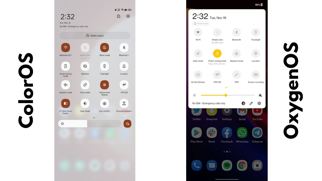
With OxygenOS 12, OnePlus picked the codebase of Color OS from Oppo, took out all the good features and replaced them with what OnePlus was good with. While this may seem like a good idea, it doesn’t look like so in practical usage. For example, let’s talk about Quick Settings. ColorOS quick settings have changed a bit from ColorOS 11 to ColorOS 12, but the OnePlus Quick Settings look almost identical to me as they were in OxygenOS 11. They brought an old element into the new software, and it just seems out of place.
Talking about customisation, ColorOS 12 is filled with various features, including the new Wallpaper-based theming system, new clock styles for Always-On display, new pattern style for Always-On display, and a lot more. Unfortunately, while I do understand its beta software, OnePlus misses out on wallpaper-based theming as of now in OxygenOS 12, which is a major feature of Android 12. Furthermore, it has the same clock styles for the Always-On display which it had in OxygenOS 11, and there’s not even a single new clock style.
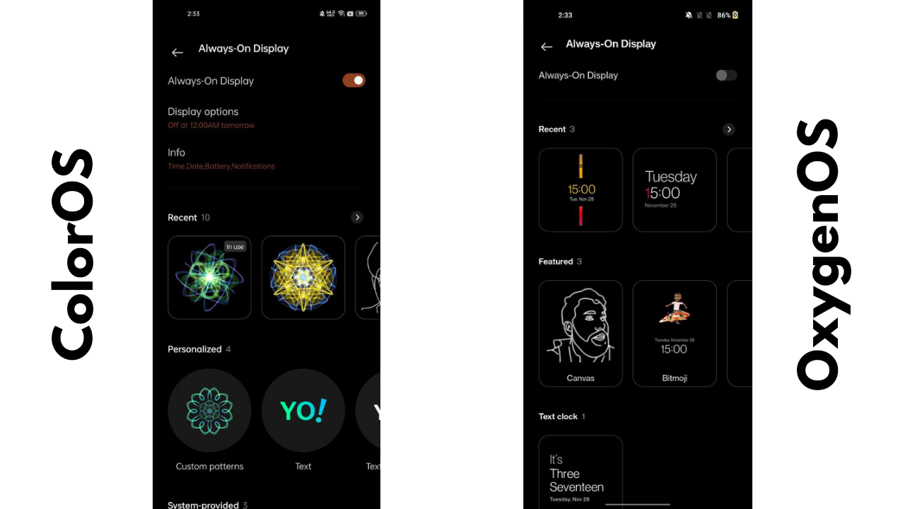
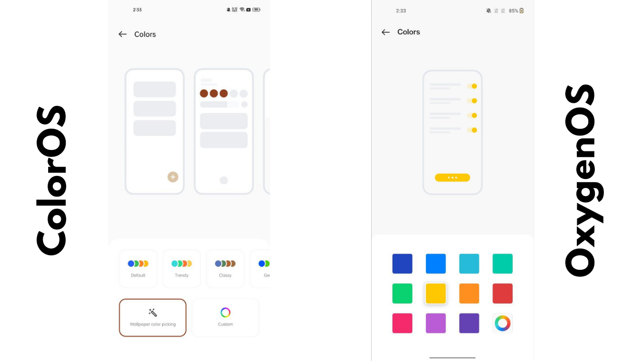
I am still not talking about the number of bugs I faced, the mediocre battery life and lags because these can still be improved by the time the stable version arrives. Further, OnePlus has now picked up ColorOS’s launcher and has renamed it to the OnePlus launcher. So we have the exact same options, interface and launcher customisation between the two OS’es.
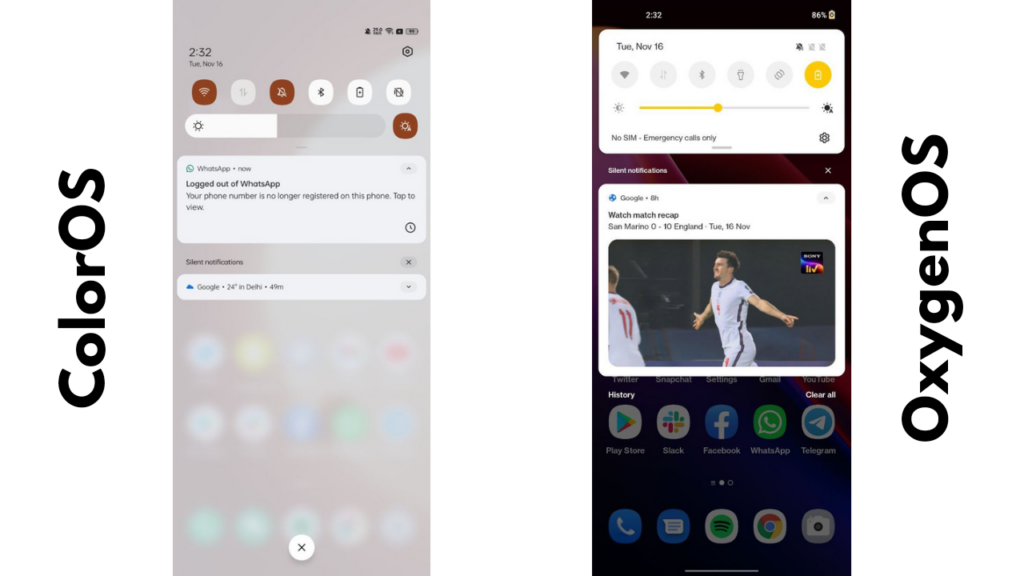
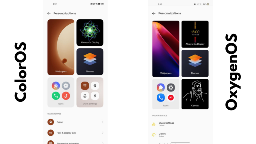
Because of this, OnePlus lost some of the better features it had with its launcher that included a better icon picker. Now, a single icon pack can be applied. However, earlier, you could pick a different icon for every App if you had a bunch of icon packs.
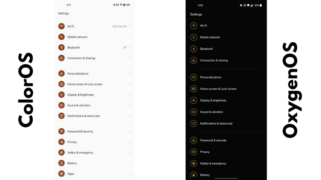
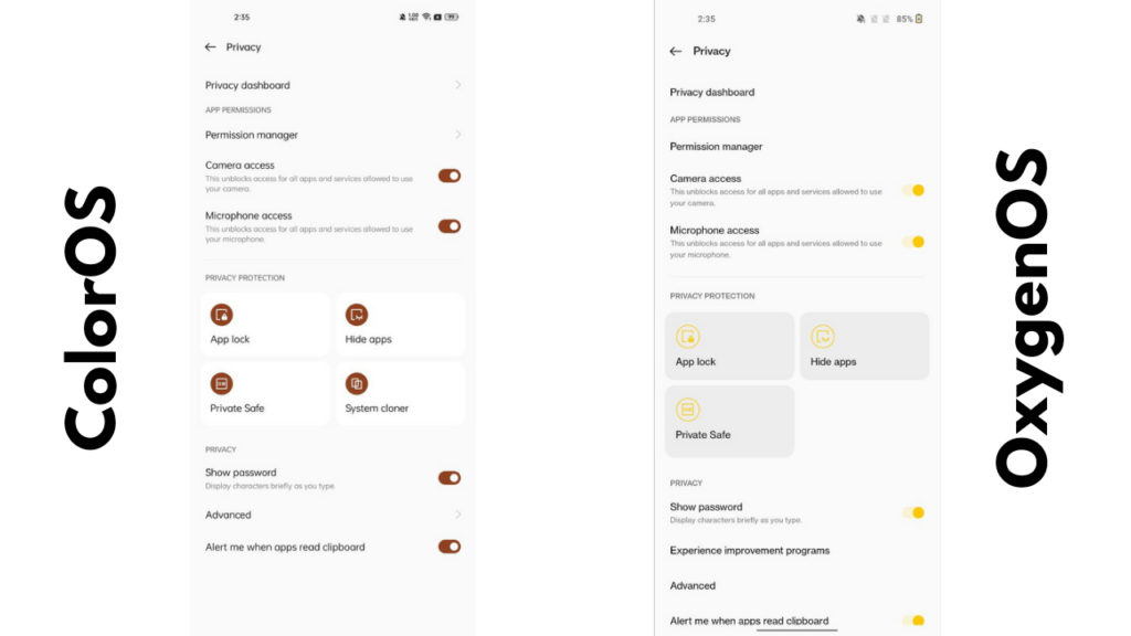
Some of the settings pages are OnePlus styled while some are styled the Oppo way. This further makes the software look inconsistent. These are just some of the elements I talked about while the rest of them continue to look bad to me every single day I try to use OxygenOS.
One of the unique features from OnePlus called Shelf thankfully made its way to Android 12 from the last iteration of OOS (just like all the other stuff), but unfortunately, it’s not as useful now because of how it gets triggered. Earlier, one could access Shelf by swiping right on the home screen (at least on OnePlus 7 series), which is more of a place where it should have resided always.
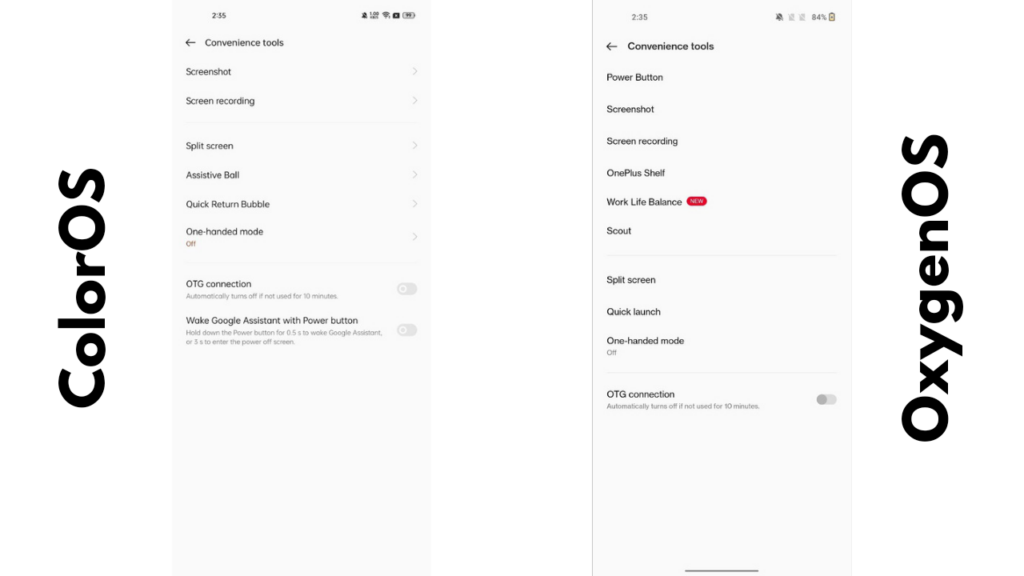
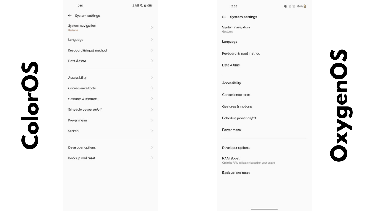
The position changed to a swipe down from the top on home screen in the OnePlus 8 series. And now, one can access it from anywhere by swiping down from a top-right corner. This is more inconvenient as I now end up opening Shelf instead of the Notification Centre because that’s what my muscle memory triggers whenever I have to see notifications. Unfortunately, there’s no way to change the location of the Shelf trigger, so I ended up disabling it altogether.
Seeing the downfall of OxygenOS is a sight I imagined I would never witness. But, unfortunately, the OnePlus experience is getting worse by the day and the brand lost its originality the day it announced its merger with Oppo.
We would just like to say that Oppo is already doing everything better in software which OnePlus has already messed up. So rather than buying a OnePlus phone, we would suggest you look at Oppo first because the software experience is very similar between the two now. Features that are different are worse in OnePlus phones that ruin the overall experience.
On the other hand, Oppo devices such as the Reno series are much better with software and timely updates. So we hope OnePlus could revive once again to what it was and what people liked about it the most. But as of now, there’s no way we can recommend a OnePlus device over an Oppo smartphone.


