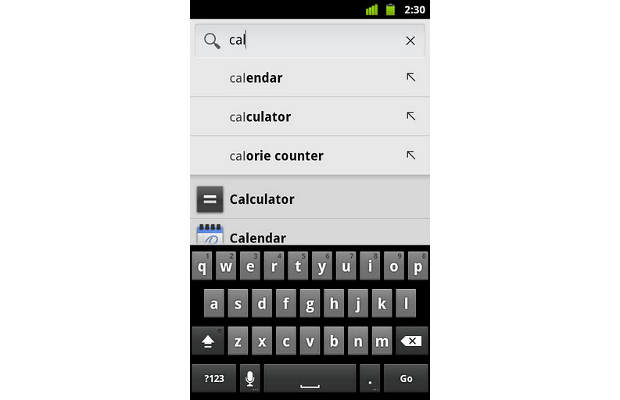
Google has revamped its native search App for Android smartphones with emphasis on the speed of search and a simple user interface. The new Google Search app has been revamped with a new colour scheme and user interface similar to the user interface of Android 4.0 Ice Cream Sandwich. The app also gets search suggestion help from other apps installed on the smartphone.
The new Google Search app is meant for handsets running Android 2.3 Gingerbread or lower versions. Google has also added its search proficiencies, such as country-specific search suggestions.
Apart from that, the app smartly keeps web suggestions in the results on the top based on what the user has typed in the search box. At times, the history items (keywords) show up as soon as you start typing and those items can be removed by pressing the box for long.
Users can also take help of other installed apps to get more search suggestions and for that they will have to select the number of apps from the Search settings.
By default, the Google Search app is very similar to Universal Search in BlackBerry OS and Spotlight in Apple iOS. With the new spruced up user interface, the Google Search app will bring some joy to Android smartphone owners.
Download the Google Search app from Android Market.


