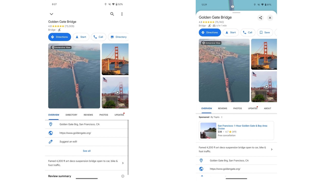
Google Maps has received a set of new UI changes accounting for a redesign with a Sheets-based user interface. These changes were first spotted being tested back in February of this year, followed by another round of testing in May. Now, the redesign for Google Maps is rolling out to everyone.
As spotted by 9to5Google, these sheets in the UI, with their more rounded corners, display the map more prominently, highlighting the background layer. This redesign not only helps preserve context while navigating the App but also gives Google Maps a lighter appearance. If one wants to close these sheets, they’ll have to tap on a new ‘x’ button in the top-right corner of the sheet, or by swiping back from the left/right EDGE of the display, which is the normal back gesture used across the system.

Another significant change is in the directions search interface. While the initial UI for entering your destination, complete with the transportation methods switcher and a list of recent locations, remains unchanged as a fullscreen page, the post-entry interface has been updated.

Now, the top of the screen only displays the start and end locations, and the mode switcher has been relocated to the bottom for better reachability. According to the report, the Google Maps redesign is rolling out to users on Android only for now, as the change isn’t visible on the iOS version of Google Maps yet.
As for other news related to Google Maps, the navigation service is set to receive support for Satellite Connectivity according to a recent leak. Google Maps will allow you to update your location in the app via satellite at 15-minute intervals, up to five times a day. This could be a useful and probably a life-saving feature if you’re stuck in an area with no network reception.


