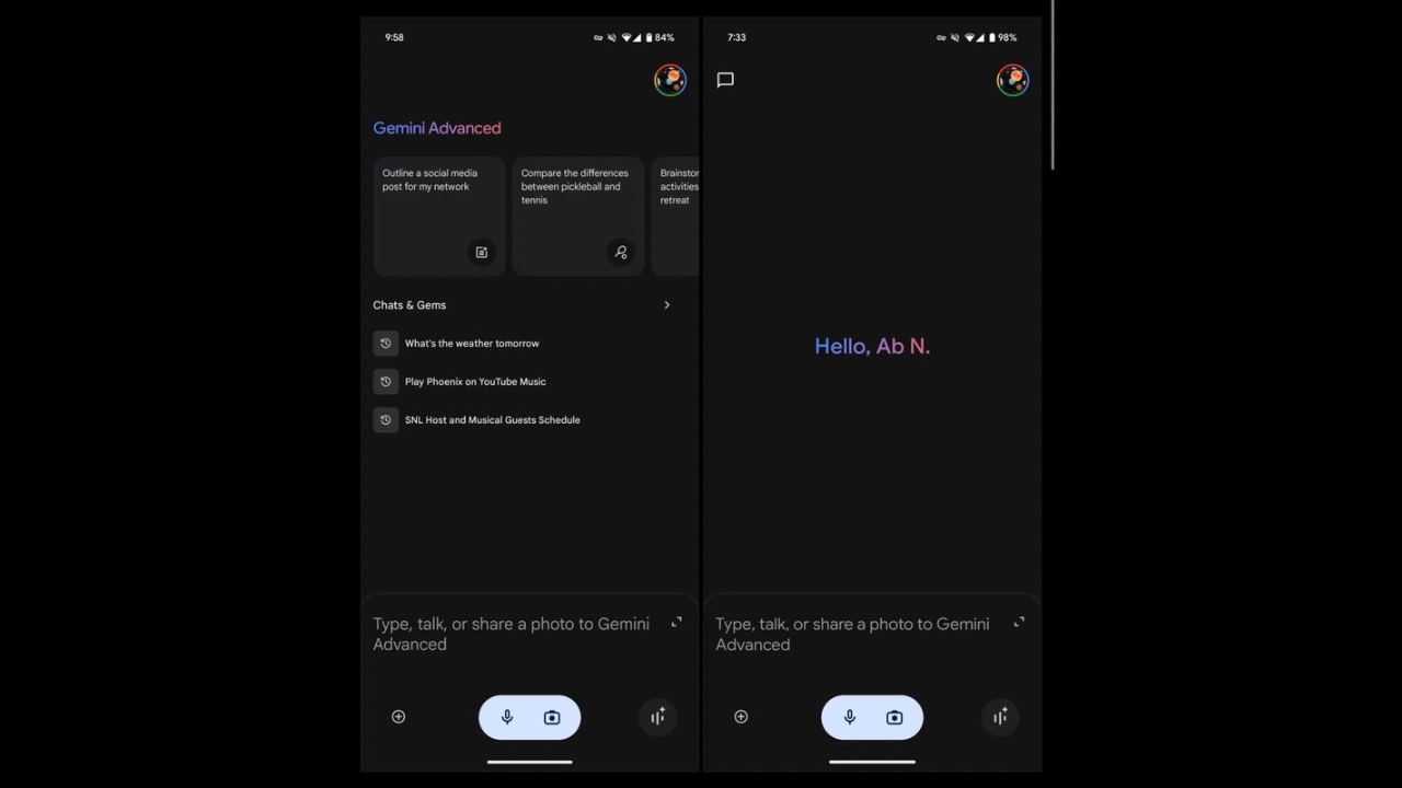
The Google Gemini App is getting a new and cleaner look with a clutter-free user interface. This is the first time Google has introduced such a major change since the introduction of Gemini back in February this year. As of now, the updated UI isn’t visible to everyone and hasn’t appeared on iOS version of the Google app which has the Gemini tab.
As shared by 9to5Google, compared to the current user interface which has the “Gemini Advanced” logo at the top of the screen, with a carousel of suggestions below, as well as the “Chats & Gems” list, the new and cleaner user interface hides all these elements and replaces them with just a “Hello, [name]” message at the center.

A new message bubble icon has been added opposite the account switcher, providing quick access to your Recent conversations and Gems. This icon features a design consistent with the online navigation drawer, ensuring a seamless and familiar user experience across platforms.
Read More: Google Gemini Live is Rolling Out to Free Users on Android
The chat box at the bottom remains unchanged, and still reads “Type, talk, or share a photo to Gemini (or Advanced).” The new minimal user interface adds a sleek new look to Gemini and should roll out to more users over the coming weeks.
Meanwhile, Google recently also added a new Gemini shortcut in its Search widget on iOS and iPadOS. Google has not only added the functionality to customise these shortcuts from a given list of options, but has also added a fourth shortcut that can be added, and can be set to access Gemini so users can directly trigger it from their home screen.


