Android 4.0, the next generation operating system from Google, dubbed as Ice Cream Sandwich (ICS), has been in the limelight for quite some time. But, hardly anyone knows exactly what it offers over existing Android versions.
We have tested Android 4.0 on the Nexus S smartphone recently, and hope to give you a clear perspective on the operating system.
We managed to install Android 4.0 ICS IML74K build on the Indian version of Nexus S (SLCD) GT-I9023 smartphone, which has a Super LCD display and uses a different graphics controller from the GT-I9020 that sports an Amoled display. Here’s our account of Android 4.0 Ice Cream Sandwich.
It is to be noted that the Android 4.0 Ice Cream Sandwich update was pushed for the legacy Nexus S smartphone over the last weekend. This is the first Android 4.0 ICS build from Google for a device other than Galaxy Nexus. The GSM versions of Samsung Nexus S (GT-I9020 and GT-I9023) got Android 4.0 ICS build.
The Android 4.0 ICS update was pushed over-the-air for Samsung Nexus S owners in US while the build was put in the Android Open Source code servers for developers to download and test it. In India, Android device owners are yet to receive the update but Nexus S (GT-I9023) users will not be able to install it on their devices in the normal way.
Faster and neater user interface
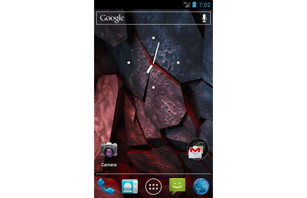
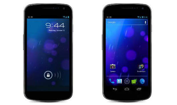
The first visible change that Android 4.0 ICS brings is a new user interface. However, the boot-time in ICS is a couple of seconds longer compared to that of Android 2.3 Gingerbread. The background of ICS, which is heavily influenced by Android Honeycomb for tablets, is simpler and less textured. At first the new Android 4.0 ICS leaves an impression of very basic, solid lines and a flat user interface.
The Google search bar at the top is fixed and is depicted only by a solid silver line with Google text at left and a mic icon at the right. The dock at the bottom has a solid silver line parting the four functional App icons with the App Launcher shortcut at center. There’s a translucent circle just above the line on the left with a folder where several app icons are clubbed together. Between the search bar and the dock is the translucent Analog clock.
As you open the Launcher, you will find something visually very different, but you won’t be able to point out what it is. Those are the new Robot fonts that run system-wide. The Launcher interface has been redesigned and can now be used with right to left swipe gestures. An aspect worth noting about the new drawer is the inclusion of widgets of different sizes, which can easily be added to the homescreen.
Android 4.0 ICS offers only five homescreens that can be customised along with a new navigation method. The status bar at the top has been revamped with a Network icon, denoted by E for EDGE and 3G, and placed close to the upright battery icon. The notification tray has a translucent colour and appears much lighter and smoother, giving a feel of the theme of the movie TRON.
Resizable and scroll-able widgets
Google engineers have tapped the potential of widgets and made them resizable. From the App Drawer, users can choose the available widgets and set it on any of the homescreens. The homescreen offers a grid that can accommodate four app icons. Similarly, the widgets offered in the 3×1 or 3×2 or 2×2 interface size can always be resized.
Besides resizable widgets that can show updated data, Google has also made the apps that collate data streams scroll-able. For instance, widgets like Gmail, Calendar, Reader and others offer scrolling within the widget and don’t require the main app to be opened. This is something very new for the base version of Android ice cream sandwich and also helps getting a quick snapshot of information.
However, only widgets that are specifically designed to be resizable and scroll-able will offer this functionality.
Multitasking and notifications
In Android 4.0, the home icon will offer multi-tasking or switching between open apps by a long press on the home button (be it physical or capacitive). Just like in Honeycomb, a list of active applications will be visible with a small snapshot thumbnail of the window. To remove those items from this list, one has to simply tap and hold on the thumbnail and swipe to the right or left. Switching between two actively running applications is very quick and snazzy.
Notifications have got a few tweaks and show some metadata of the respective notification, and also respond to some new gestures that let the user remove specific notifications from the list. For instance, if you wish to remove a missed call notification from the list you just have to tap and swipe the notification to the right or left. This totally eliminates the cumbersome hunt for the x icon to close the notification.
Messaging and contacts
The Messages app has a wider looking interface with bigger thumbnails and a few words of the SMS along with the time stamp. The New Message icon is located on the left corner, which makes it ideal for both left as well as right handed users. However, at first instance the user might face some issues locating and using the features.
While composing a new text message, the ‘To’ column for the recipient offers contact suggestions based on the numbers or letters being typed in the box. The Android 4.0 ICS keyboard is nicely laid out and offers real smart word prediction, which is quick and accurate almost all the time. The built-in input technology autocorrects misspelt words and underlines potentially wrong spellings, which is quite impressive for heavy Messaging and email users.
Contacts app is now renamed as People app and has been totally revamped with a fresh and clean interface. Initially, users will take a while to get used to the new interface, but will eventually fall in love with it. The People app offers three views for contacts. First is the Google view that offers details of all contacts linked with the Google account. Next to it is the custom view that offers contacts classified by the first letter of their name and arranged alphabetically. And in the individual contact the interface is quite simply inspired by the Microsoft Windows Phone’s Metro UI. With the contact’s large photo on top, users can swipe from right to left to see the most recent updates by the contact on his/her social media accounts.
Basically, the People account is very similar to the People Hub of Nokia, but with the main focus on contacts. Users can add Google and social media accounts to collate all contacts as one place. The first few hours on the phone might make it appear really slow, which is because the accounts are syncing and pulling data to and from the device. Use of WiFi is recommended to get this done faster.
Camera
Camera app has been optimised visually, with more real estate visible on the screen and a large button on one side. However, the camera app takes a good 3-4 seconds to load. The image capturing process takes a couple seconds and then it is ready for the next one. Offering comprehensive options to tweak the settings for capturing best images, the preview offers icons of apps through which the image can be shared. The camera app exits with a sound that is similar to the one that signals the closing of aperture.
Gtalk and Gmail
Just like the Messages app, even Gtalk has a much cleaner interface with bigger avatar icons, and only six users are listed in the basic screen. On top rests the email account with a drop down option which clearly shows that Gtalk supports multiple account sign-ins. Gmail has undergone a major overhaul. It looks much lighter and works quite a lot zippier. The icon locations have been changed.
Apart from these apps, there has been no major change in the Settings app. Over all, you would need a few days to get used to the new user interface of Android 4.0 Ice Cream Sandwich, but thereafter you will love it.


