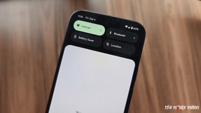
Google’s Android 15 was released to AOSP a few days back, and a stable release is set for October. However, before its release, we are seeing leaks regarding the Android 16 Quick Settings and Notifications panel, which is set for a complete overhaul, bringing a change that might not be widely appreciated.
According to a report by Android Authority, the publication was able to activate a new version of the notification and Quick Settings panels while tinkering with the Android 15 QPR beta. Mishaal Rahman, the source of the leak, suggests this new panel could be implemented in Android 16. However, Google could bring about a change that might be a downgrade over the current implementation of the Quick Settings and Notifications panel.
In the new panel, swiping once still brings down the notifications panel like the current implementation, but the panel now takes up about a quarter of the screen rather than the entire display. Further, you can’t longer see any Quick Settings tiles in the new notifications dropdown. On the other hand, the app you are using before you swiped down the panel is visible in the bottom half of the screen.
Read More: Google Gemini App Gets File Upload Support on Android and iOS
One would think swiping down the second time would bring down the tiles but unfortunately, that’s not the case. Instead, the Quick Settings panel is accessed by pulling down the status bar with two fingers, which is something that we suspect won’t be liked by the public as it increases the effort being used to access quick settings.
After opening the Quick Settings panel, you can swipe left or right to navigate through multiple pages and view all your tiles, similar to how it’s done at the moment. The brightness control remains at the top, but now includes a text label and dynamically displays the brightness level as you adjust it, resembling the updated volume sliders in Android 15. Additionally, most Quick Settings tiles have been reduced in size, allowing more tiles to be displayed on a single page for easier access.
The redesign of the Android 16 quick settings and notifications panel seems to be based on Flexiglass. As the publication notes, Flexiglass is the internal codename for the redesign that Google is doing to SystemUI to make it more stable.
The new user interface is far from finished at the moment, but it could be a hint as to which direction Google plans to move in with its next version of Android. Again, the company could scrap it altogether or further tweak this UI to make it similar to the current Quick settings and notifications panel. We’ll only know once Google releases a developer preview of Android 16, ideally in February or March of 2025.


