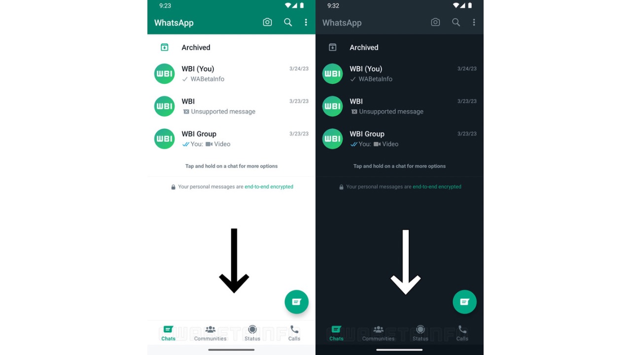
WhatsApp switched to the material design style of user interface years ago, on the Android app. Since then, the App hasn’t seen any major redesign but it seems like WhatsApp may be working on an overhaul for the design in its Android app. However, it isn’t confirmed as to when we could see the change.
The report from WABetaInfo suggests that the Android app for WhatsApp may soon get a major redesign with the navigation bar going to the bottom from the top. This would bring the UI of the WhatsApp Android app closer to the iOS counterpart. In addition, the feature tracker also shared the screenshots of the upcoming tweaked user interface where the bottom bar comprises four options – Chats, Communities, Status, and Calls.

Currently, these options reside at the top in the form of tabs which now looks outdated. WABetaInfo says that the change is a result of majority of users requesting an updated design with a more modern look and one which makes it easier for users to navigate between the different sections of the app.
The tweaked user interface that includes a bottom navigation bar is under development and it will be released in a future update of the app. Not only will this be a welcome change, it will also bring consistency across the UI of WhatsApp on Android and iOS. It would also help with reachability of the buttons for those who have phones with a large display.
In related news, WhatsApp recently launched the ability to link up to 4 devices with one account so you can use the chatting service on other phones apart from the primary device. This means that all your chats will stay synced across all connected devices, giving you the flexibility to switch between them as needed.


